This luxury florist brand design for Petal and Branch is modern, romantic, and warm. Inspired by all things lovely, this brand evokes feelings of nostalgia and intimate moments. Petal & Branch includes a stylized serif paired with a romantic script, handmade textural patterns, and an earthy color palette. Before getting into the brand, it’s important to look into the strategy that supports the design.
Petal & Branch Luxury Florist Brand Design
Brand Strategy
The motive behind this brand is to form stronger connections with the ideal client profile. This is accomplished by cultivating a strong, cohesive brand from the color palette, to typography, and textural elements. From the moment someone lays eyes on this brand, we desire for them to be immersed in feelings of nostalgia and intentionality.
Petal and Branch have trouble communicating the value and specialty services their clients receive. Most importantly, we are looking to solve a brand clarity problem. This is accomplished with deliberate design decisions on color palette, typography, and deliverable assets.

Ideal Client Profile
Eli & Maci
Age: 28-35
Well established in their careers, Eli and Maci are nostalgic millennials who love all things charming. Inspired by vintage heirlooms and mid-century modern decor, they have a strong sense of style. They commonly eat organic and purchase sustainable products.
They had a long engagement, and have been saving up for the wedding of their dreams. Still desiring to keep it intimate and meaningful, this couple has a small guest list. They are drawn to earth tones and moody color palettes.
Color Palette
The color palette includes earth tone neutrals and pops of warm, rich tones. It will elevate the brand to feel luxurious and romantic. The three accent colors are brown, burnt orange, and moss green.
Brown is grounded and evokes feelings of stability, sincerity, and growth. Additionally, orange is creative and establishes feelings of security, positivity, and passion. Lastly, green is harmonious and promotes feelings of abundance, balance, and assurance. In addition, the soft neutrals offer a variety and depth to the color palette.

Logo Suite
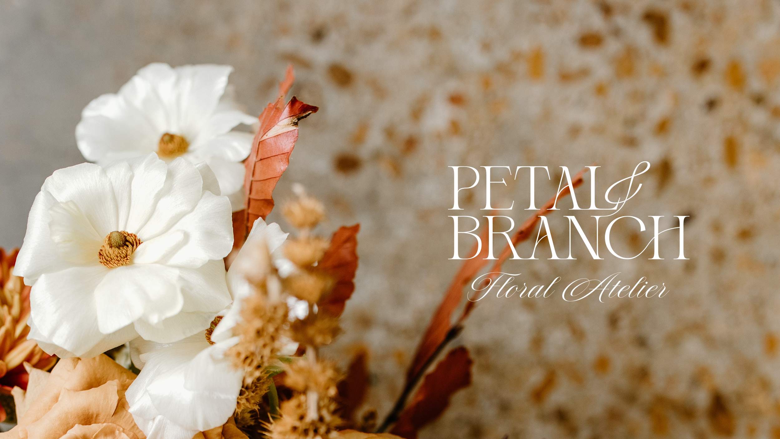
This brand includes a uniquely customized serif paired with a clean sans serif and romantic script. The ampersand intertwines in the logo representing the organic style of Petal and Branch’s arrangements. Additionally, this element symbolizes the unique approach they take with each client.
Oftentimes, scripts can date a brand and cause it to feel juvenile. However, choosing the right script can nail a design and bring it all together. Antura Script is a calligraphy-inspired script including detailed letterforms and charming characters. This typeface speaks directly to the ideal client profile established in the brand strategy.

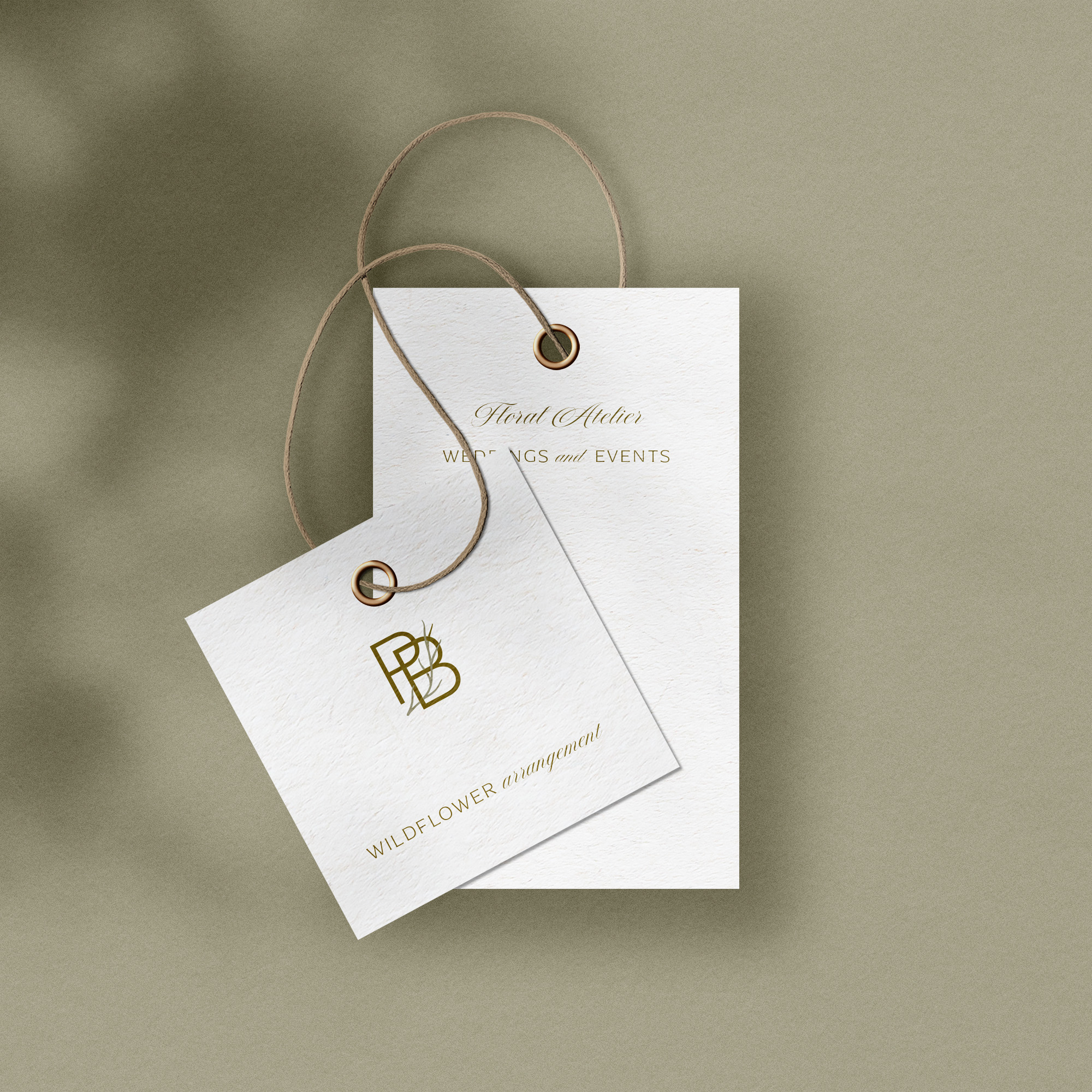
Unique compositions on stationery and packaging add a level of sophistication and elegance. For example, on the printed stationery, there is a balanced use of negative space. Allowing the design to breathe elevates the brand to be more trustworthy and intentional.

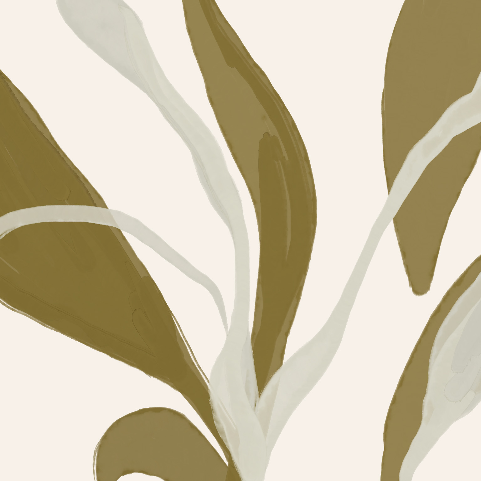
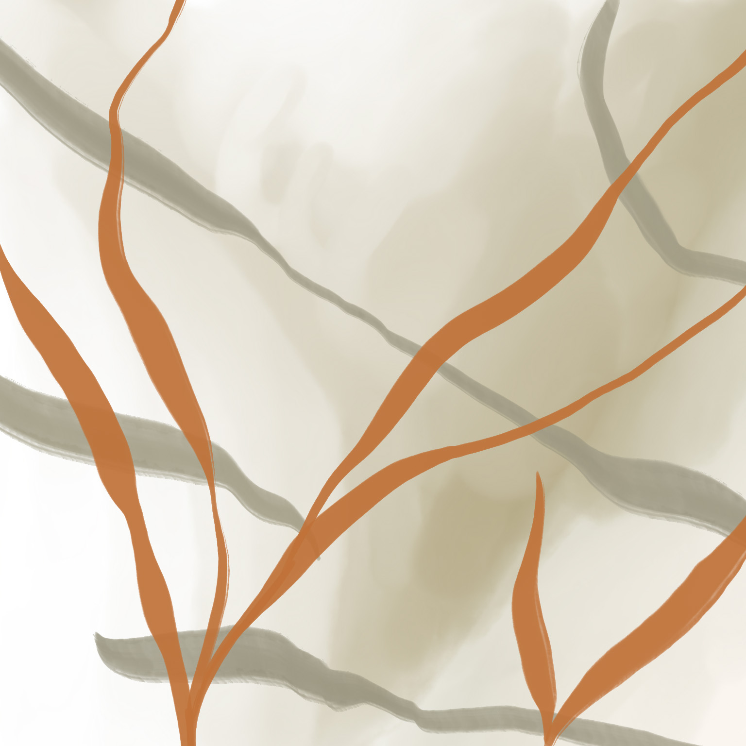
A brand style guide is included with each custom brand project. This is a presentation that helps guide clients on how to use their brand elements. For instance, applying hand-painted textural elements on items such as tissue paper is a great way to maintain brand cohesiveness.
Applying custom brand elements throughout your business builds robust brand consistency. Increasing brand consistency grows your audience by becoming more memorable and trustworthy.
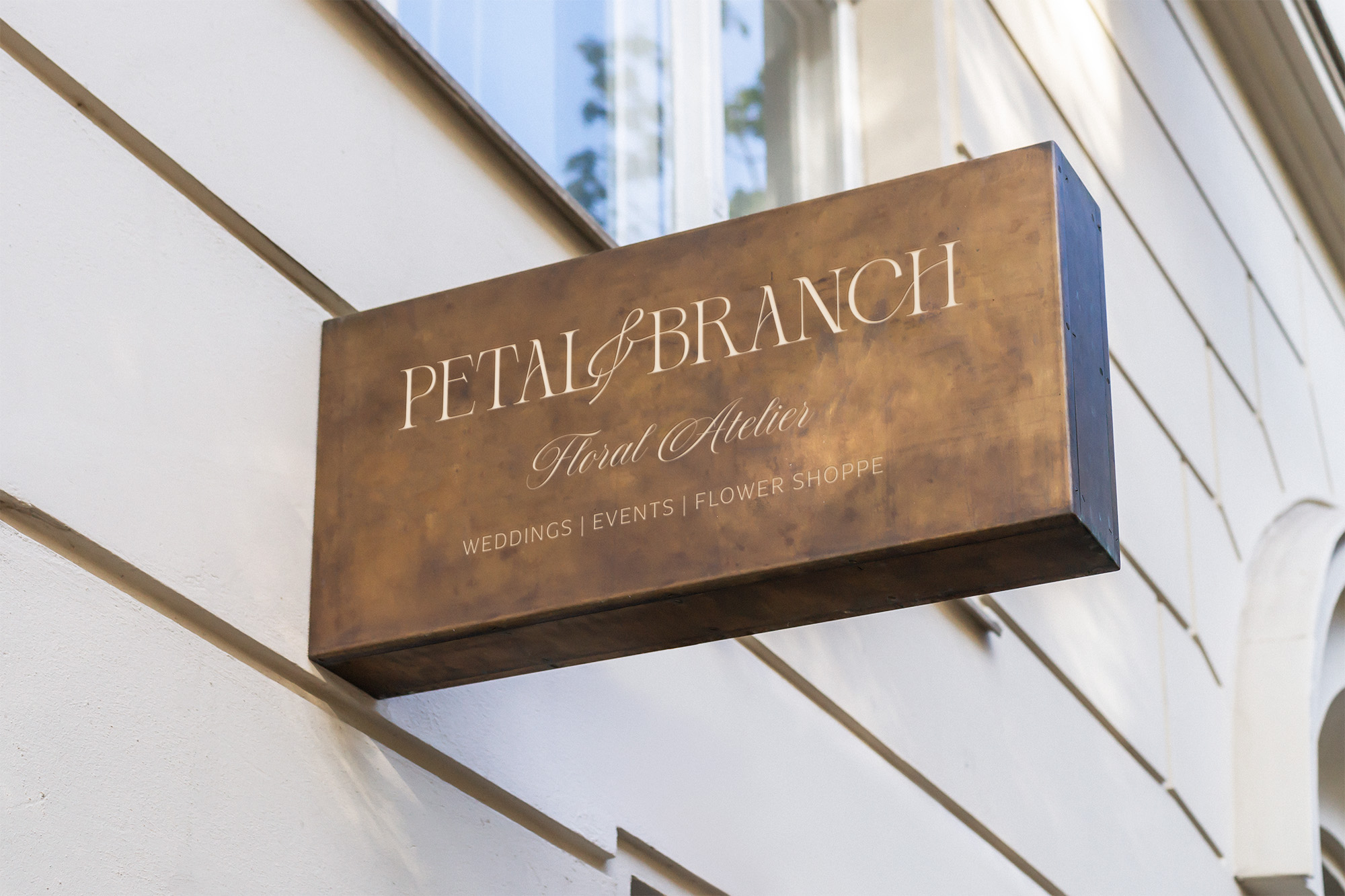
Feeling lost when trying to cultivate a strong, consistent business? Your brand visuals have the power to grow and reach your business goals. Whether it’s marketing, your website, or stationery, establishing a brand propels your business forward! Not nurturing a steady brand prevents clients from taking you seriously.
I’m always happy to open the conversation. Reach out to schedule a time to talk about your business! I would love nothing more than to help you succeed!
