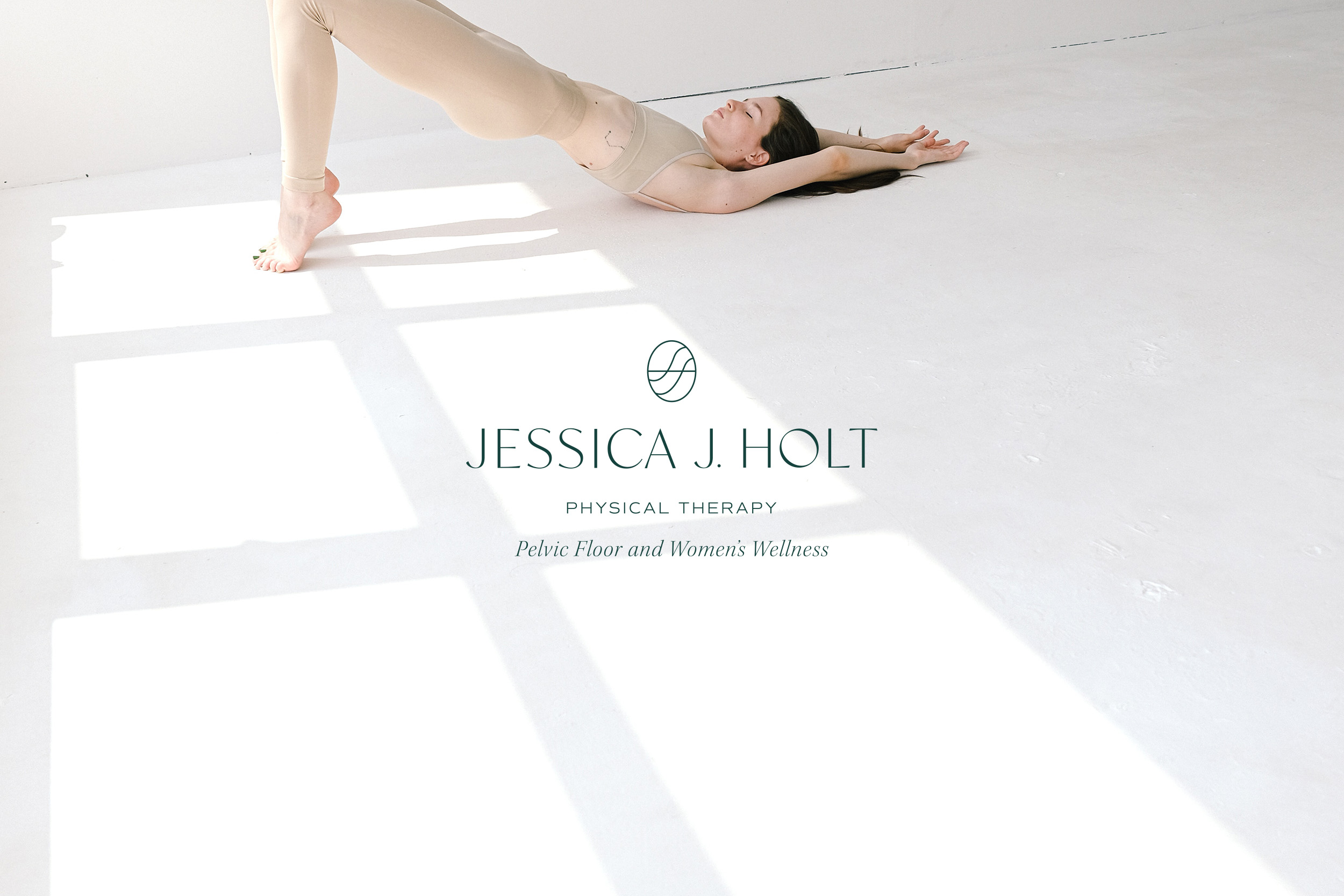
Straying from typical sterile healthcare, Jessica J. Holt Physical Therapist Brand Design is drawn to natural elements. Inspired by organic and sustainable living, Jessica Holt is a doctor of physical therapy located in Cartersville, Georgia. She specializes in the pelvic floor and women’s overall wellness. The motive of this brand is to push the boundaries of a typical, sterile medical environment with a modern, clean design.
Jessica believes women’s health is worth investing in, so it is important to portray that with her brand design. This is accomplished with crisp modern typography and thoughtful design elements. Before diving into the logo suite, it is important to assess the ideal client portfolio. This allows a strong foundation to build the brand upon.
Brand Strategy

Ideal Client Profile
Jacqueline
Age: Early 30s
Jacqueline is a married stay-at-home mom who enjoys practicing yoga and traveling to the mountains or the coastline. She is fashionable but practical and remembers that her purchase holds a responsibility to the earth and humankind.
Jackie splurges on a pair of new leather shoes and secretly hopes her toddler doesn’t get ahold of them. Her largest need is someone who understands her health concerns and is a good listener. She desires self-care despite the many responsibilities of home and family life.
Additionally, she shops organic and searches out sustainable options as much as possible. Takes part in holistic health and has a dream of having a home birth.
Mission Statement
“We strive to bring quality, intentional, and holistic pelvic health physical therapy to bring healing and wholeness without sacrificing your daily responsibilities in order to enhance your quality of life.”
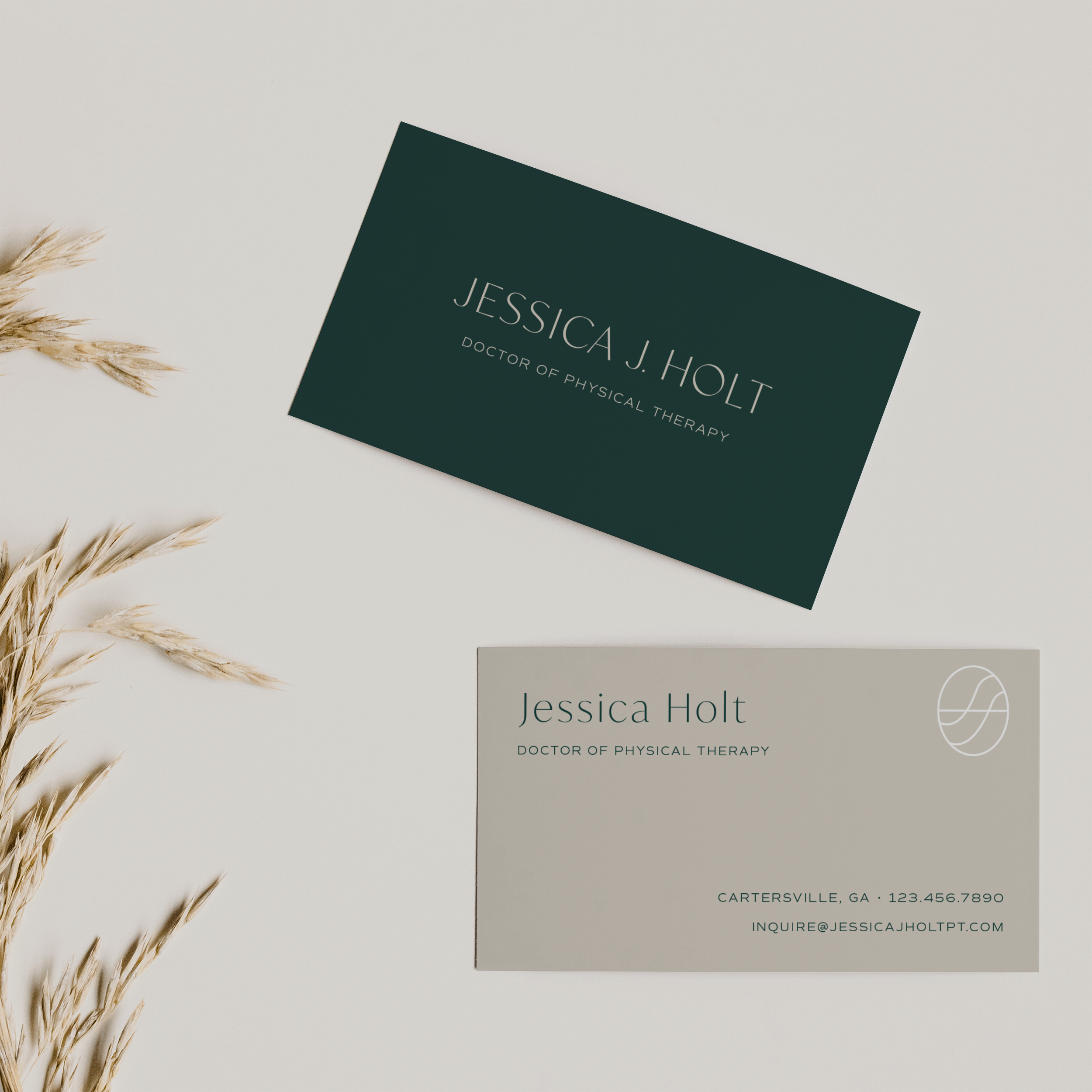
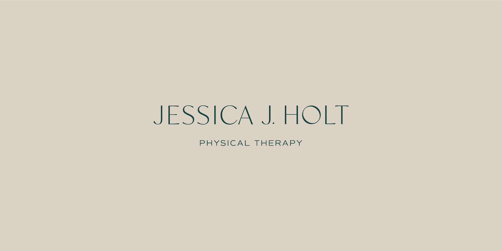
Jessica J. Holt Physical Therapist Brand Design
Color Palette
The darkest tones of the color palette include a deep navy blue and emerald green. Blue is logical and evokes feelings of intelligence and serenity. While green is restful and promotes feelings of restoration and balance. Additionally, soft neutrals offer a variety and depth to the color palette. A muted dusty rose speaks to Jessica’s feminine audience without feeling overly effeminate. At the same time, soft sage green is abundant and balanced.

Logo Suite
As mentioned previously, this brand design combines a contrasted sans serif with a timeless sans serif. Using timeless typography such as this provides a trustworthy, professional feeling. Her ideal client profile is someone who desires quality professionalism as well as trustworthiness. By combining classic design elements, her clients feel safe and protected when hiring Jessica for their healthcare needs.
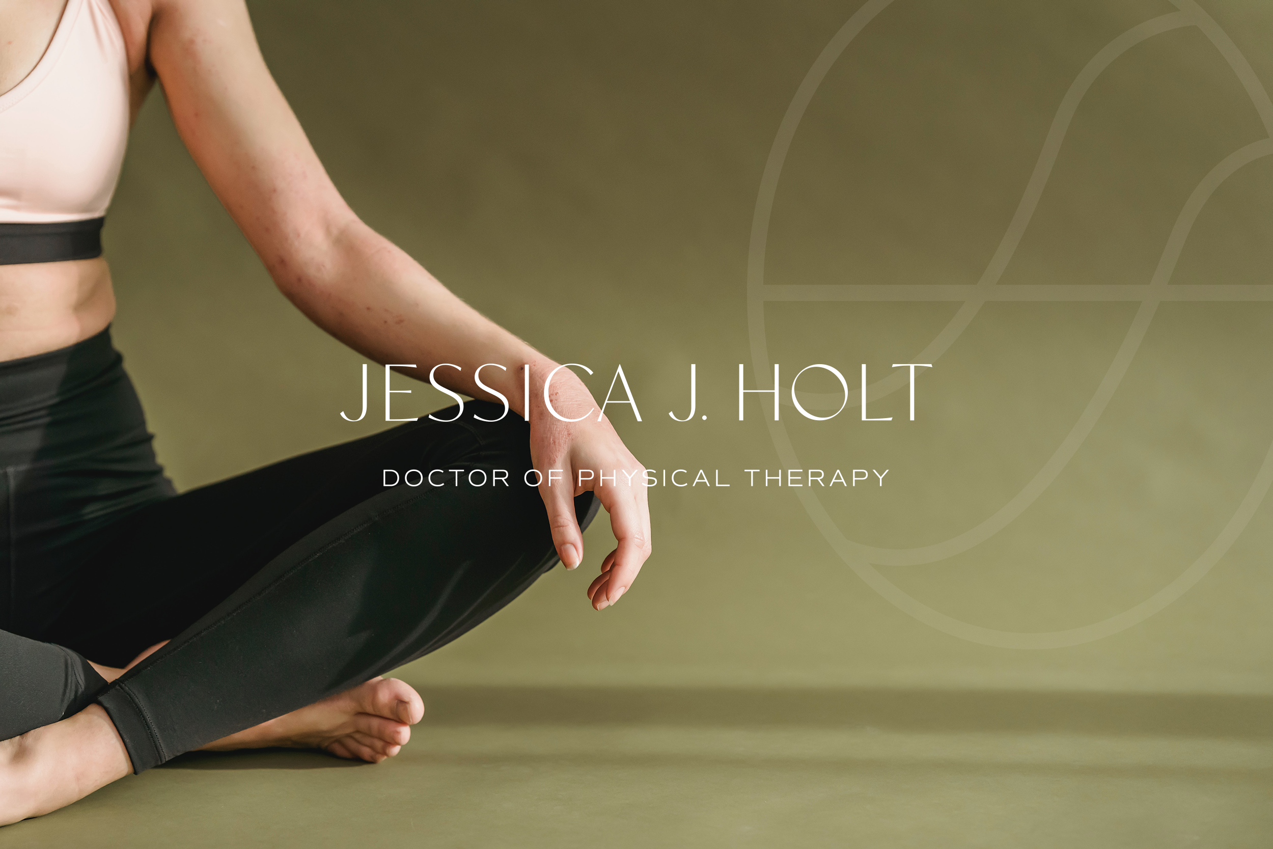

The conceptual icon required A LOT of brainstorming and a variety of ideas. Among the plethora of ideas, some included abstract line work, text-based monograms, and pregnant inspiration. Finally, I landed on combining some of these concepts into one. Her business name being her own name, I incorporated her initials to create an abstract monogram. While Jessica works with all females regardless of giving birth, pre and postpartum woman are among the majority of her clients. Therefore, this icon is representative of the female form, specifically pregnancy with one shape containing another.