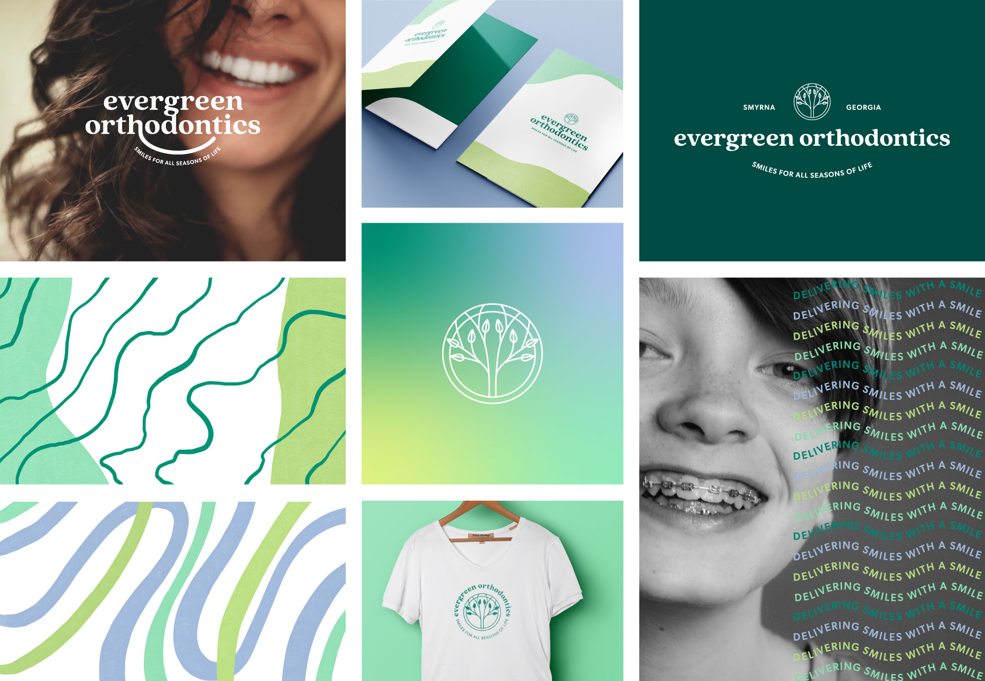
Fun orthodontist brand design for Evergreen Orthodontics, a new orthodontic practice opening on the west side of Atlanta, Georgia. They are a female-led business with lots of energy and a BIG focus on treating our patients like family. They strive to create a fun office culture with a team that truly loves what they do. Bright, crisp, and colorful; this project is fun, unique, and compassionate. I was able to provide a comprehensive brand style guide that helps guide my client on implementing their new brand in their office interiors, online, and stationery collateral.

Fun Orthodontist Brand Design for Evergreen Orthodontics
Evergreen Orthodontics attract millennial-aged parents looking for a friendly, relatable doctor to help them manage their child’s care. They don’t only want someone who provides quality healthcare but also inspires confidence, delivers smiles, and shares a laugh. They are drawn to the office’s approachable fresh energy and appreciate the relaxing, fun environment.

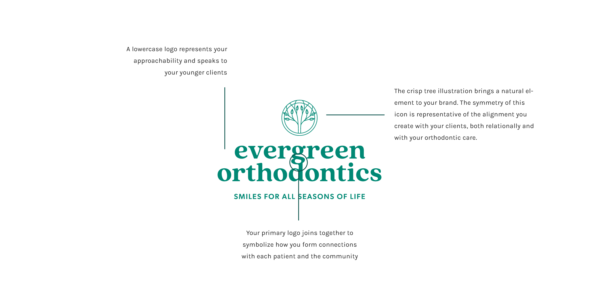
This brand design is fun, unique, and focuses on quality, compassion, and expertise in orthodontic treatments. Bright, modern design connects with the community of all ages. A lowercase logo represents approachability and speaks to a younger audience. The crisp tree illustration brings a natural element to the brand. The symmetry of the icon represents the alignment created, both relationally and with orthodontic care.

