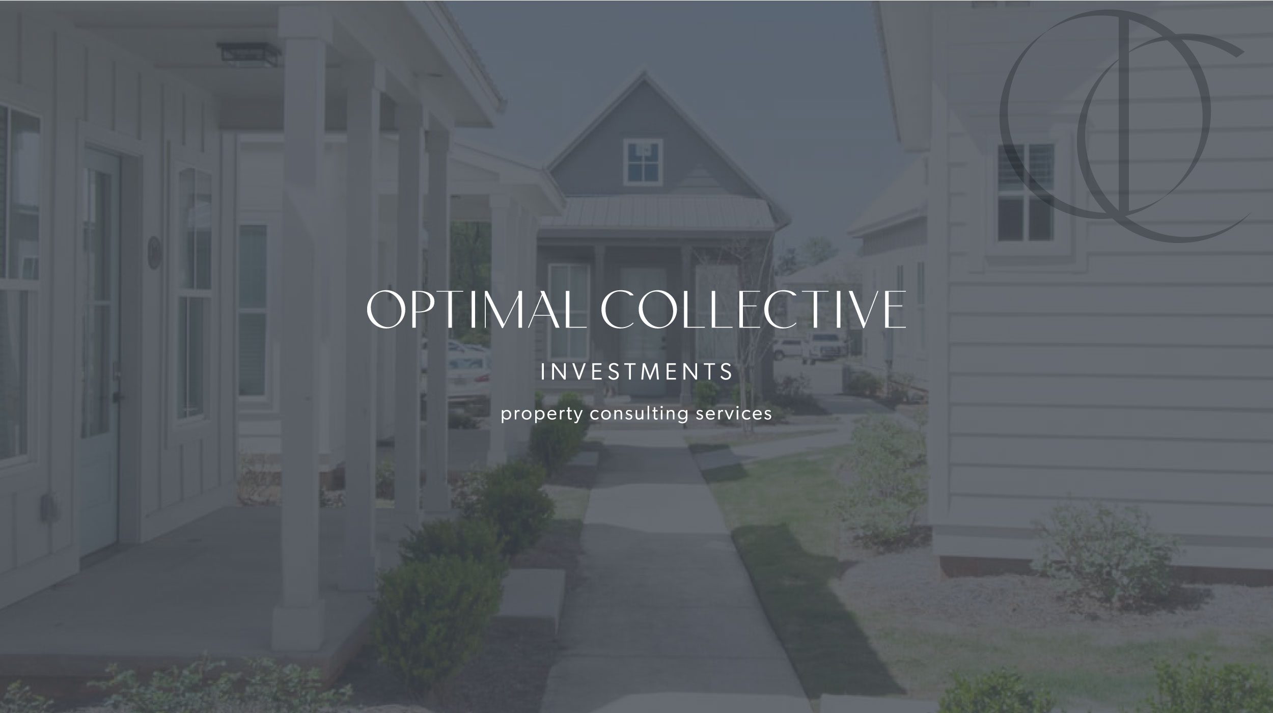
Providing professional investment consulting services, OCI breaks the boundaries to provide an all-inclusive experience. This sleek brand design for Optimal Collective Investments is modern, fresh, and clean.
Part of the corporate consulting industry, Optimal Collective Investments is not my typical client. I usually work with creatives such as photographers, wedding planners, florists, stylists, and wellness businesses such as estheticians, counselors, and therapists. Working with entrepreneurs with a creative component to their brand lights a fire in my soul!
Upon meeting Kaitlyn, it was clear she is not the typical corporate business you’d think of and we hit it off right away. She has various experiences in the property investment industry including overseeing branding and marketing for properties. Because of this, it is clear she has the knowledge and understanding of the value brand visuals have on any business.
But before I jump into the strategy and design behind this project, let’s go back to the beginning.
Naming Session
When Kaitlyn originally inquired, she expressed the need for help in naming her business. It was important for her to establish a name that conveys trustworthiness, professionalism, and clarity. With no desire to use her actual name, we scheduled a strategy session dedicated solely to naming her business.
Prior to this naming strategy session, I completed research of my own based on our discovery call and brand discovery questionnaire. To begin, I created a word map including words, phrases, and ideas to establish a theme and clear direction forward.
We hopped on the call and jumped right into it. By the end of the hour, Kaitlyn had confidence in moving forward with the name Optimal Collective Investments.
Project Scope
Because every business is different, specific deliverables vary and are customized to every Lovendear client. On day one of the brand nurture week, I continued market research and brainstormed visually to put together the strategy and creative direction presentation.
We met at the end of the workday where I presented the presentation. The strategy and visual direction were finalized and we made a list of the á la carte deliverables that make the most impact for OCI. We decided on a custom postcard, bubble mailer, and website landing page, but more on that later!
Brand Personality
Optimal Collective Investments is sophisticated, clean, educated, competitive, experienced, and well-rounded.
Brand Vision
Above all else, OCI is known for polished, collaborative, and superior property consulting services that help businesses make a profit by developing improvement plans that drive results.
Core Values
- Creating a home — Kaitlyn is in the business of creating a home by evaluating the functionality of a space – whether it’s student or family housing.
- Driving Profitable Results — OCI is committed to providing profitable results both through their extensive consulting services and marketing solutions. They go above and beyond to provide a professional and seamless process.
- Being a Jane of All Trades — Having a wide range of experience in property management and development, Kaitlyn is uniquely qualified to offer consulting with a number of services. She ensures a level of collaboration and that her customers value and trust.
- Community Development — OCI provides improvements to the communities her clients are investing in. They will feel confident in the caring approach OCI takes with development properties.

Color Palette
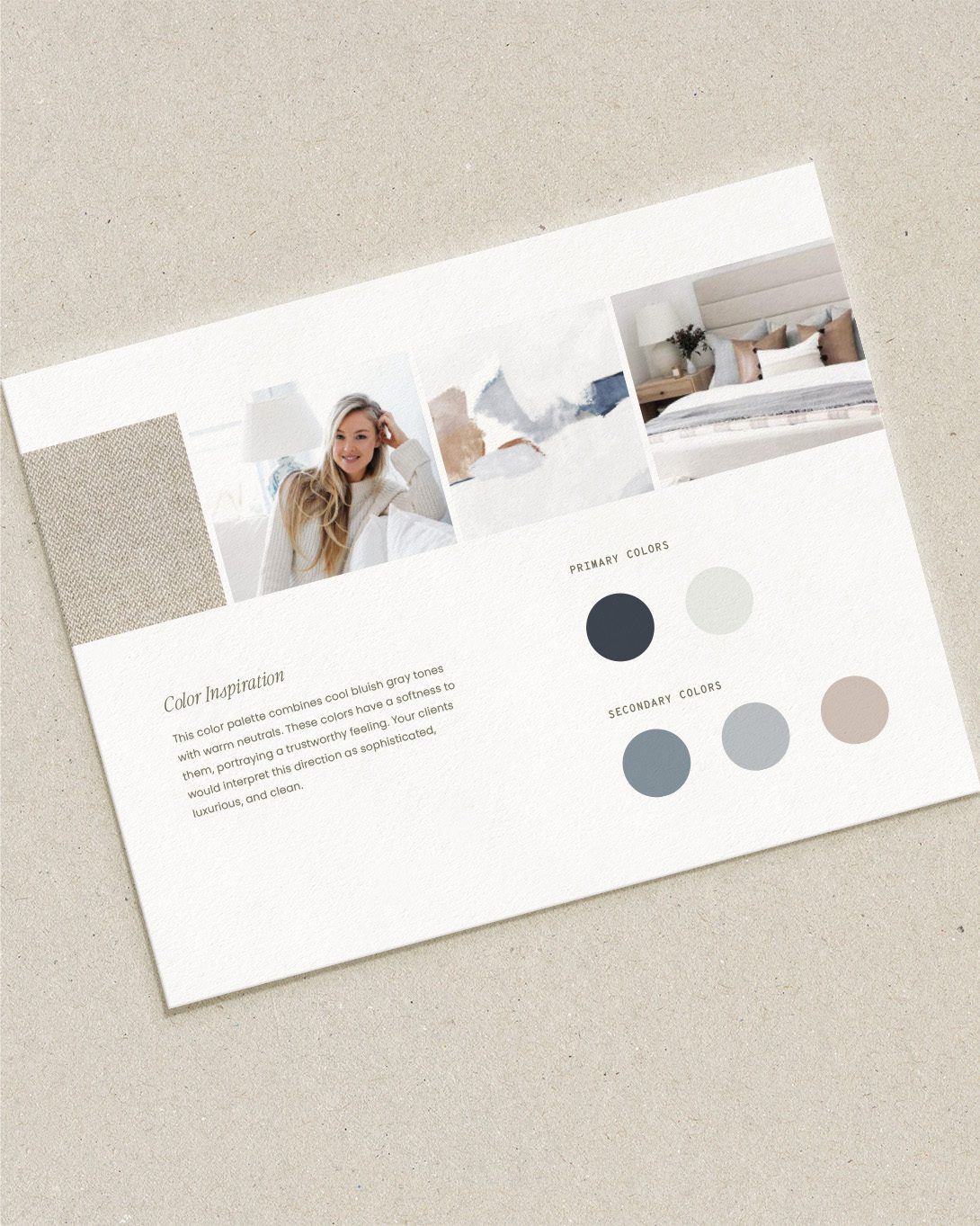
Now, let’s talk color! When establishing a brand color palette, always refer back to the strategy. Doing so ensures you have your ideal audience in mind when making decisions.
For OCI, I knew we wanted to go with blue tones but not too corporate. Most businesses in this industry use a brighter cold tone of blue not giving much space for approachability. That being said, selecting the right shades was a significant part of this process.
The reason blue is such a successful brand color is that it evokes feelings of intelligence, logic, order, calmness, efficiency, serenity, trustworthiness, clarity, and forward-thinking.
Selecting a deep navy tone for the dark neutral rather than black adds softness while remaining focused on strength, stability, and versatility in investing.
Warm neutrals suggest a focus on stability, groundedness, and practicality. These tones add a touch of femininity without becoming too ladylike.
In summary, this color palette combines cool bluish-gray tones with warm neutrals. These colors have a softness to them, portraying a trustworthy feeling. Clients would interpret this direction as sophisticated, luxurious, and clean.
Logo Suite
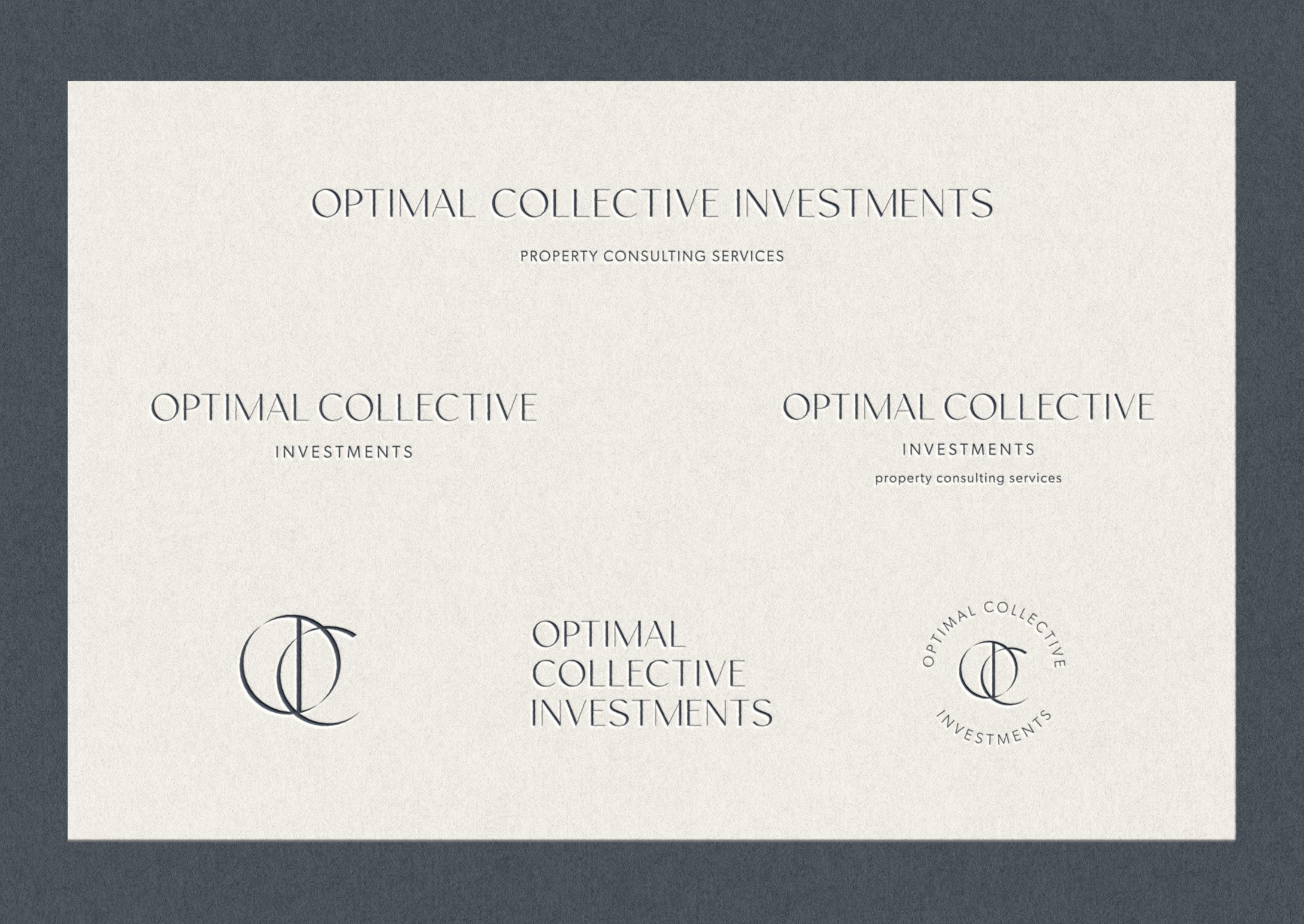
The logo concept conveys a polished sophisticated feeling. A contrasted sans serif is fresh and modern, professional and trustworthy. Subtle sharp details offer a refined approach bringing intentionality to the brand.
An important component for Kaitlyn was the monogram. She wanted to have a mark that would encompass the acronym in a polished, memorable way. Giving space for contrast in the monogram draws the eye into the design as a whole.
Because the name Optimal Collective Investments is quite long in nature, I designed multiple variations to accommodate wherever she applies her brand visuals.
brings a creativity. modern artistic pattern
Á la Carte Deliverables
As a new business looking to stand out in a corporate male-dominated industry, Kaitlyn understands the importance of strategic marketing. She brainstormed a marketing campaign to build recognition in her business and allow for an impressive networking tactic.
Custom print processes and packaging are such an impactful way to market your business and impress current and potential clients. However, custom printing can add up quickly, especially if you’re in the start-up phase of business. Don’t worry, there are still options to provide your clients with an impressive and professional experience.
Using MOO’s special print finishes are a great way to accomplish this. And it’s exactly what we did for Kaitlyn’s marketing stationery.
Postcard Design
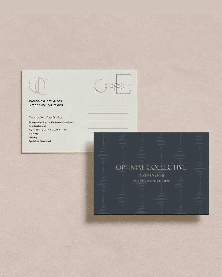
For the postcard mailer, I selected the classic gold foil finish on the front side. Overlaid on her custom brand pattern adds a beautiful, luxurious touch to her brand.
Business Card Design
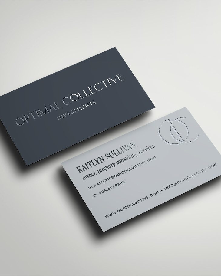
She opted for the spot gloss finish for her business cards. This up levels the traditional digital printed business card and offers a chic, polished look.
Website Landing Page
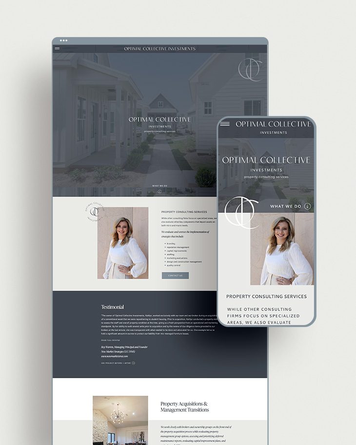
It’s safe to say a website is crucial to the success of any business. This rings especially true for OCI. As a new business owner in the property investment industry, sending current and potential clients to a professional online space increases the probability of bookings.
Built on Showit, this one-page website is a great start for Kaitlyn to begin marketing Optimal Collective Investments.
This website landing page includes past projects, information about her experience in the industry, testimonials, impressive before and afters, project details, and contact information.
Feel overwhelmed and don’t know where to start with your website? Believe it or not, you don’t need to have it all perfectly together to start. Pull together the most important information for potential clients to learn about and contact you.
A few items to consider for a website coming soon page include:
- Clear and concise information about your products or services
- Professional and/or stock imagery
- Font hierarchy applied throughout
- Color palette implementation
- Brand visuals such as logos and patterns
- Social Media Links
- Contact Form
A closer look at this Sleek Brand Design for Optimal Collective Investments
