I’m absolutely THRILLED to share my most recent project – JNicole Maternity Photographer Brand Design. I have known Jessica for YEARS at this point! I worked with her on her branding and website design back in 2017 I think it was. Needless to say, she’s been here with me since almost the beginning of my design career. She’s a dream client and so much fun to work with! Her work is nothing short of stunning, so I am proud to debut her lovely revamped brand!
Jessica contacted me back in January interested in a refresh of her existing branding. With the craziness that was 2020, she decided to transition from wedding and maternity photography to just maternity photography. Obviously, I jumped at the opportunity to work with her again!
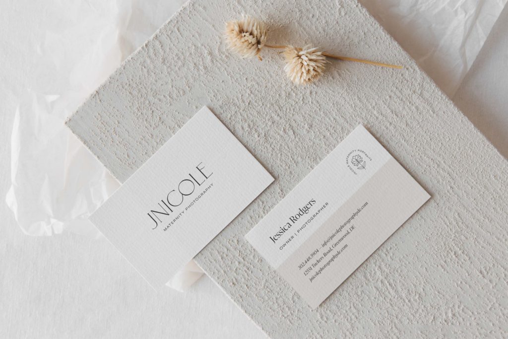
JNicole Maternity Photographer Brand Design
We kept the base of her existing brand and added more touches of female flair and sophistication to speak to her niched-down clientele. Jessica provides a custom-tailored fine-art experience for women in their pregnancy journeys. Because she was able to niche down, we reworked her strategy a bit.
Refining her brand vision and audience allows us to be more strategic with the design. Jessica’s audience is expecting mothers looking for timeless maternity photography to help them capture this beautiful milestone memory. They want someone who not only photographs them but also provides an all-in-one experience. They are drawn to color, beautiful gowns, and appreciate how she goes above and beyond. This experience makes her clients feel confident and at ease as they begin their pregnancy.
Including curved elements in the main typeface is representative of the beauty of the female form. The connection of letterforms symbolizes the bond between mother and child. This newly refined brand identity is authentic, nostalgic, and beautiful.
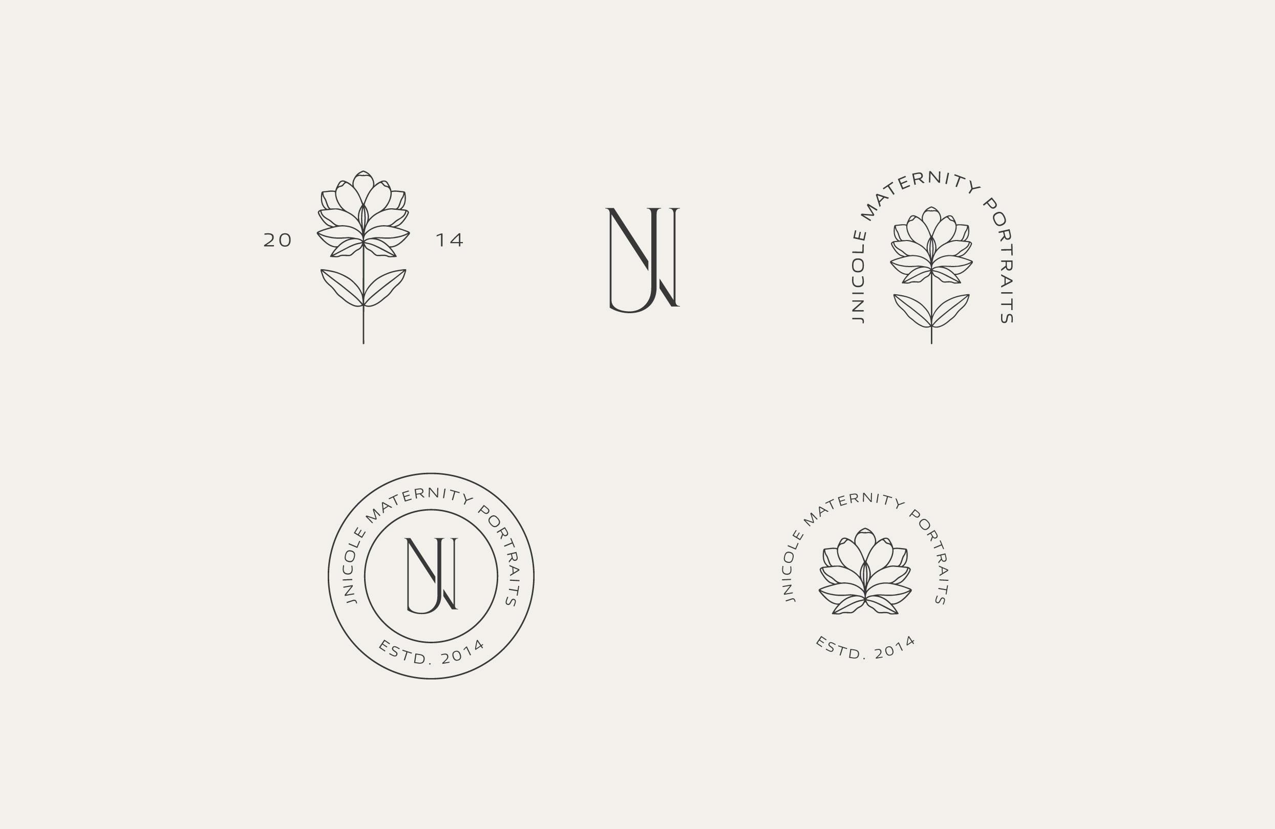
Previously, the J Nicole brand included hand-painted watercolor elements. The loose, romantic style of those elements spoke to both her wedding and maternity clients. For her new brand, we simplified this down to a line drawing inspired by a magnolia flower. The monogram still holds the same inspiration as the previous brand but is more elevated and refined.
We have a custom website design planned for August and I can’t wait to get started! Implementing her newly refined brand into a fresh web design will be the icing on the cake!
