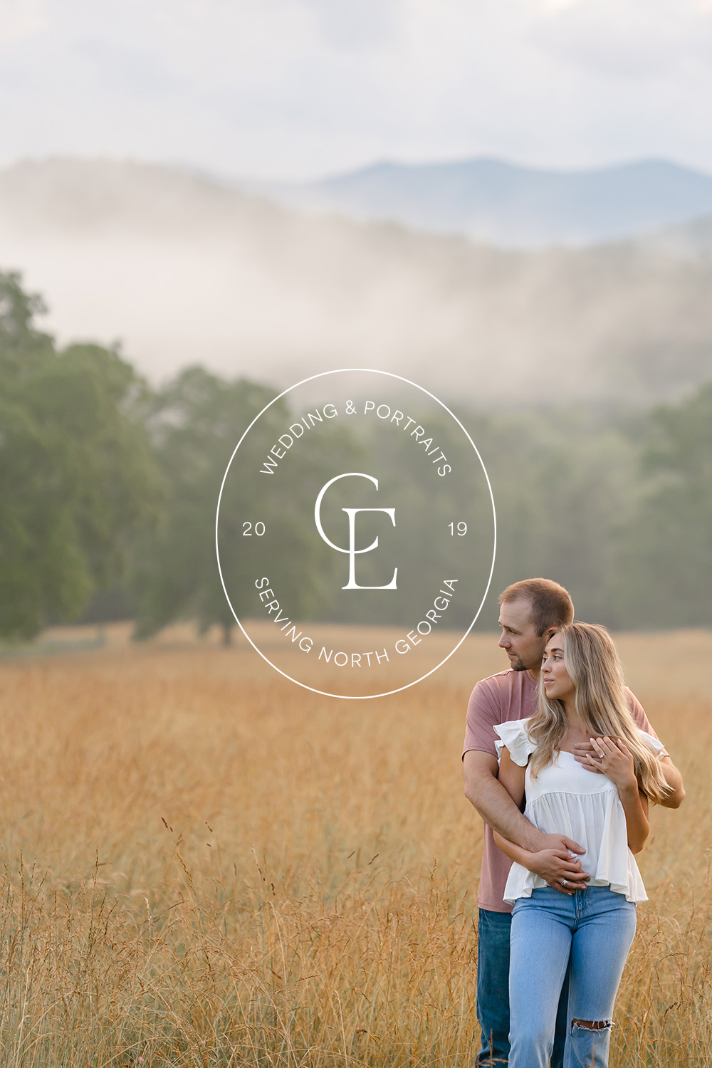
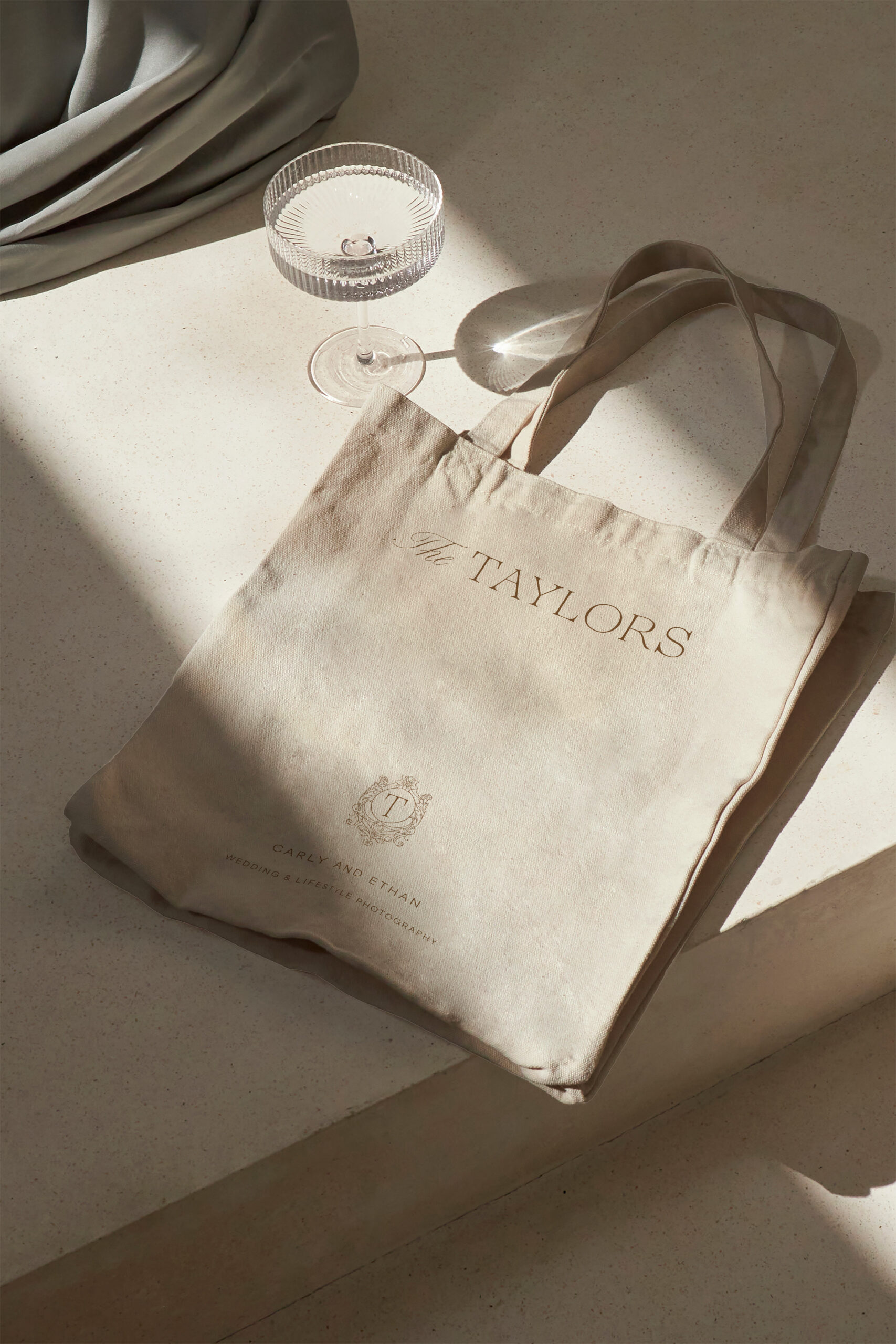
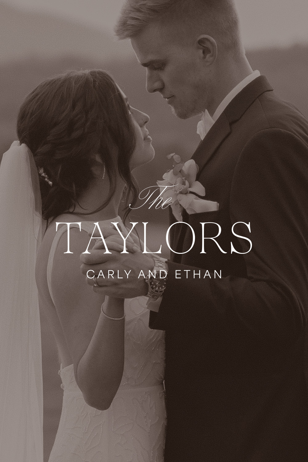
I am thrilled to share the enchanting story behind the elegant and romantic brand identity of The Taylors—a photo duo. Nestled in the North Georgia mountains, The Taylors specialize in wedding and lifestyle photography. At a pivotal turning point in their business journey, Carly and Ethan sought to lay the foundation for future growth through a thoughtfully designed brand identity.
Carly and Ethan describe their business as established and comfortable. They plan to have Carly step into the role of the primary photographer, while Ethan pursues his engineering career. Although they plan to take on different roles, The Taylors will remain a strong team on wedding day.
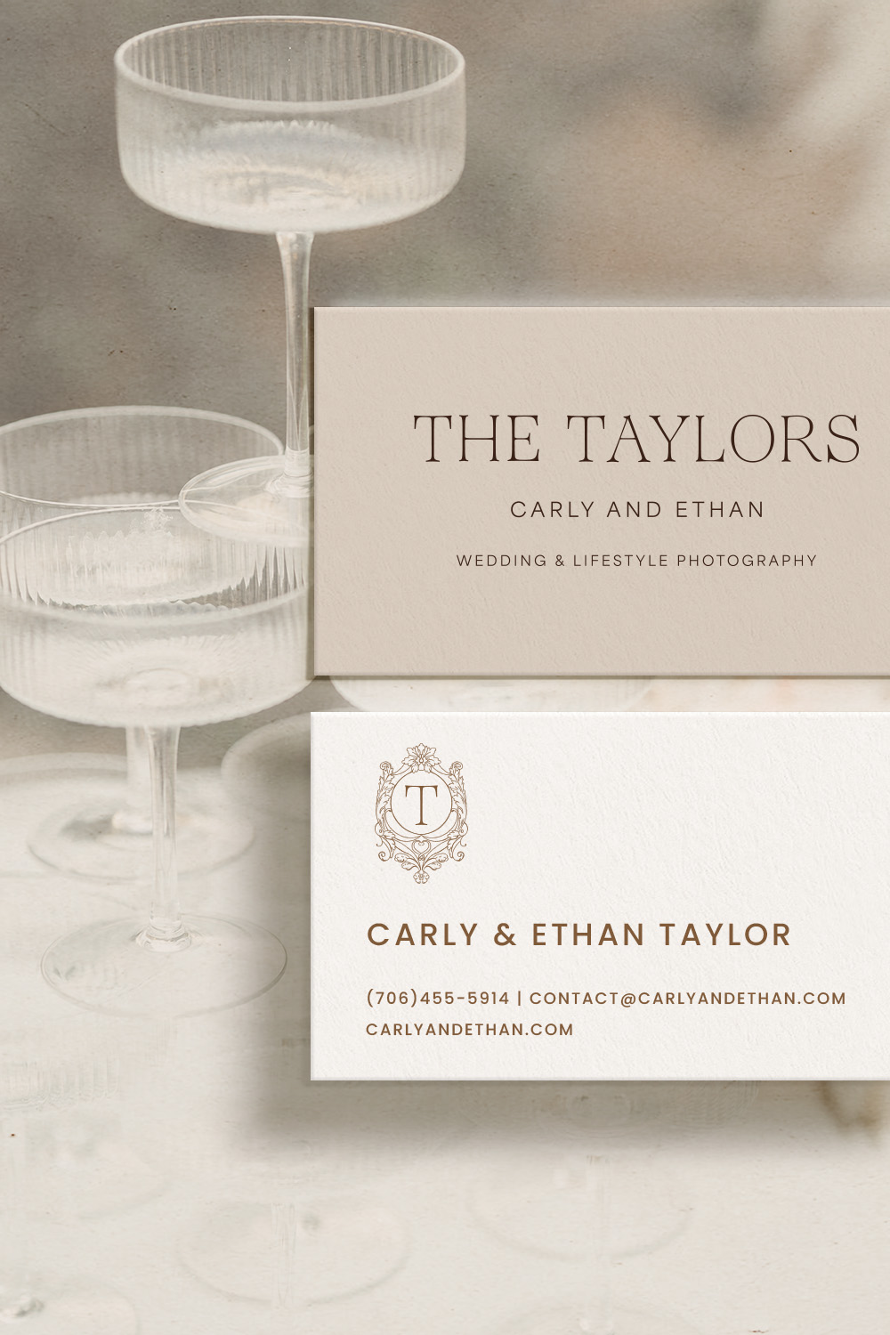
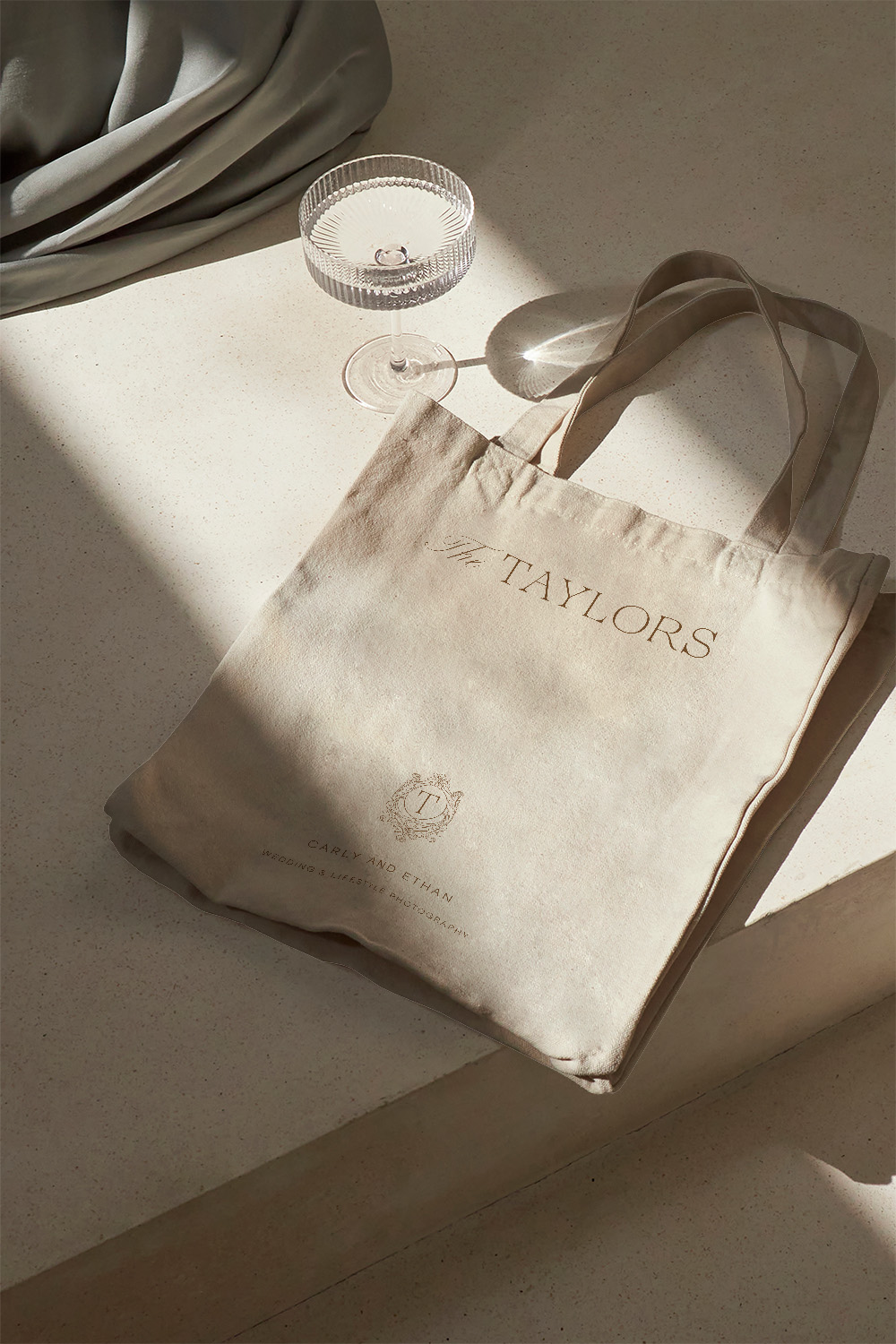
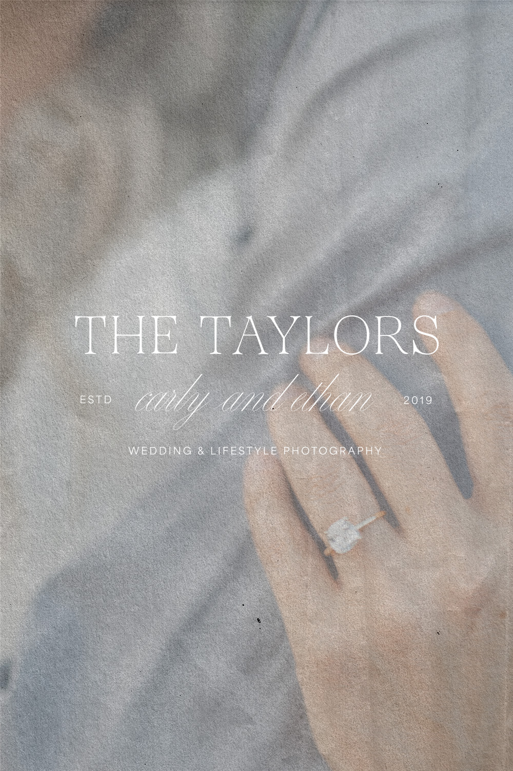
This particular project marries elegance, soulfulness, and romance. The Taylors brand, adorned with a classic serif logotype, graceful script, and artistic details, stands as a true masterpiece inspired by an old-world charm.
Project Overview
Their Beginning
Formerly known as Carly and Ethan, The Taylors started their photography business in college. Ethan’s hobby in photography quickly blossomed into a natural talent, while Carly took charge of the business side, handling marketing, scheduling, and communication. Their venture, initially focused on portraits, organically shifted towards weddings, becoming their primary specialty.
As their roles evolved, The Taylors remained a collaborative team. Today, their partnership extends beyond capturing moments and focuses on curating an experience. The goal behind this project is to create a luxurious and bespoke brand identity that not only mirrors their journey but also enhances the client experience, elevates their fine-art imagery, and embodies their community-centered approach.
Core Values
- The Local Community — The Taylors cherish your North Georgia roots and the strong bonds they have formed within the community. This allows them to provide wedding and portrait photography with a deep connection to the region.
- Curiosity and Playfulness — Their male-female duo approach brings a perfect blend of curiosity and playfulness. This ensures a relaxed and enjoyable experience for both the bride and groom on their special day.
- Authenticity — Timeless, traditional, and classic style captures not only beautiful client moments but also genuine emotions that will stand the test of time.
- An elevated client experience — Both Carly and Ethan are dedicated to providing their clients with a truly luxurious experience. By offering personalized attention, meticulous detail, and exclusive extras from the moment they inquire to their wedding day, each client touch point is thoughtfully curated.
Brand Vision
The Taylors want to be known for exceptional, bespoke, and luxurious wedding and portrait photography. Their passion lies in capturing the timeless and romantic essence of couples, ensuring their most cherished moments are captured with an approachable elegance.
The Problem to Solve
The Taylors offer a diverse range of photography services, making it difficult to present a consistent brand image. This task becomes even more challenging as a duo, especially if this is an important value. To address this, the decision to transition from Carly and Ethan to The Taylors serves as a tangible first step in achieving clarity and cohesion.
Raising prices is a common goal for business owners. For service providers like photographers, it can be particularly challenging. This is where the significance of a polished, professional, and cohesive brand identity comes into play. Through meticulous attention to detail such as a thoughtfully crafted color palette, a professional logo suite, and engaging elements like patterns or illustrations, a photographer can set themselves apart. These consistent brand visuals not only tell a compelling story but also provide the foundation to enhance the client experience and justify an increase in rates.
Elegant and Romantic Brand Identity Design
A Look Into the Creative Process
To establish a successful brand identity, you must first name the ideal client you are speaking to. The Taylors’ ideal client are women, either brides or mothers. They trust their vision and experience as photographers. Either North Georgia locals or couples looking for a destination wedding in the area, these couples enjoy small details and timeless, true-to-color imagery.
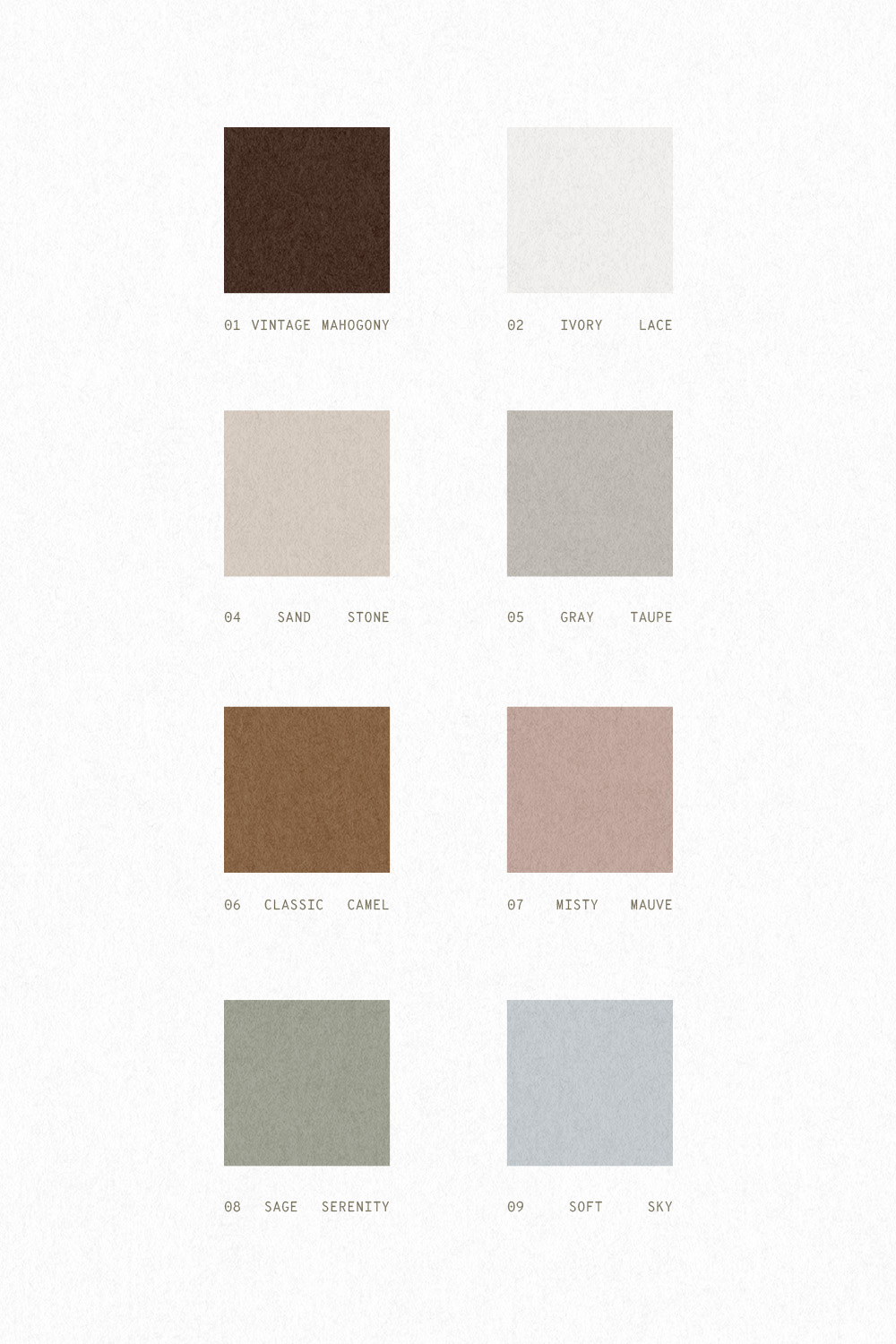
Color Palette
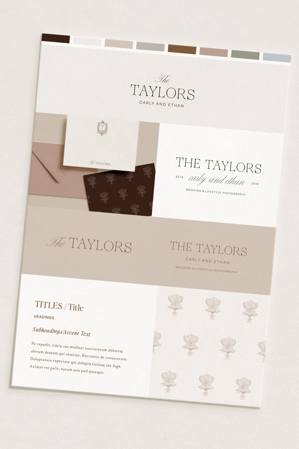
Inspired by the warm tones in figs and autumnal shades, this color palette exudes warmth and elegance. The choice of a deep, velvety brown, in place of stark black, introduces a softness that enhances the brand’s approachability. A muted rose tone adds a touch of compassion, romance, and intimacy, creating a connection with the audience. Incorporating a soft blue not only balances the femininity, but also imparts a sense of cool serenity and trustworthiness. Green, in its subtlety, brings a restful, restorative, and balanced quality to the palette. Pairing these colors with soft neutrals balances the palette overall and offers a high-end feel. Overall, this palette as balanced and timeless.
Typography
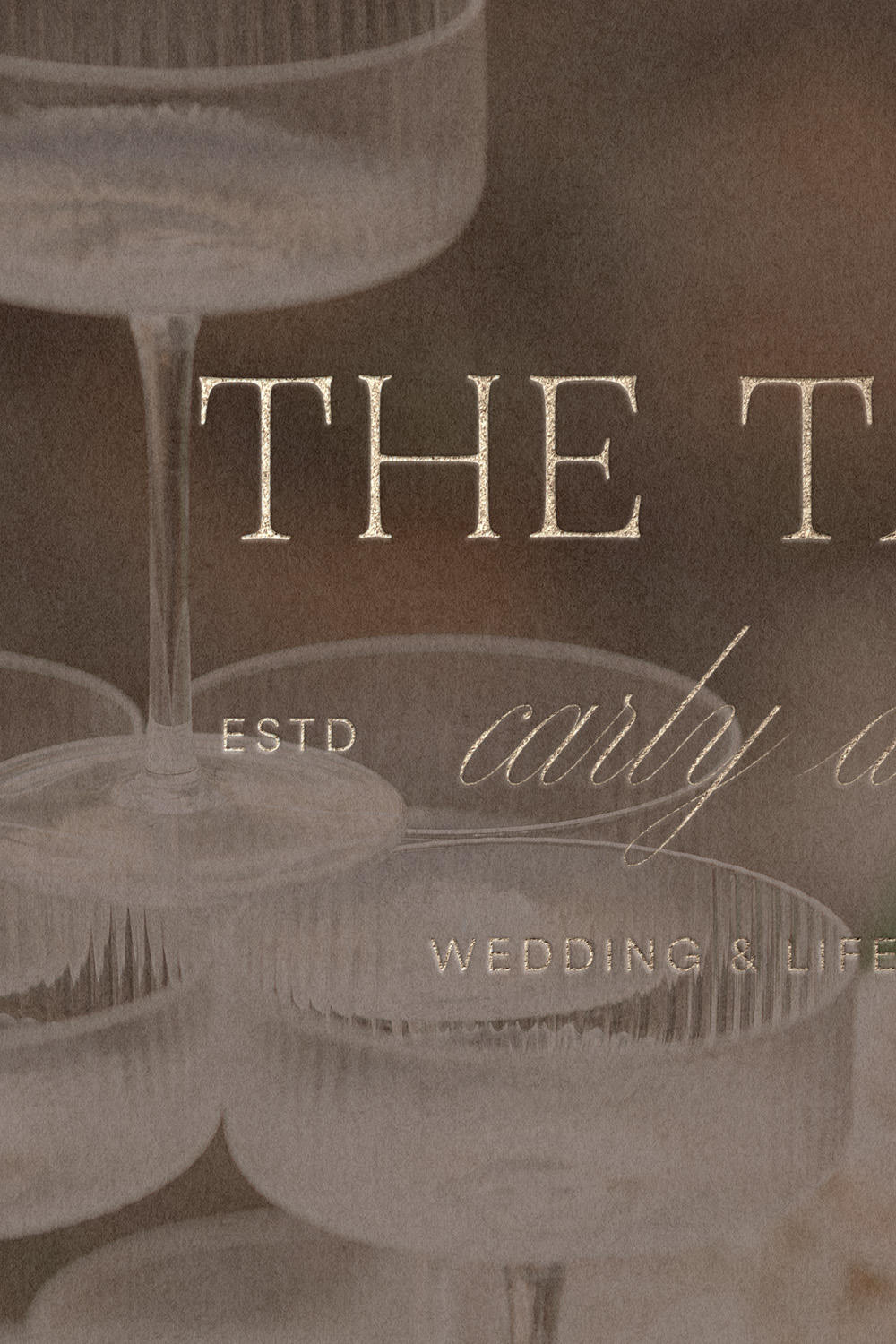
The main logotype utilizes a classic serif with a touch of vintage nostaglia. This is paired with a clean sans serif for taglines and a romantic calligraphic script font for accents. This style can be interpreted as laid-back luxury.

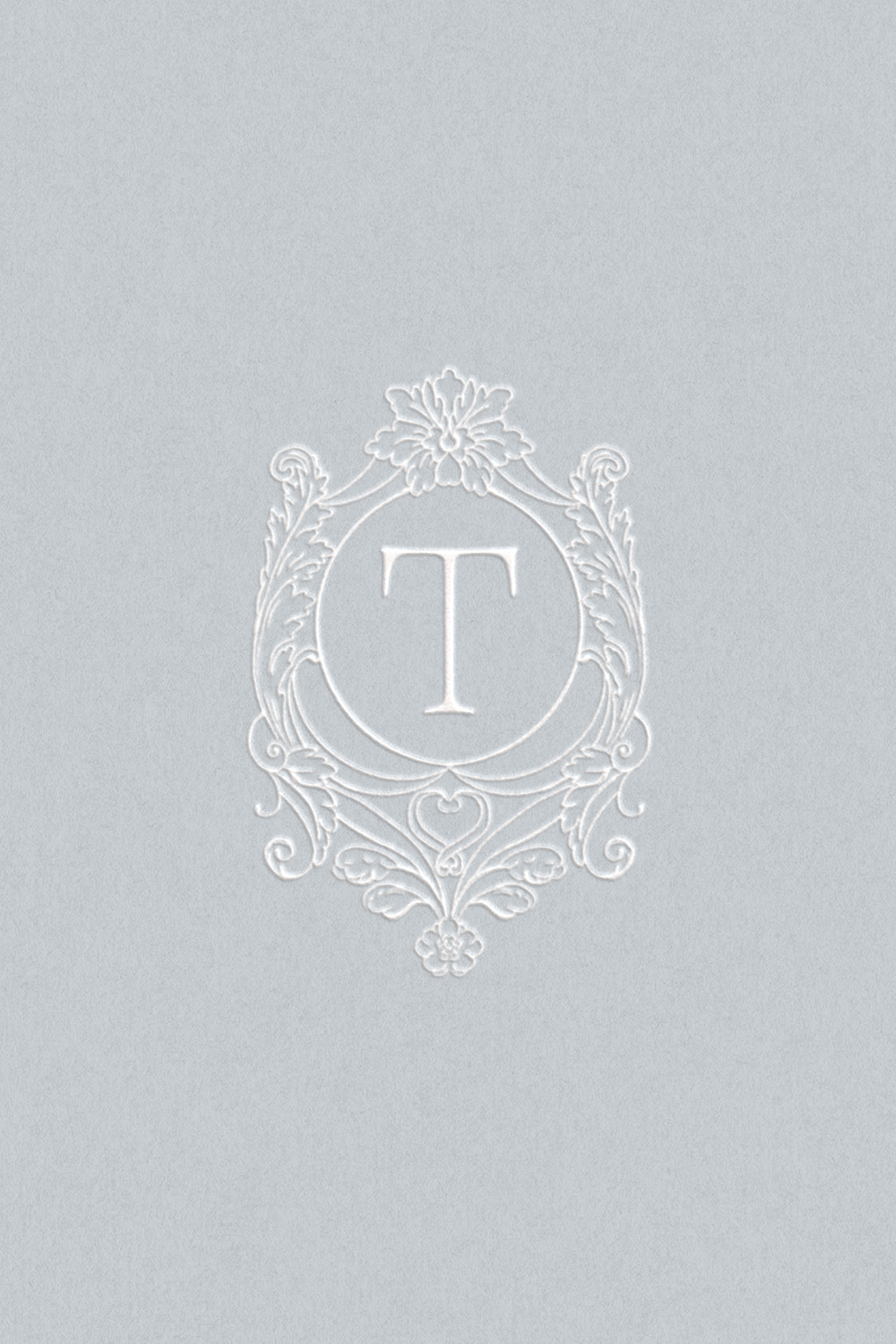
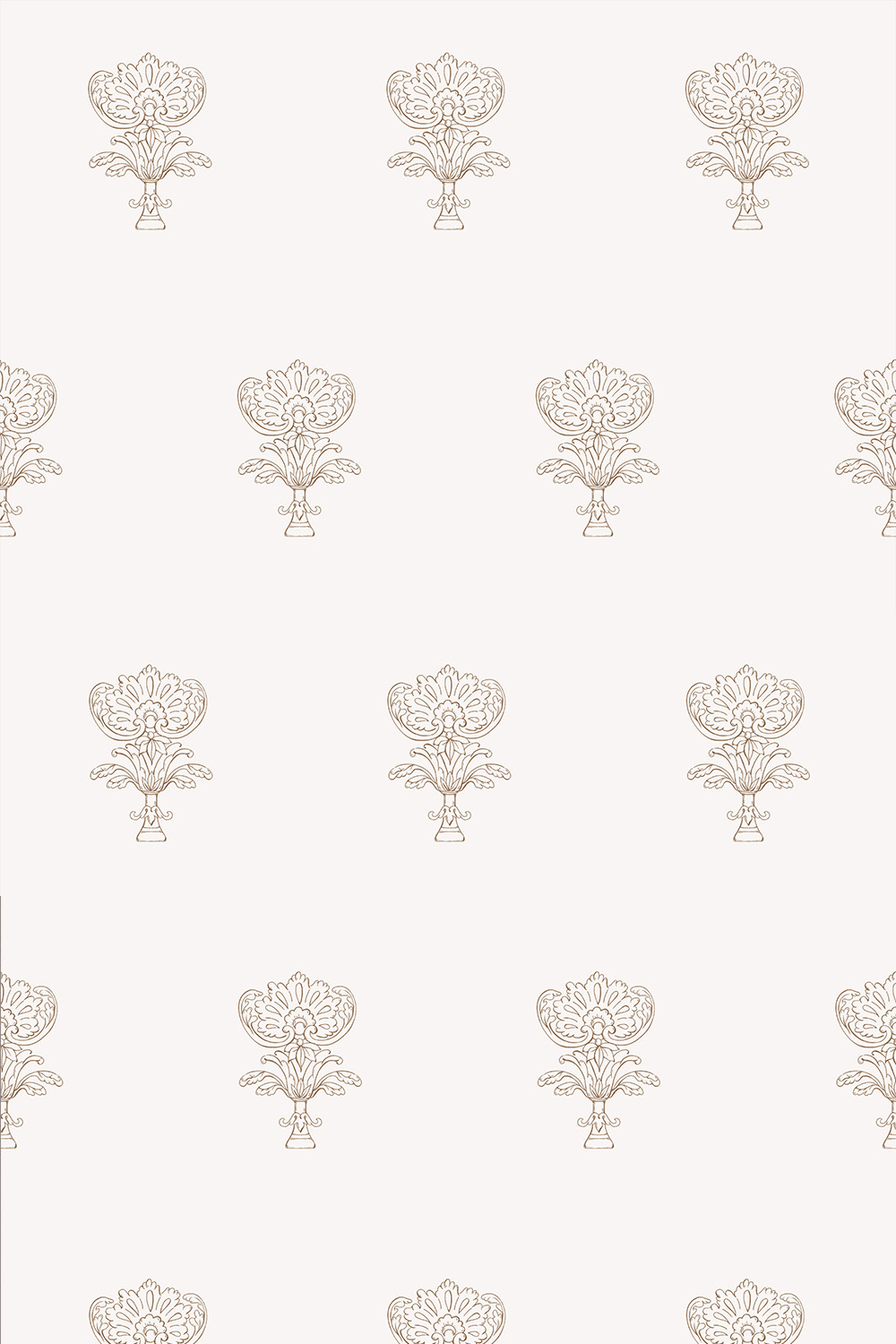
Handdrawn Crest and Illustration
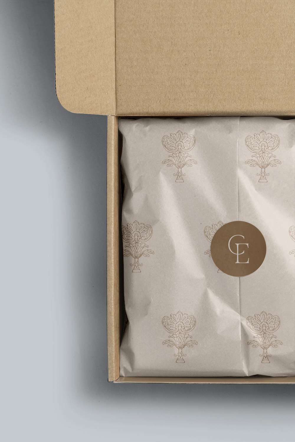
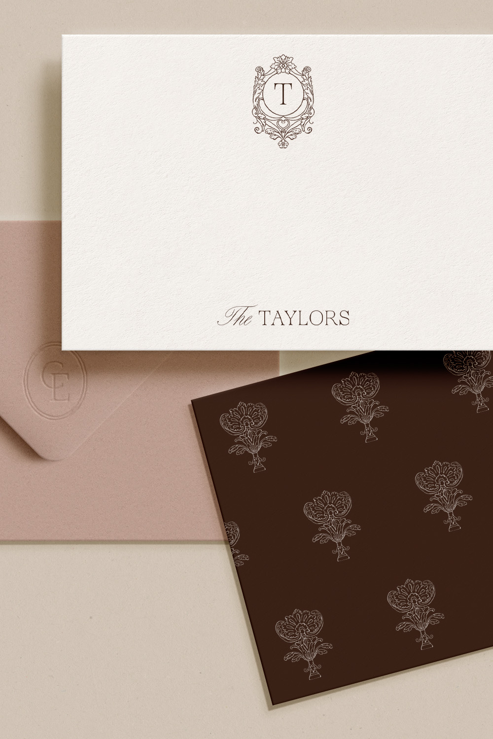
A sure way to distinguish your brand visuals is with custom textural elements such as patterns or illustrations. On our initial strategy call, we chose the additional design elements of a monogram, crest, and illustration. With an elegant, fine-art flair, these design elements offer an elegant approachability.
