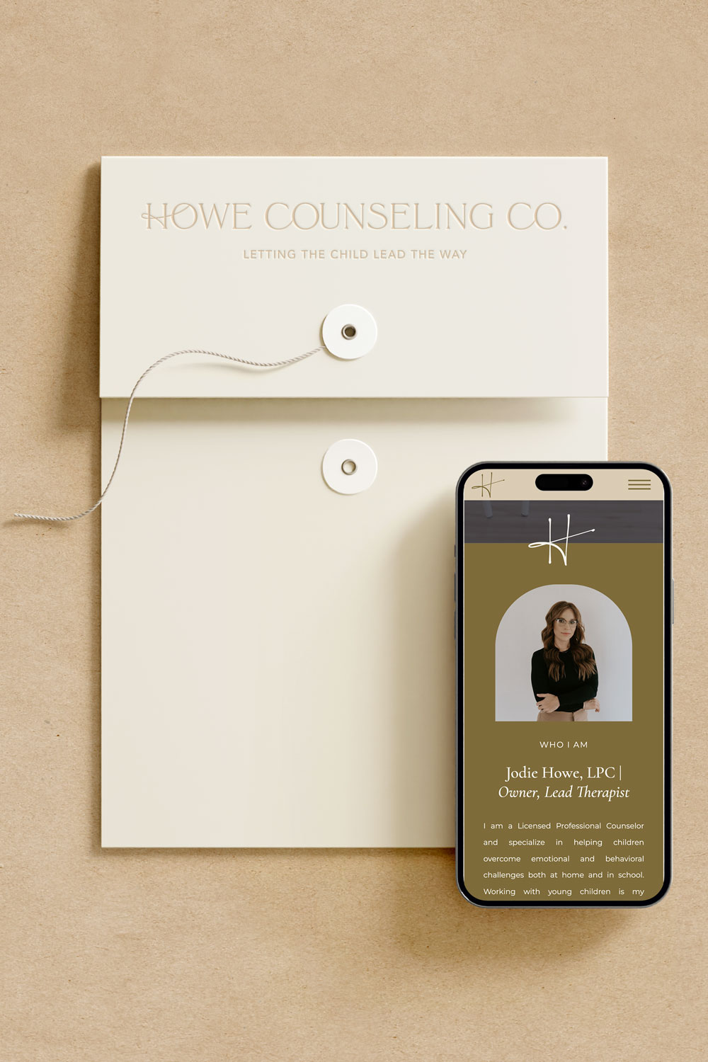
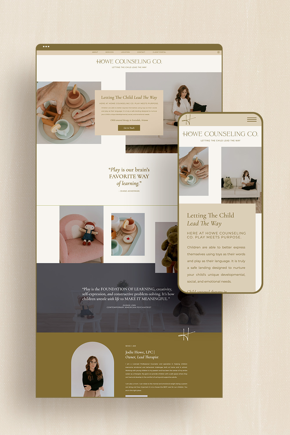
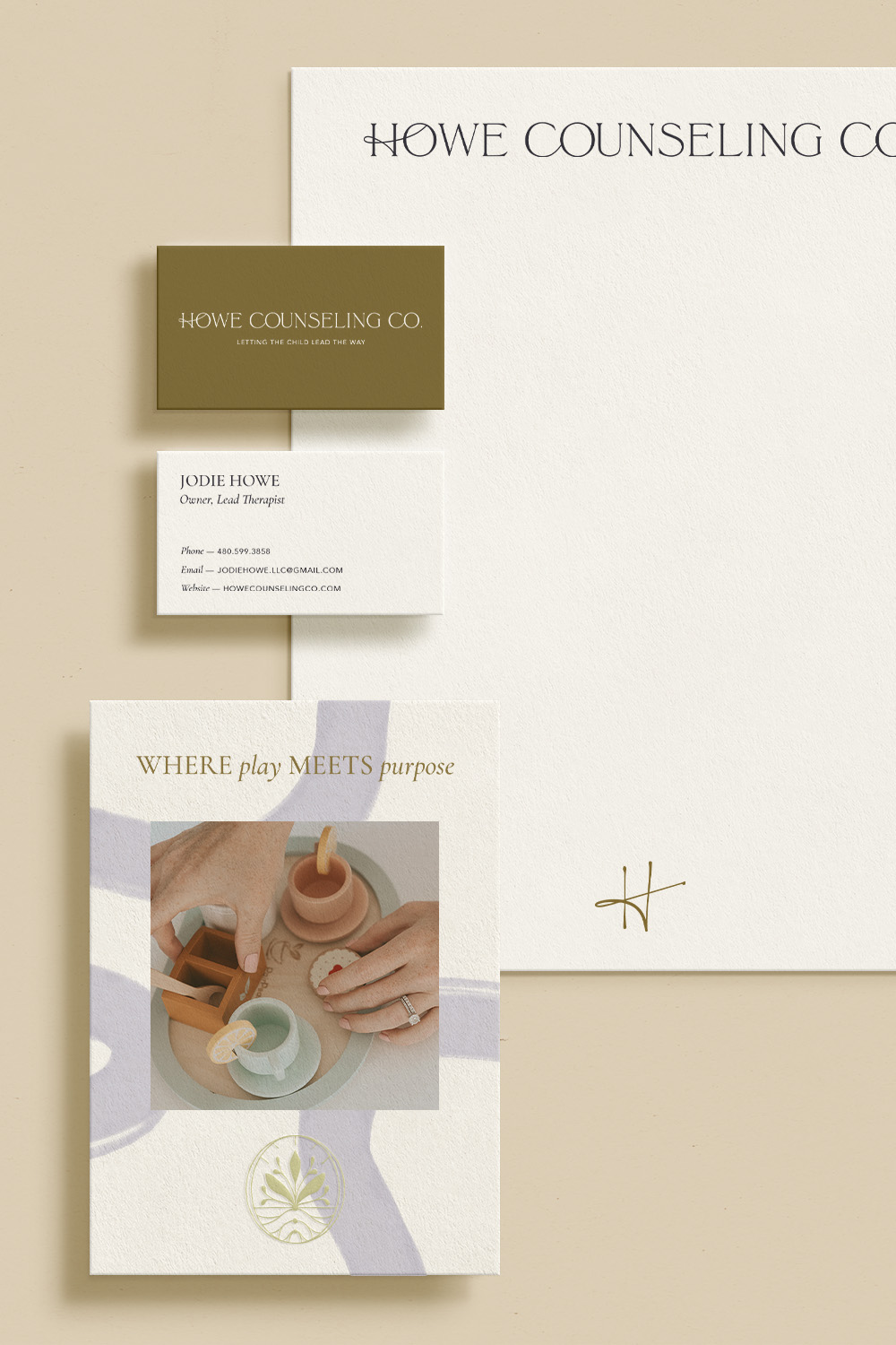
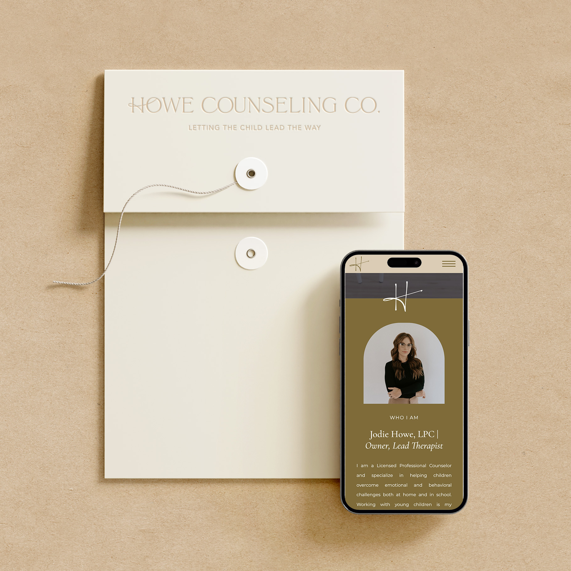
This brand identity design for child therapist, Howe Counseling Co. is sophisticated, warm, and nurturing. Jodie contacted me in need of a professional brand identity and website. She is branding out on her own to start her own therapy practice. So, it was important for her to have a strategic brand ane website to showcase her practice and legitimize her business. Before we get into the brand and website design, let’s take a deeper look at her ideal client.
Ideal Client
One of Jodie’s biggest pain point and goals of her project was to develop a successful brand that speaks to both the child and parents as well. As a child-centered therapist, the kids always come first. However, the parents must trust and value the services provided and the client experience. These are all things I kept in the back of mind while designing her brand.
Howe Counseling Co’s ideal client are Children under the age of 12 and their families. They are located in the Scottsdale, Arizona area. Specifically, the parents are seeking professional support for behavioral concerns at home and in school. Demographically speaking, this ideal client includes upper-class families who work including physicians, lawyers, tech industry pros, real estate agents, etc.
These clients are looking for relationship-first therapy, clarity, play therapy, and time and attention. They want therapy that’s based on a strong and trustworthy relationship first. They believe that building trust with themselves and their children is key to successful therapy. Howe Counseling never makes them feel rushed or pressured. They care about clarity, value, and being apart of the entire process. Jodie’s years of expertise puts them at ease when growing in understanding of what therapeutic services she offers. They are not interested in narrative therapy but play therapy to help better connect with their child’s emotions and perspective. They care about the time and attention provided in each case, which allows Jodie to connect with the entire family through the child. She is not overwhelmed by a large amount of clients, so she has the time to be intentional and detailed.

Neutral, Playful Color Palette
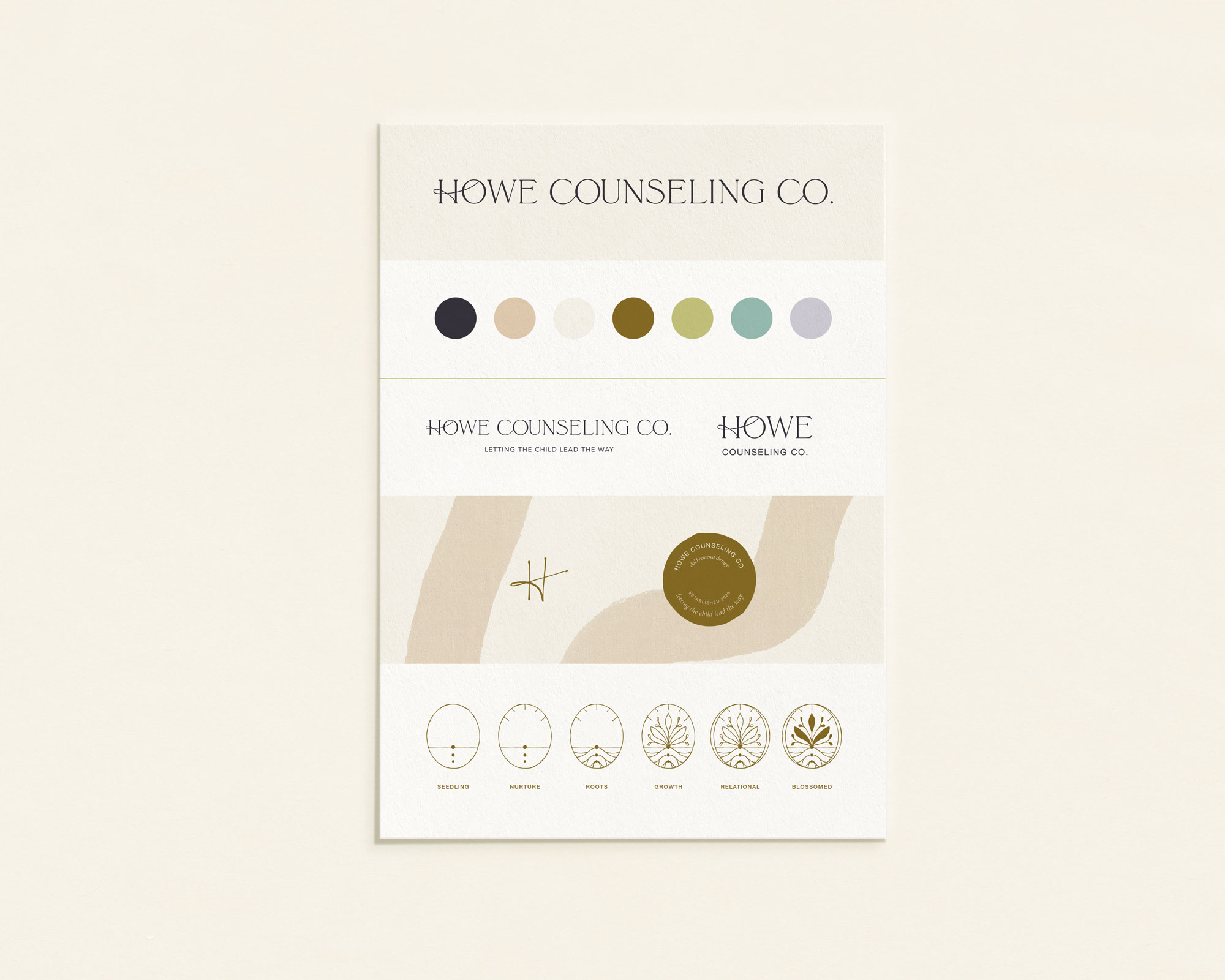
This color palette option is neutral, playful, genuine, and passionate. Green is restorative, balanced, and harmonious. Using a bold mossy green and more youthful colors brings that playfulness to your brand without becoming too childish. Warm neutrals balance the palette well and add depth and variety. This palette is also gender-neutral giving space to connect with all types of clients.

Howe Counseling Co. Brand Board
Growth Conceptual Icon for Child Psychologist Brand Identity
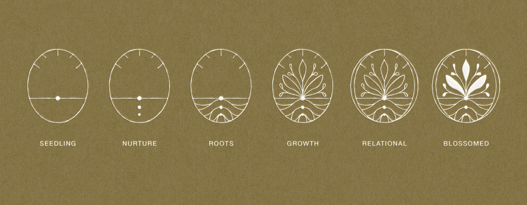
This growth conceptual icon was a large part of the Howe Counseling brand identity. During the strategy phase, Jodie emphasized her desire to convey the blooming and blossoming that occurs when working through child therapy. That true healing occurs during the play therapy process.
It was important to convey this with her brand visual. During the design refinement process, we discussed the idea of a conceptual icon. Something that would represent the different stages of growth experienced through this interactive therapeutic process.
Using symbolism of nature offers a unique perspective and style. Each piece builds on itself and is integral in the growth process.
- A seedling needs to be nurtured to produce roots for the plant to continue to grow.
- As the circle becomes enveloped by another is representative of the parent-child relationship forming deeper to support the child’s growth
- In the end, the plant can truly blossom and grow into a healed and healthy child.
Brand Identity Design for Child Therapist Howe Counseling
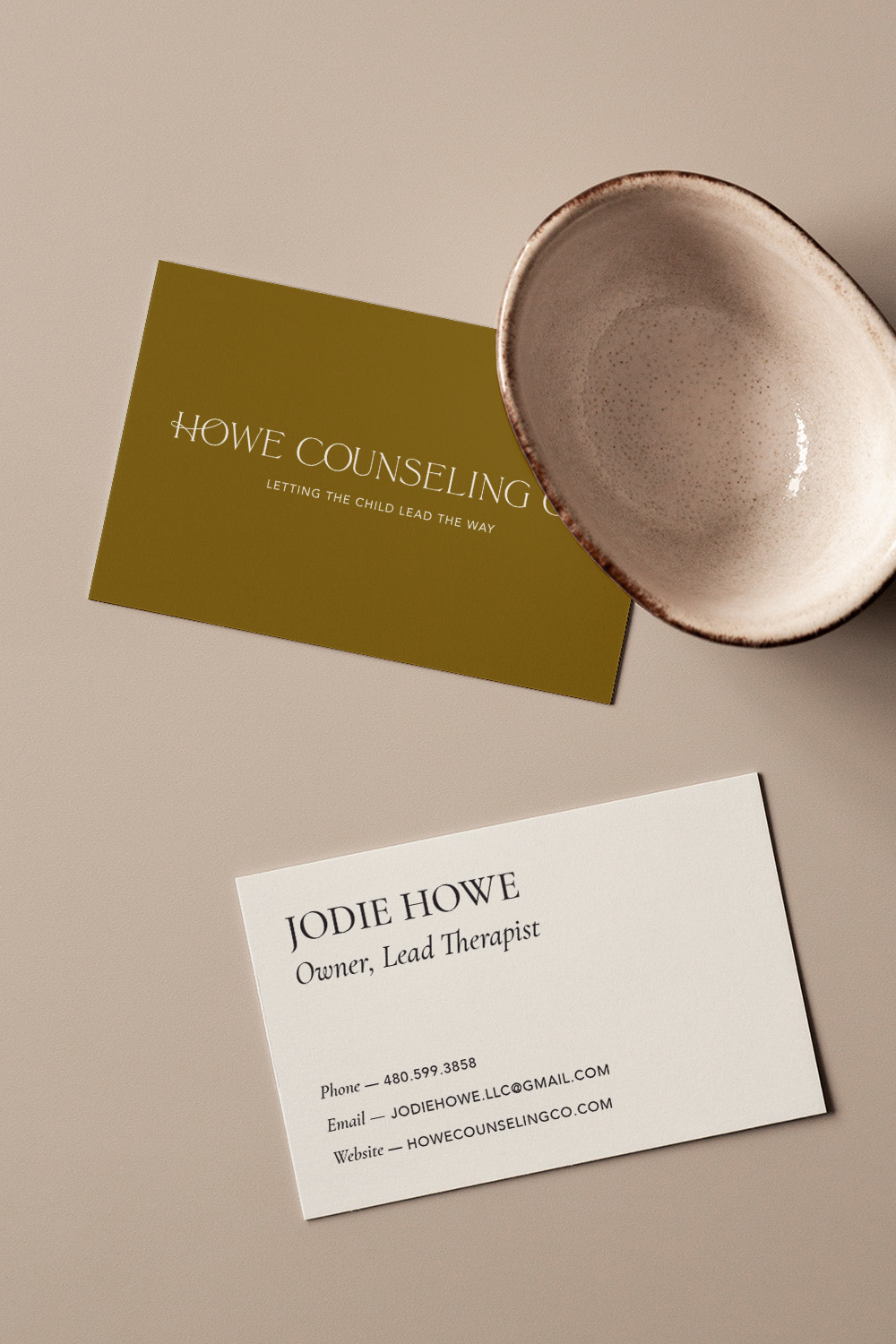
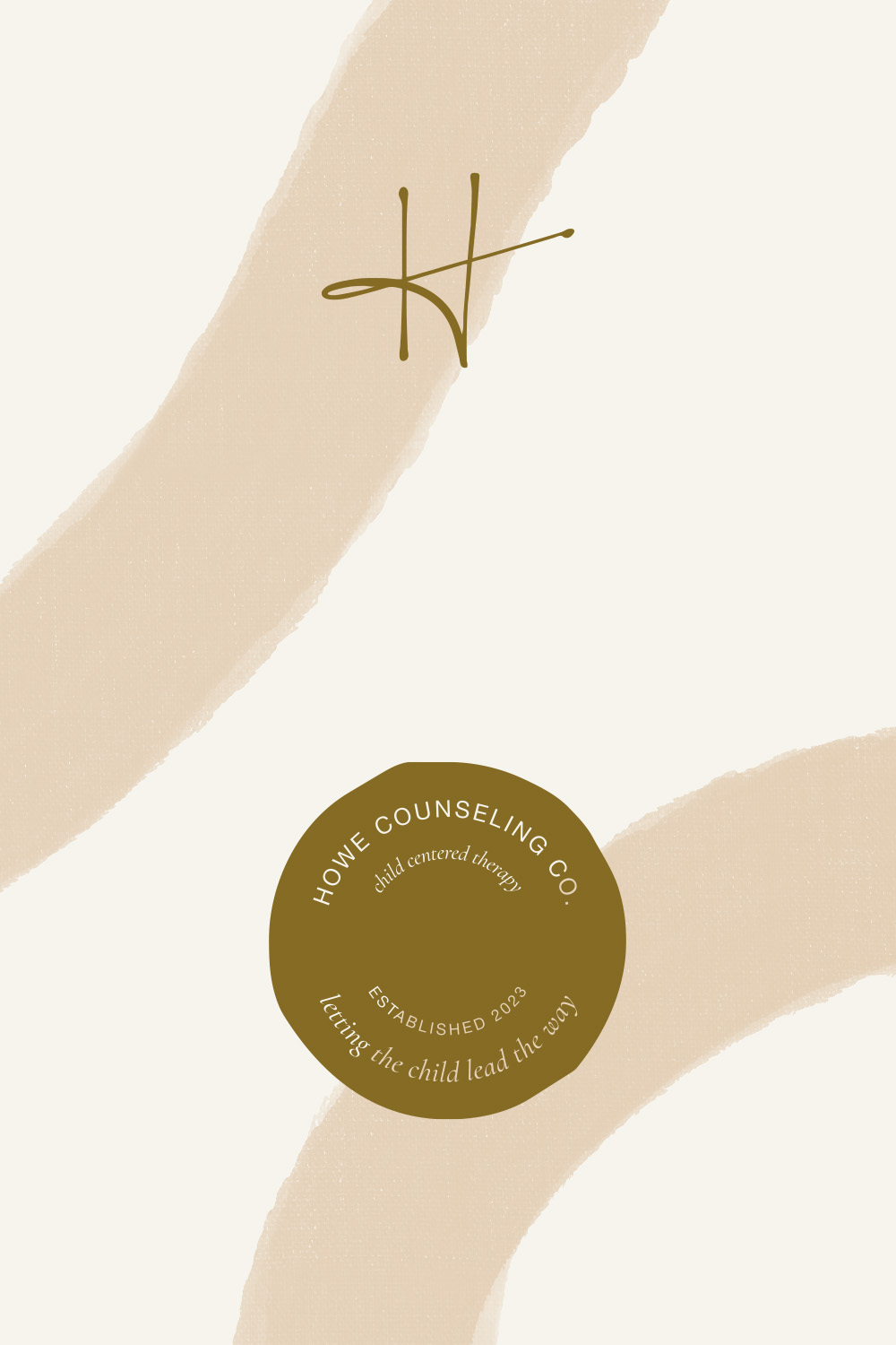
For the main logotype, I customized a classic serif typeface by adding movement and connecting letterforms to bring playfulness to your logo while remaining sophisticated to speak to upper-class parents. Adding a signature style to the logo adds a playful nature to the logo similar to sketches and marks made by children, but remaining high-end.

