Known for her luminous, romantic imagery, Lucy Munoz is an industry-leading photographer and educator. This brand and Showit Website is elegant, and luxurious, and portrays her fine art editorial imagery. Before we jump into the brand and Showit website, let’s take a look at the process and the why behind this project.
About the Process
Lucy was my very first Brand Nurture Week client. When I first launched this service, I designed your brand and website in one short week. After going through a beta testing period, I decided to break this process up a bit.
It felt a tad rushed and I never want my clients to feel overwhelmed or stressed. Now I offer a brand nurture week where I design your brand from scratch in one week and a website in a week where I customize your Showit or Squarespace template in one week. Breaking it out into separate weeks allows for more breathing room in the process.
Let’s dive deeper Lucy’s brand and Showit Website
The Why Behind Brand & Showit Website for Photographer Lucy Munoz
Before we get into the visuals of this brand and Showit website, it’s important to discuss the meaning behind the brand.
With a vision to inspire new ideas with a fresh artistic approach, Lucy provides high-end luxury wedding, editorial, and campaign photography. Having years of experience in the photography industry, she has established herself as an expert industry leader.
She has been featured in many publications and is known for her luxurious destination and California weddings. Her work is
Lucy’s core values include:
- Expert Industry Leadership — Having years of experience in photography and education, she is uniquely qualified to offer a high-end photography experience. She ensures a level of artistry that your customers value.
- Excellent Customer Service — She is committed to providing excellent customer service by offering a seamless, professional experience. She ensures a level of expertise and knowledge that her customers value and trust.
- Romantic Artistic Imagery — Lucy’s work provides art rather than just photography. People feel connected to the editorial, luminous light, and romantic style and align with her artistic approach. Her work can be described as fresh and relevant.
- Growing Business — Lucy has specific and actionable goals to grow the educational and product side of her business. She seeks to provide international workshops and outsource administrative needs in her business.
Establishing Lucy’s core values, brand vision, and personality allows us to build a brand that she and her ideal clients resonate with.
In addition to being an expert photographer, Lucy is an educator. She hosts many workshops and provides mentorships for aspiring photographers. Because of her place in the industry, one main goal was to design a more professional, trustworthy brand identity.
For photographers, it is very important that your brand visuals and website experience positively support your imagery.
The Problem
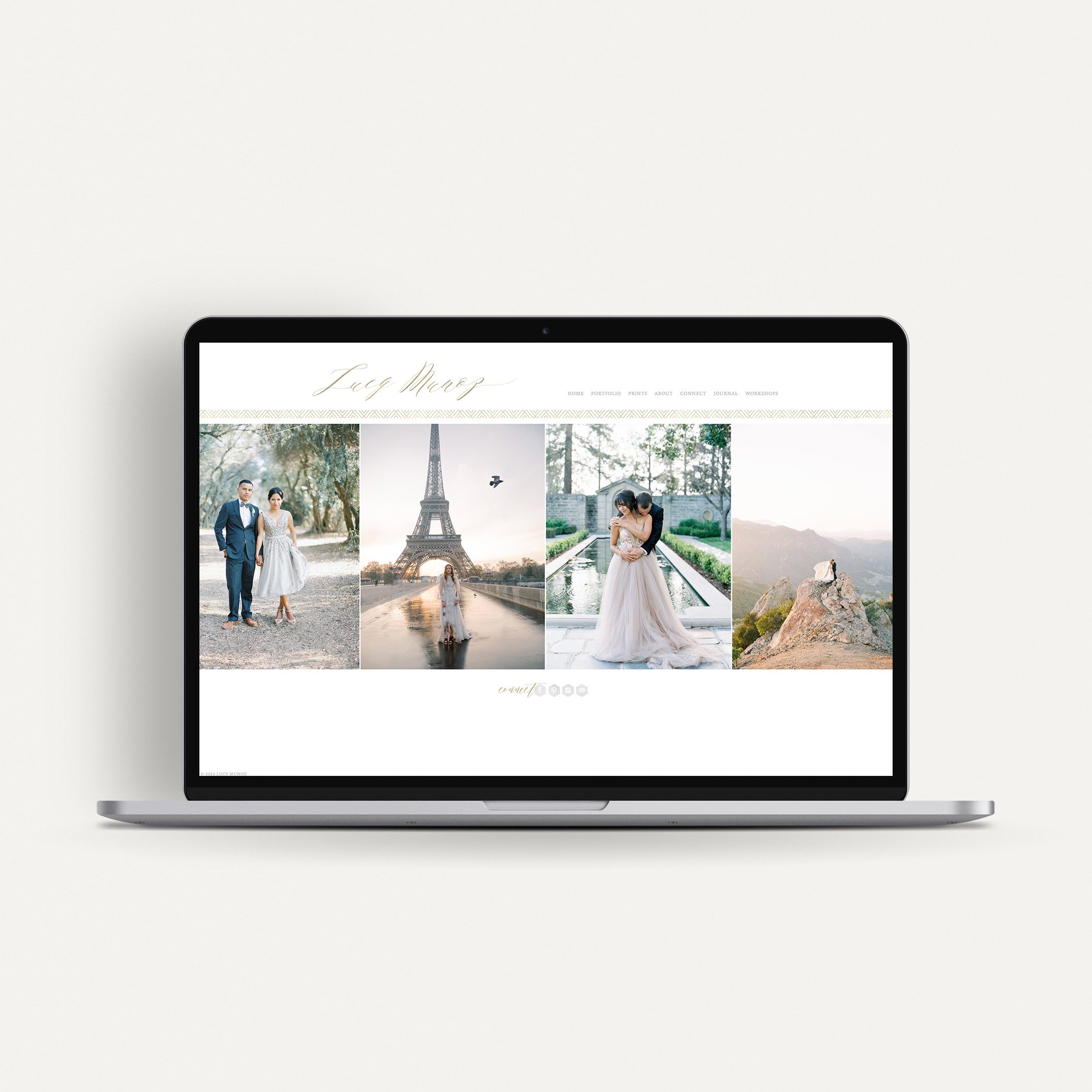
Because Lucy has been in business for so long, her logo and website were outdated. Her initial branding did not support her fine-art editorial imagery. Her brand visuals consisted of a trendy juvenile script font and graphic gold foil texture. As Lucy continued to grow and perfect her craft, her brand visuals remained stagnant. This resulted in a disconnect between her brand and photography.
Lucy’s website was built on WordPress and had not been updated in years. She experienced difficulty with the platform and became overwhelmed updating her website herself. Additionally, her website included hardly any written content. A lack of well-written copy results in a poor SEO ranking, making it difficult for potential clients to find you.
BEFORE

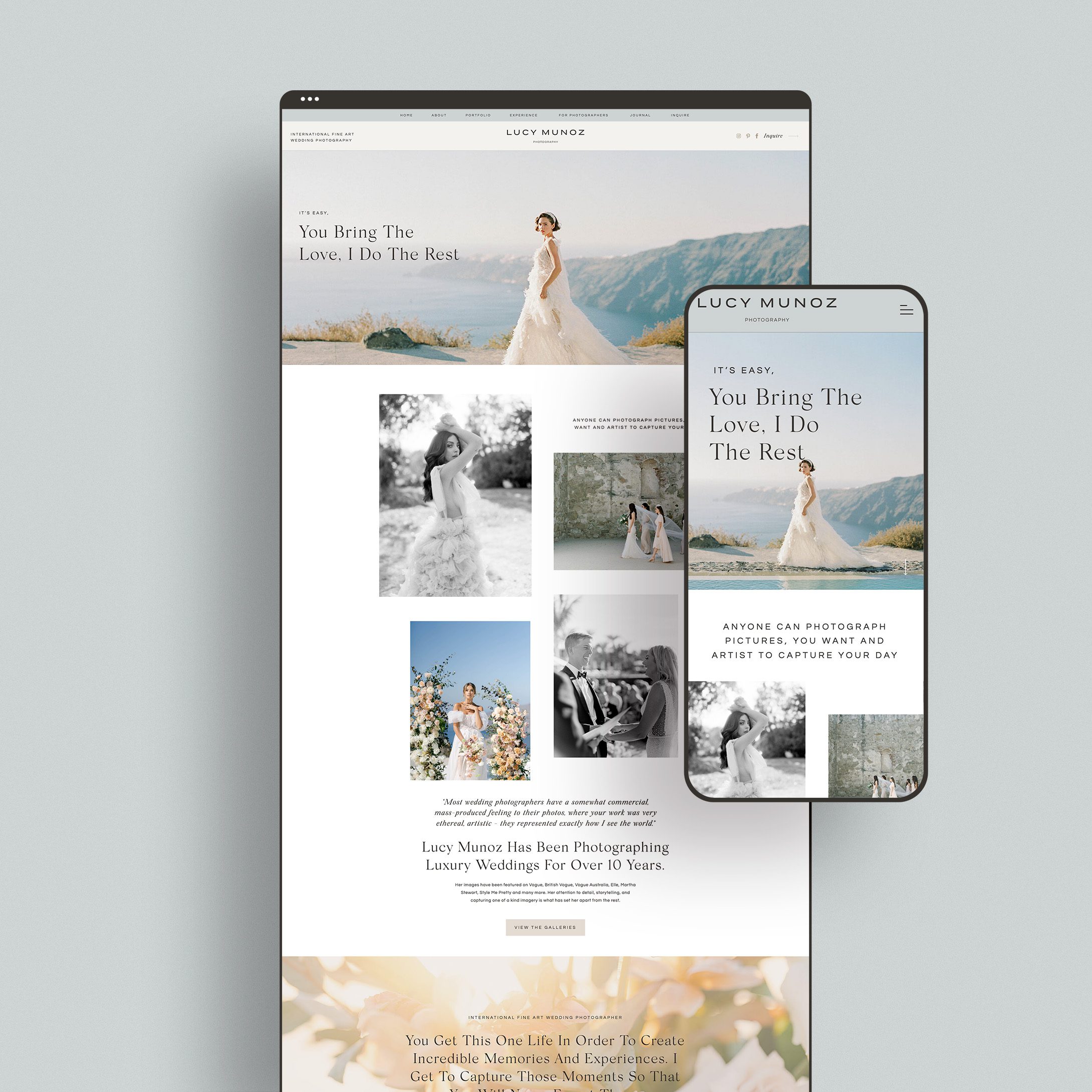
AFTER
The Solution
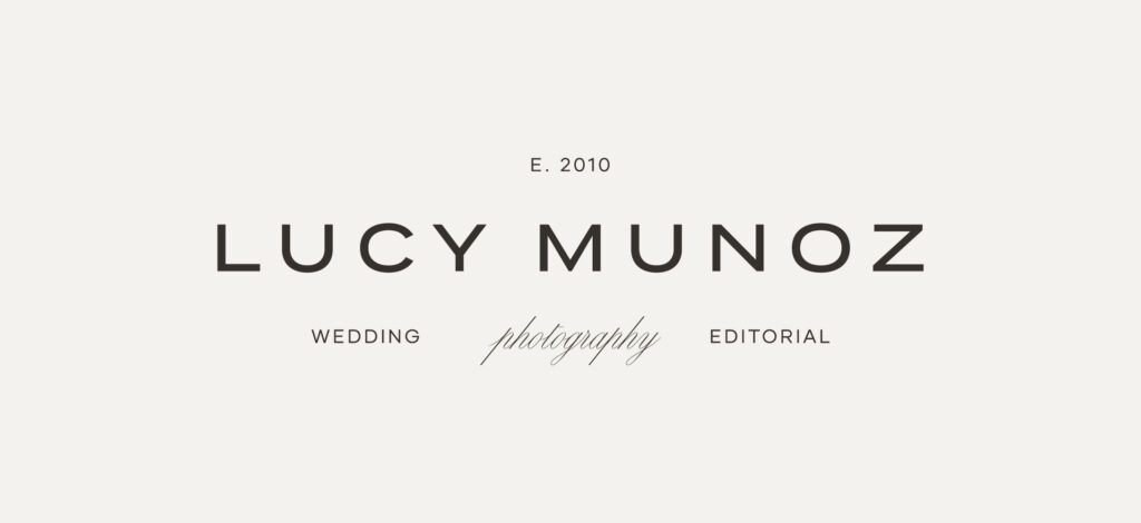
As we began the discovery phase, the strategy for her brand and Showit website became clear. The goal of her project was to develop a brand identity and website experience that lived up to her imagery. Selecting a clean and modern font for the primary logo brings sophisticated luxury to this visual brand identity. Establishing timeless design gives room for Lucy’s brand to stand the test of time.
As mentioned, Lucy’s previous website had little to no written verbiage other than her blog. Incorporating more messaging behind her brand and optimizing her website with SEO-rich keywords brings more clients and customers to her website.
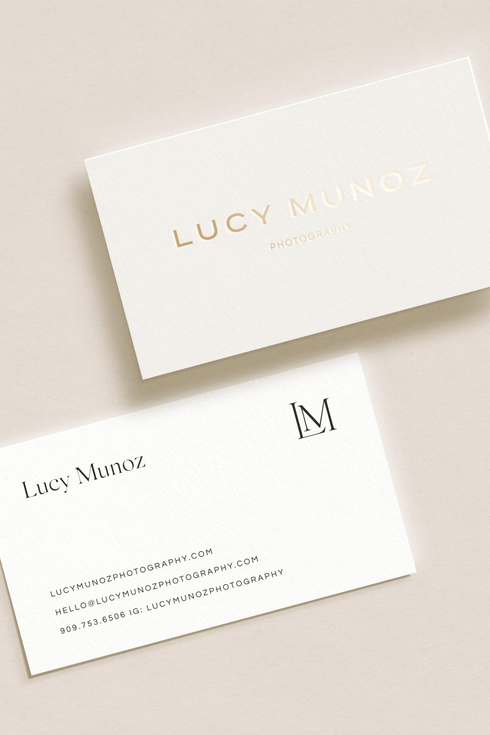
A Breakdown of Lucy’s Logo Suite

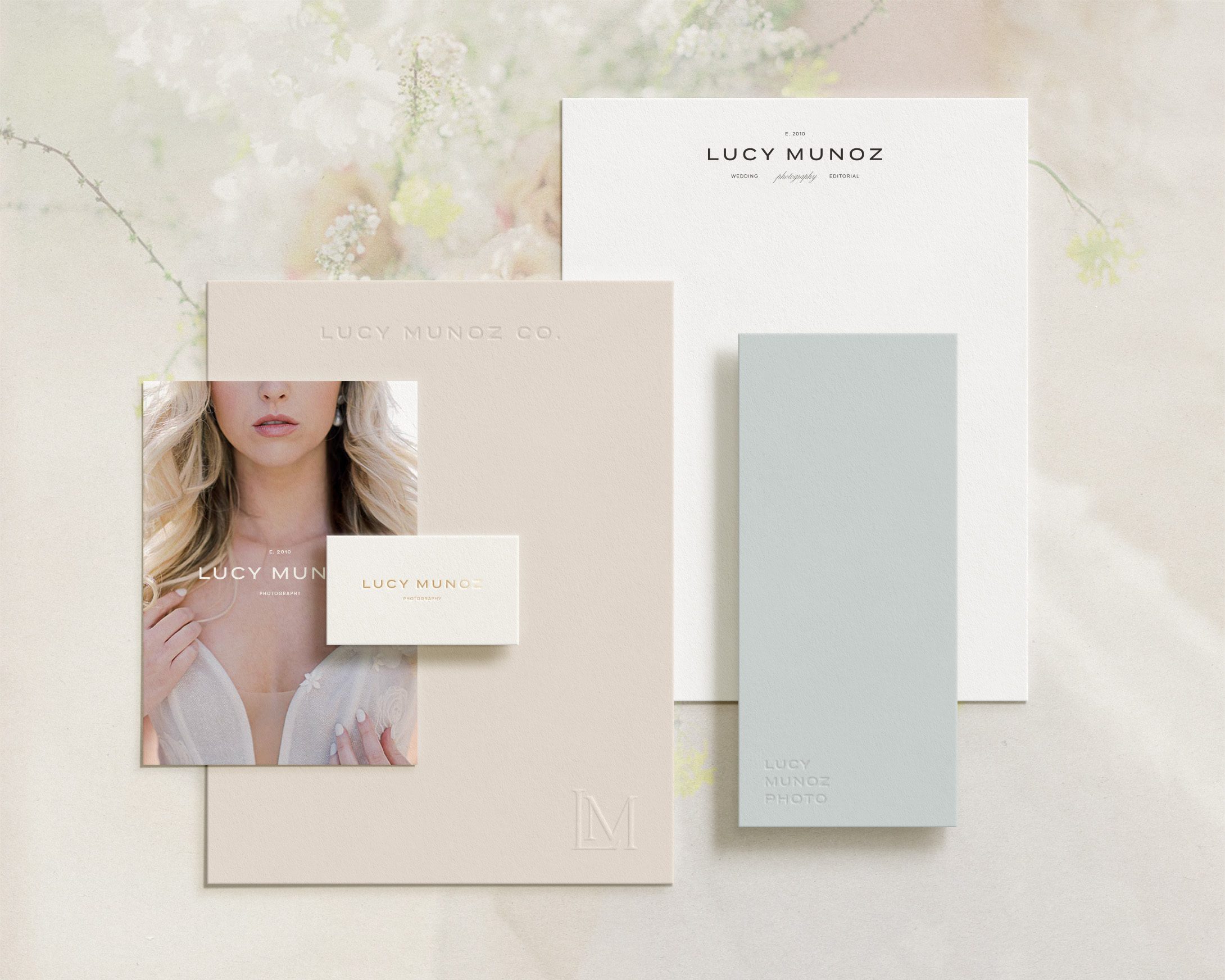
Incorporating negative space into the logo design represents a refined, fresh look. This direction is timeless and trustworthy. The goal of this brand is to feel approachable and elevated, an identity that helps support future business growth.
The primary logo conveys the classic editorial aspect of Lucy’s brand. A modern, chic sans serif is sophisticated and timeless. This direction supports her work well by allowing her photography to stay at the forefront of your brand while remaining industry-leading and professional.
Pairing the primary logotype with a timeless elegant calligraphic script font brings a level of approachability to the brand. Additionally, this element gives homage to the original logo in a way. It’s always important to reflect on how we grow as business owners.
Color Palette
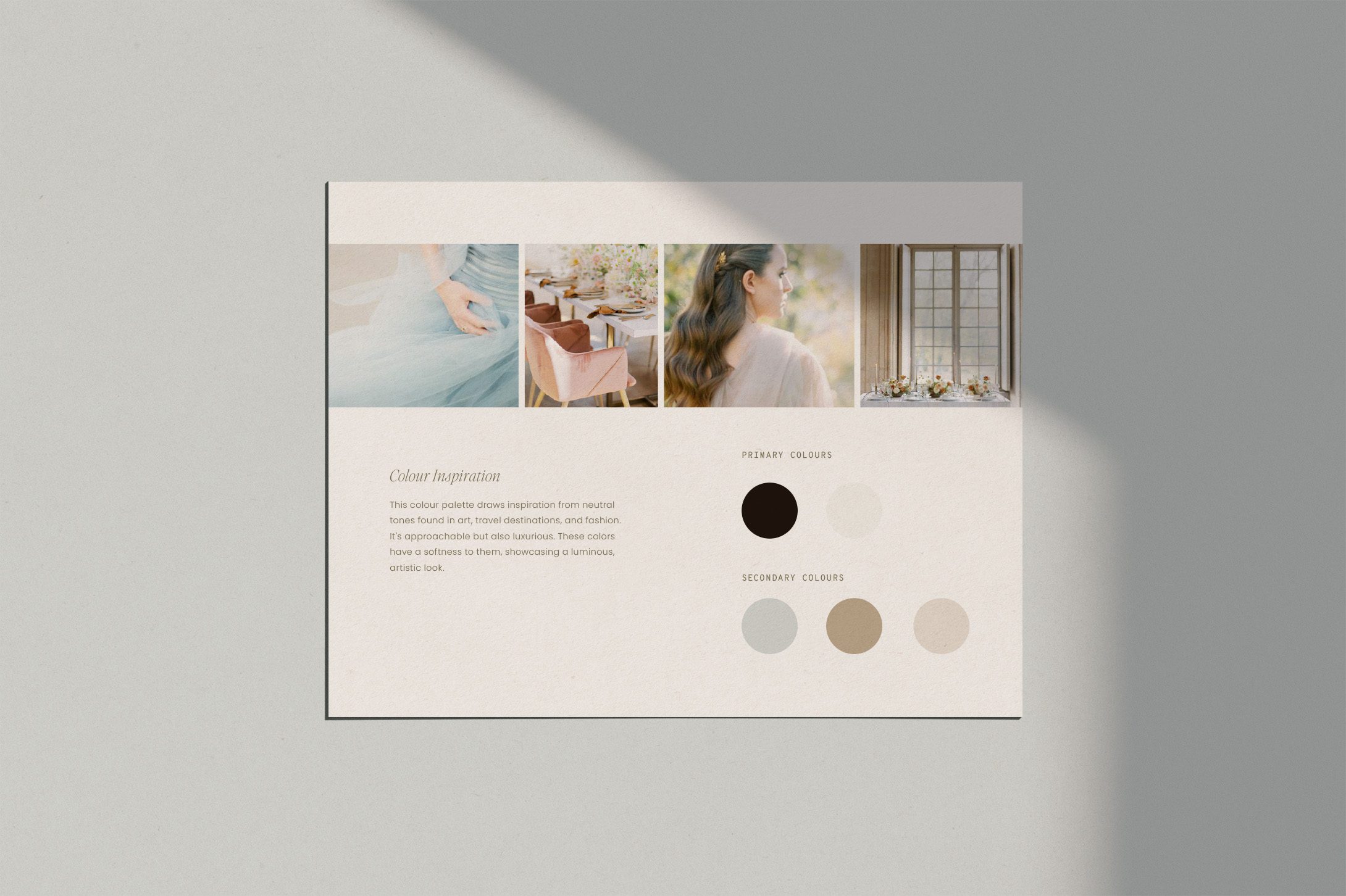
Color plays an important role in a successful brand identity. This color palette draws inspiration from neutral tones found in art, travel destinations, and fashion. It’s approachable but also luxurious. These colors have a softness to them, showcasing a luminous, artistic look.
Lucy’s Website Transformation on the Showit Platform

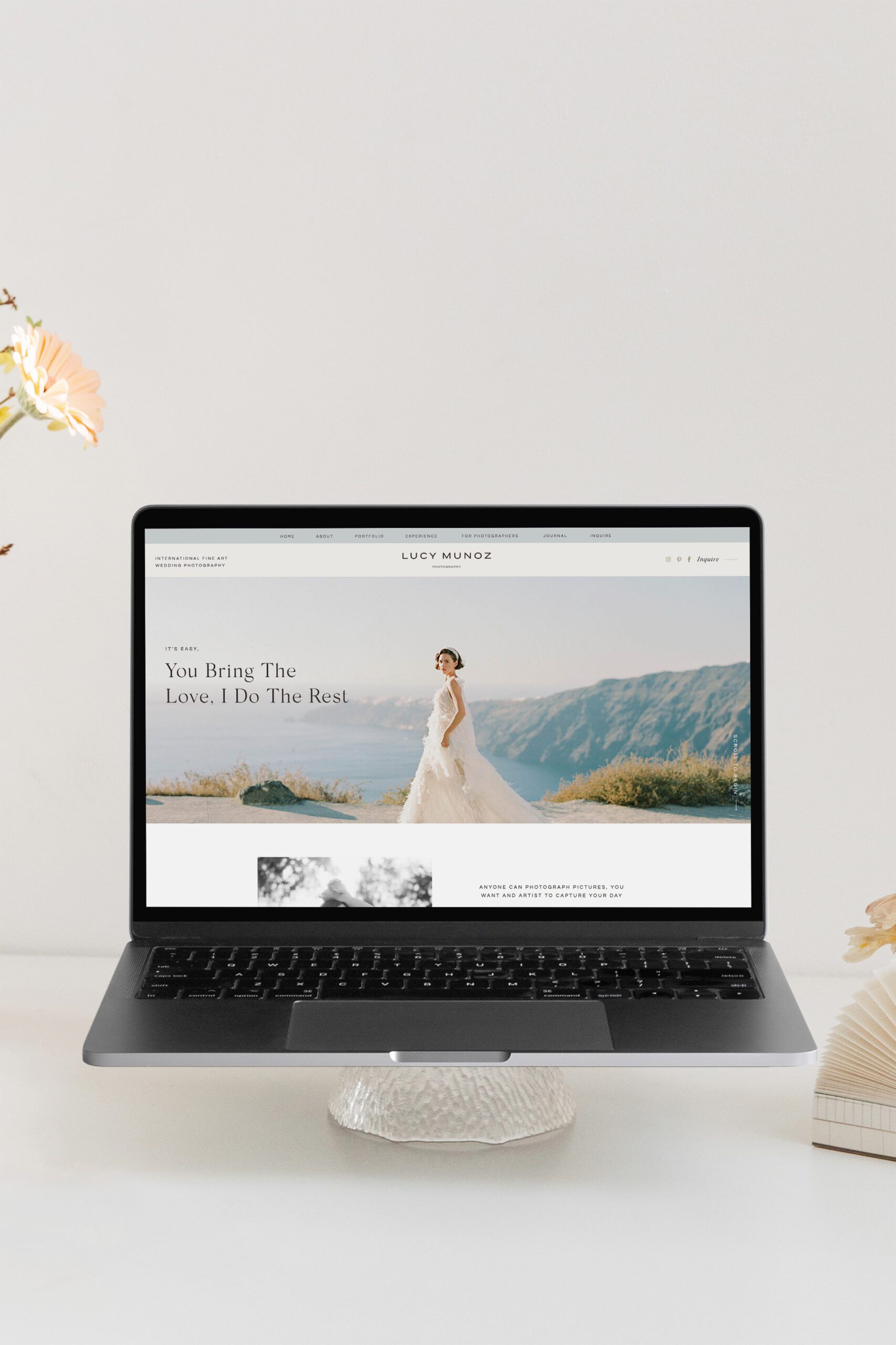
For Lucy’s Showit website, I customized the Clover Club Tonic template. Starting with a Showit website template for website in a week helps the process timeline. Beginning with existing page layouts gives a jumpstart to the website design. Additionally, if you don’t have a budget to hire a copywriter, you can use the template as a fill-in-the-blank exercise to help jumpstart writing your website copy.
To start the customization process, I begin adding in all brand fonts, colors, and asset files such as logos, patterns, illustrations, and textures. Next, I started swapping out all of the demo content for Lucy’s written verbiage and imagery.
By the end of the process, Lucy received a beautiful transformative website that includes all the features to help her business grow and continue to book dream clients.
She is able to market and sell her courses and mentorship programs, show off her beautiful work, and form deeper connections all in one place!
Tonic Site Shop has a collection of beautiful user-friendly Showit templates. Use the code, lovendear to receive 15% off all Tonic templates!
Additionally, I am re-launching my Showit template shoppe later this summer. Subscribe to the newsletter to be the first to know about the new products and receive special offers and pricing.
Thrivecart Integration
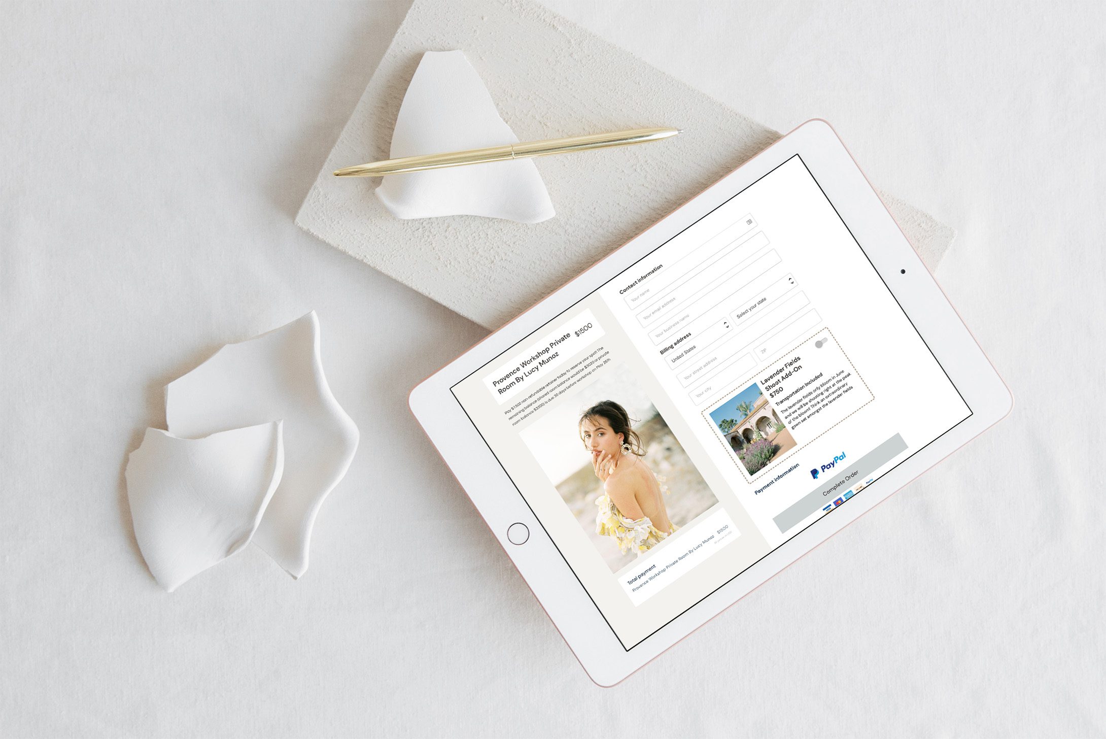
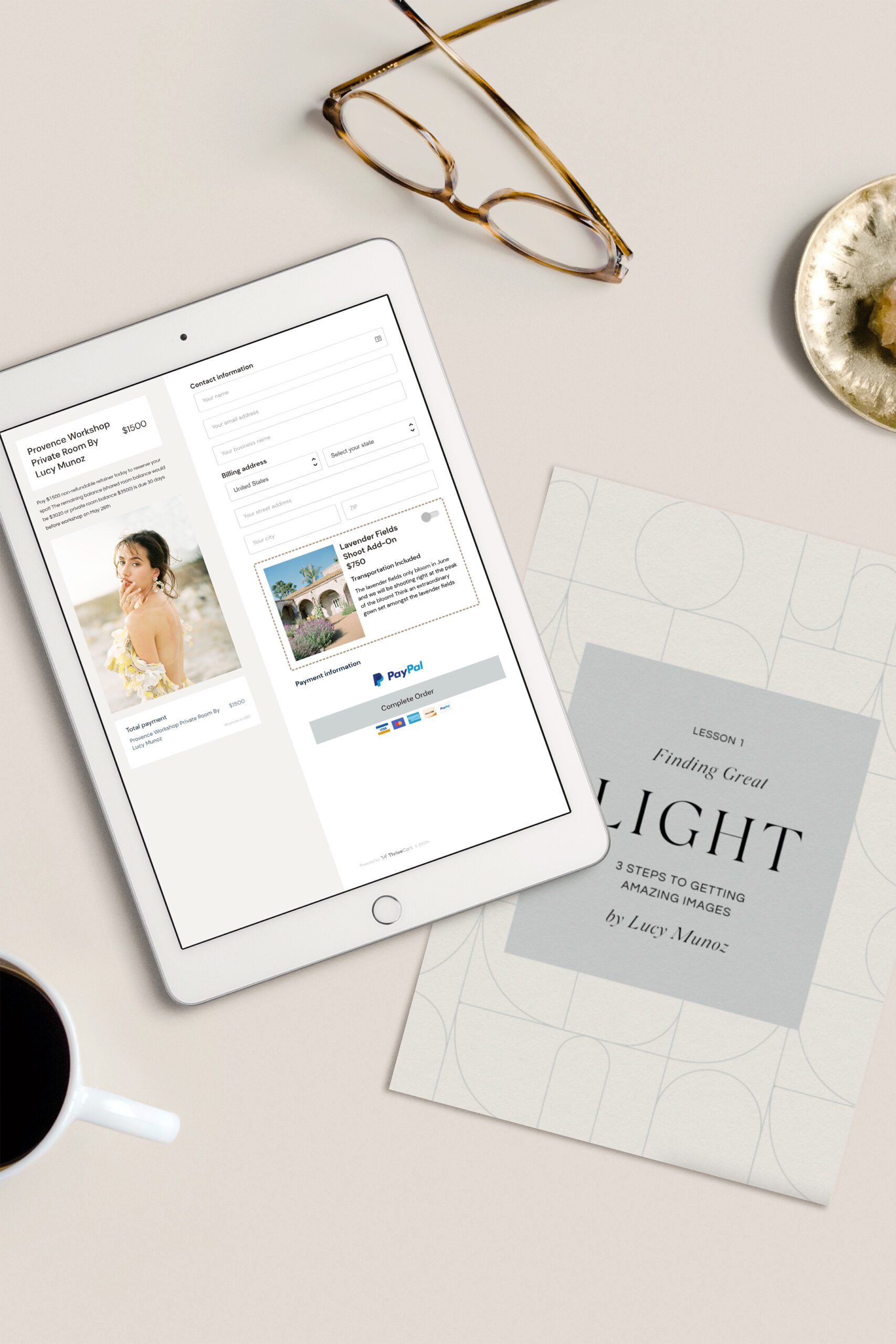
As mentioned, Lucy is also an educator and mentor. Previously, she did not have a good platform for selling courses or programs. Showit does not have shop capabilities built into the platform. However, there are many options for selling online products that integrate seamlessly with Showit.
Because education is such an important part of Lucy’s business model, part of her project included setting up a Thrivecart account for her to sell her products.
Looking to bring in some passive income? Sign up for Thrivecart to sell prints, guides, templates, or prints on your website!
Final Results of the Brand & Showit Website for Photographer Lucy Munoz

