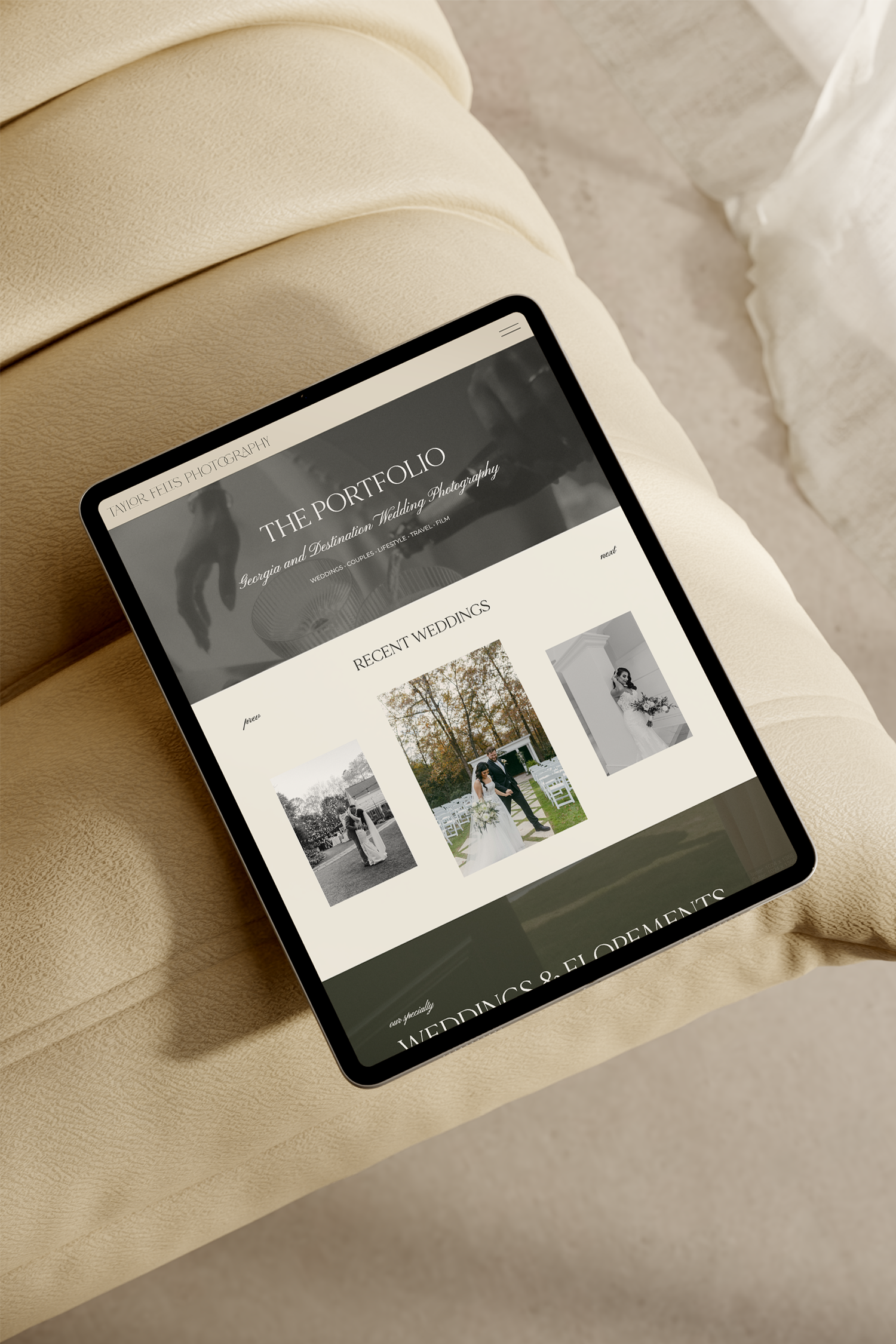
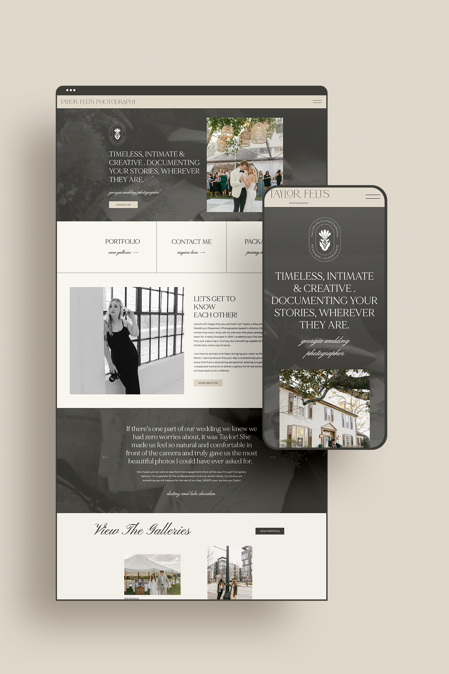
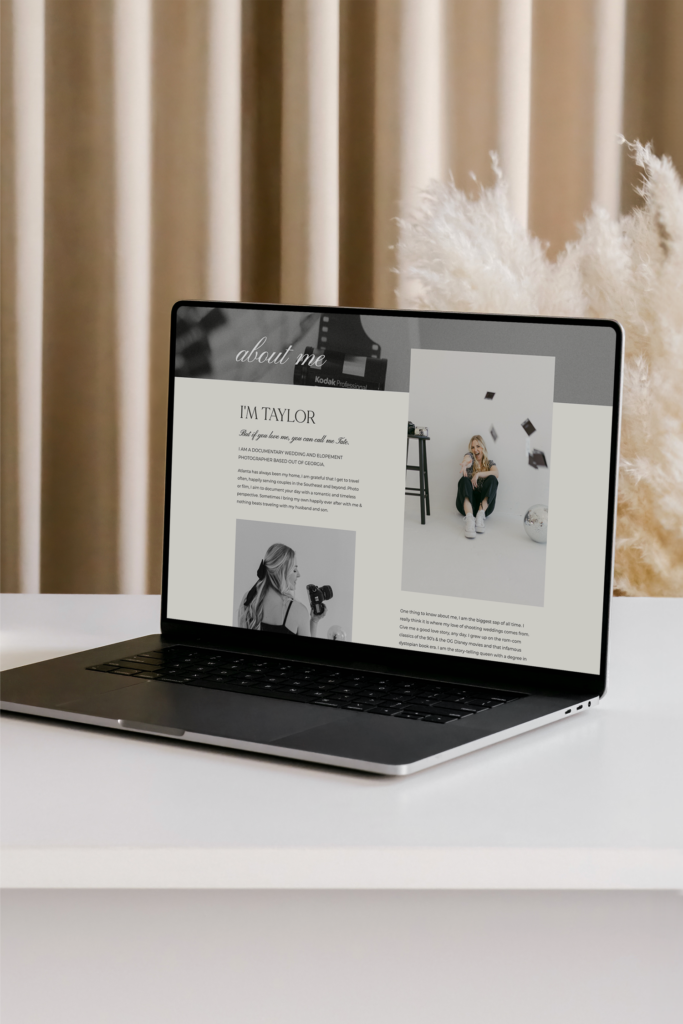
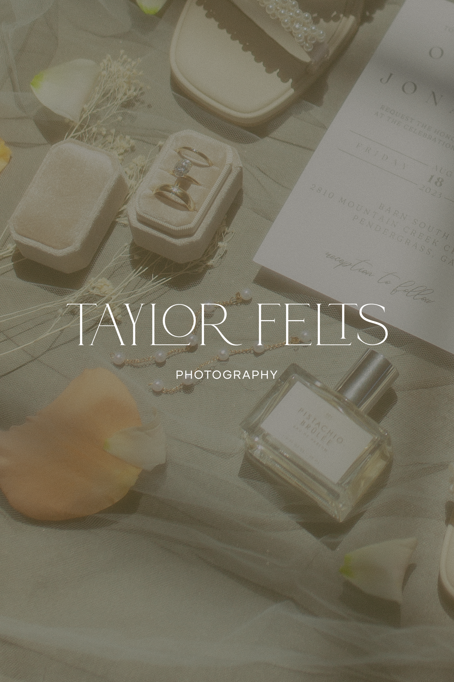
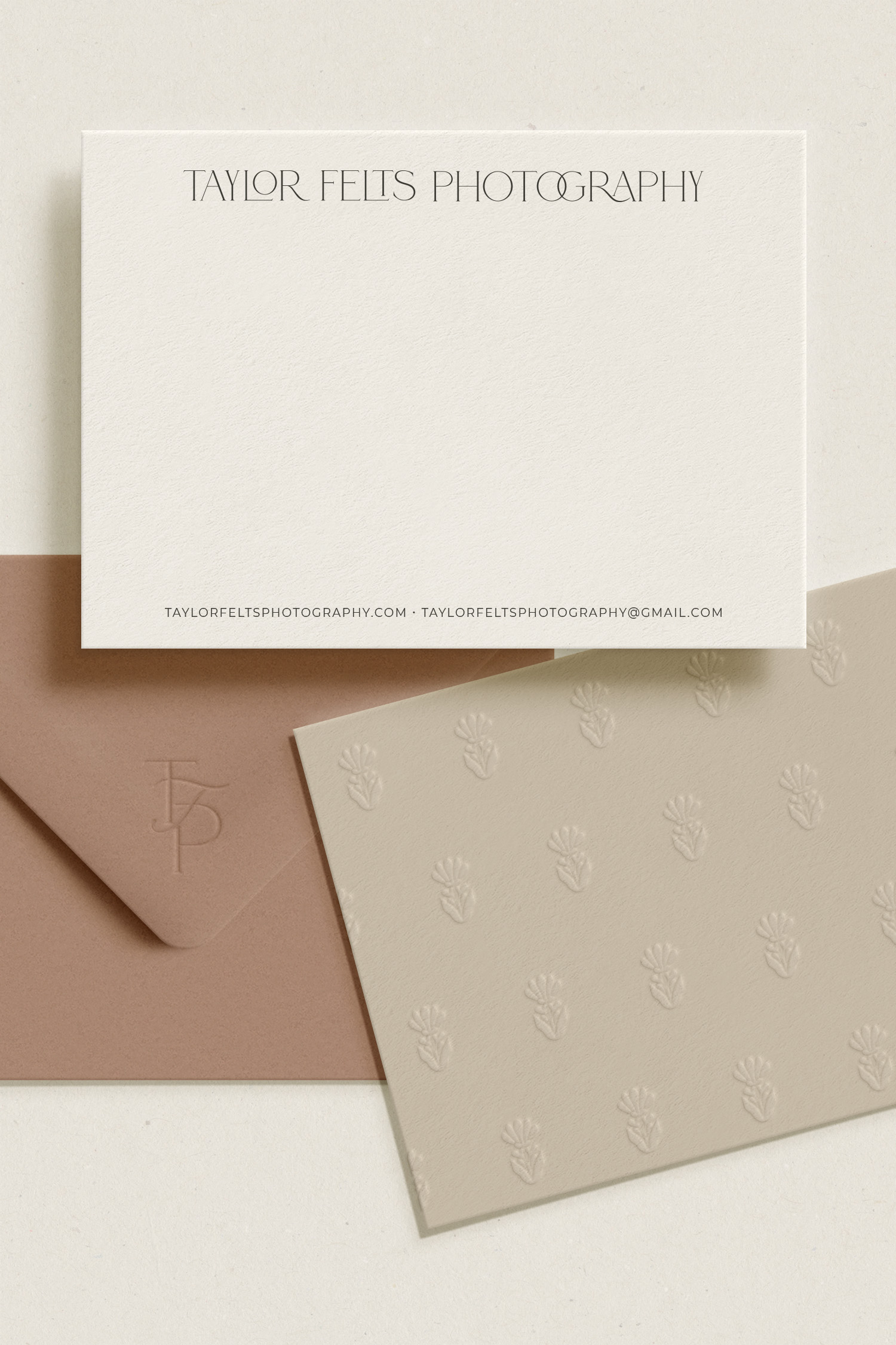
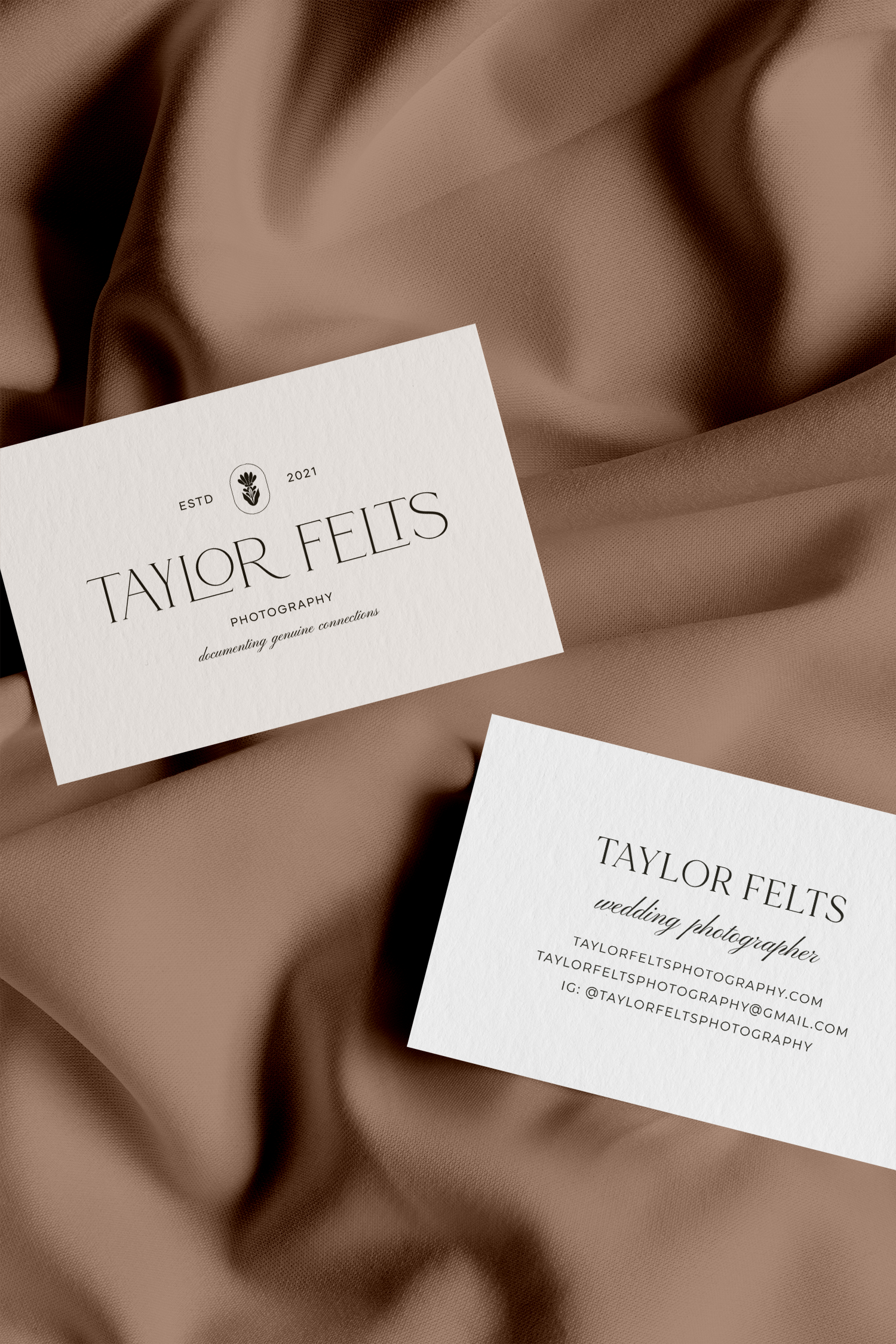
I am thrilled to share this timeless brand design for photographer Taylor Felts. This visual identity includes a customized logo typeface, warm neutral color palette, and custom botanical icon design. All of this comes to life on her beautiful Showit website! Before we get into the full design, let’s take a closer look at the meaning behind the project.
Project Overview
Project Scope
Similar to the Alexandria Grace brand and website project, I combined the full brand nurture week and website in a week into one quick and efficient five days. Taylor had a higher priority of establishing a more credible and unique website. This service was a great fit for her to establish a more professional online presence that supports a higher pricing structure and attracts more ideal clients.
Core Values
- Client-Centered Experience – Taylor is dedicated to tailoring every moment to reflect her clients unique love story. She is there to listen, understand, and bring their vision to life in every frame, ensuring their day is authentically theirs.
- Empathy – She doesn’t just take images, she captures the essence of emotions and beauty of real moments. Her photography reflects her deep understanding and connection with their journey.
- Creativity – Taylor approaches every shot with an eye for creativity and passion for storytelling, seeking out genuine and unexpected moments. She aims to craft images that reflect her clients wedding day authentically.
- Consistency – She ensures clients can count on her to deliver quality imagery. Her clients value they can relax and trust every detail to be captured with care and precision.
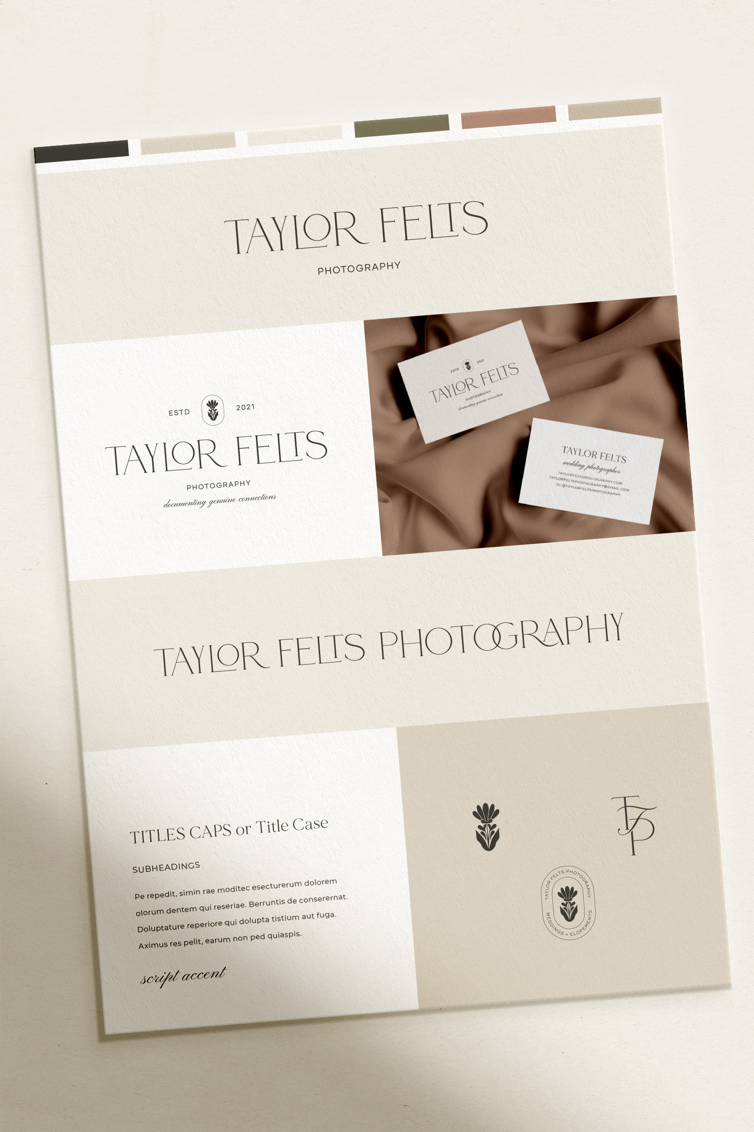
A Closer Look at the Brand Design
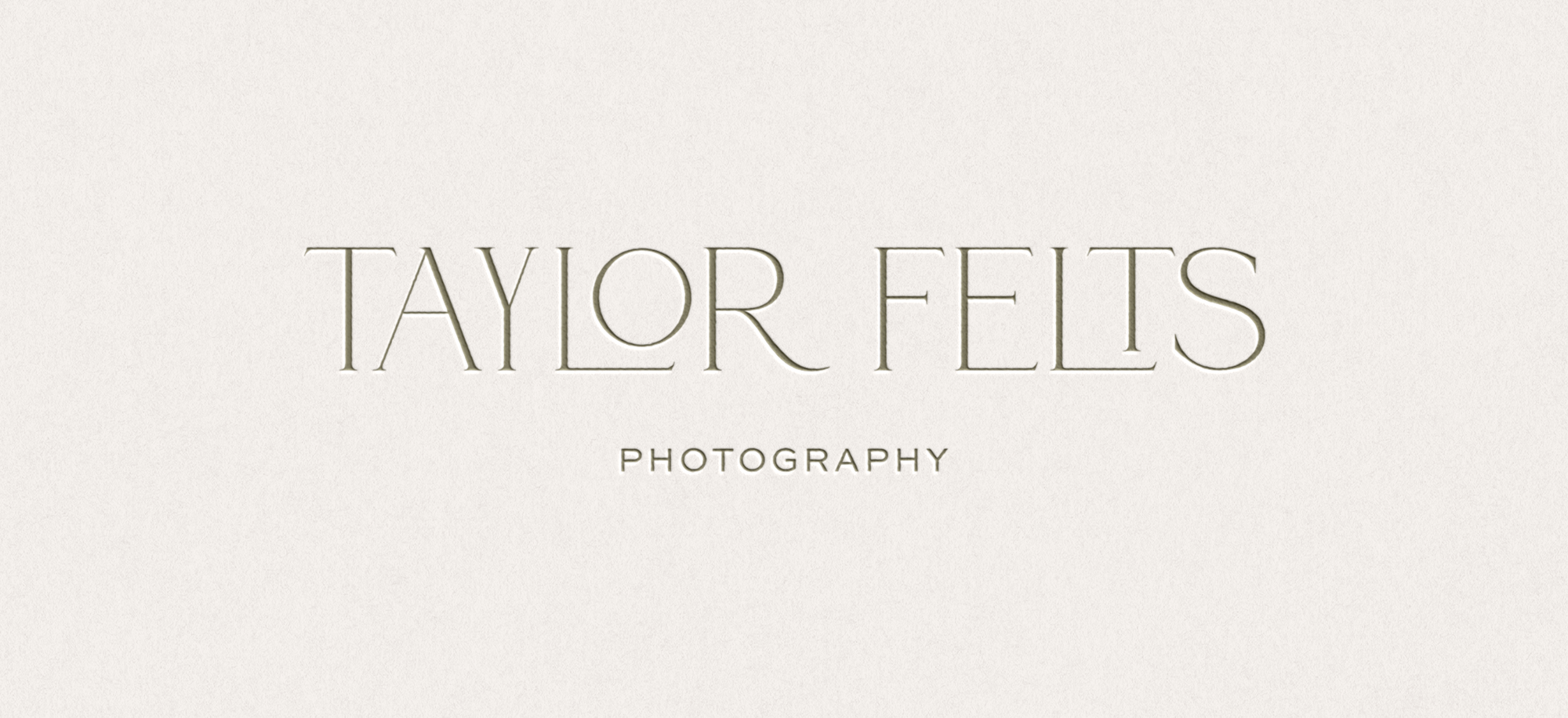
Logo Suite & Brand Development
Strategy & Creative Direction
Taylor Felts Photography is known for documentary-style wedding photography that focuses on true moments and emotion. She captures memories by providing unwavering support, knowledge, and expertise. This ensures every image reflects the authenticity and beauty of your special day. Taylor is genuine, carefree, timeless and trustworthy. Her ideal clients are couples who prioritize being in the moment and who trust their photographer to execute their vision. They prioritize their photos together rather than a specific shortlist and value details and fun.
Color Palette, Logo Suite, & Brand Icons
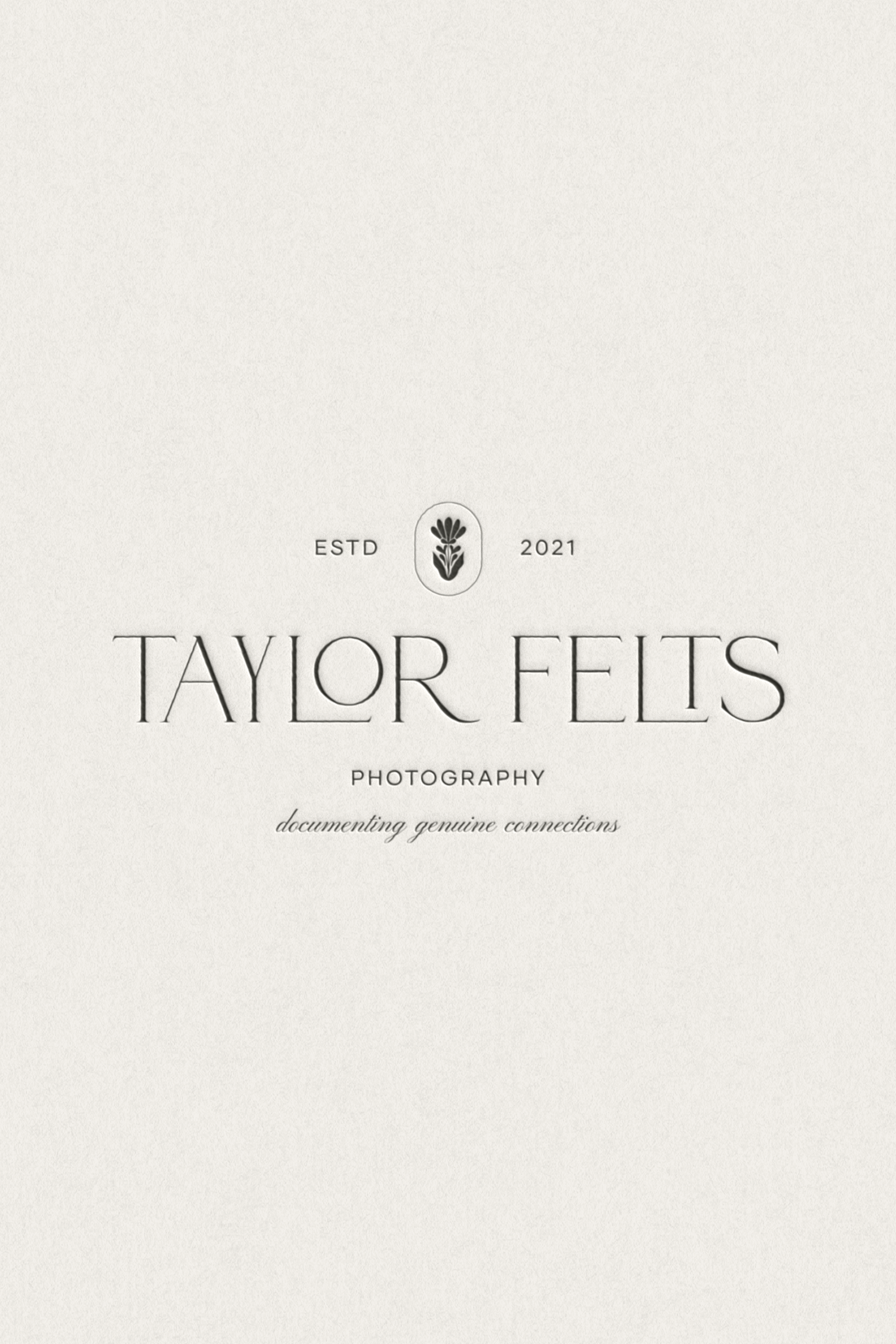
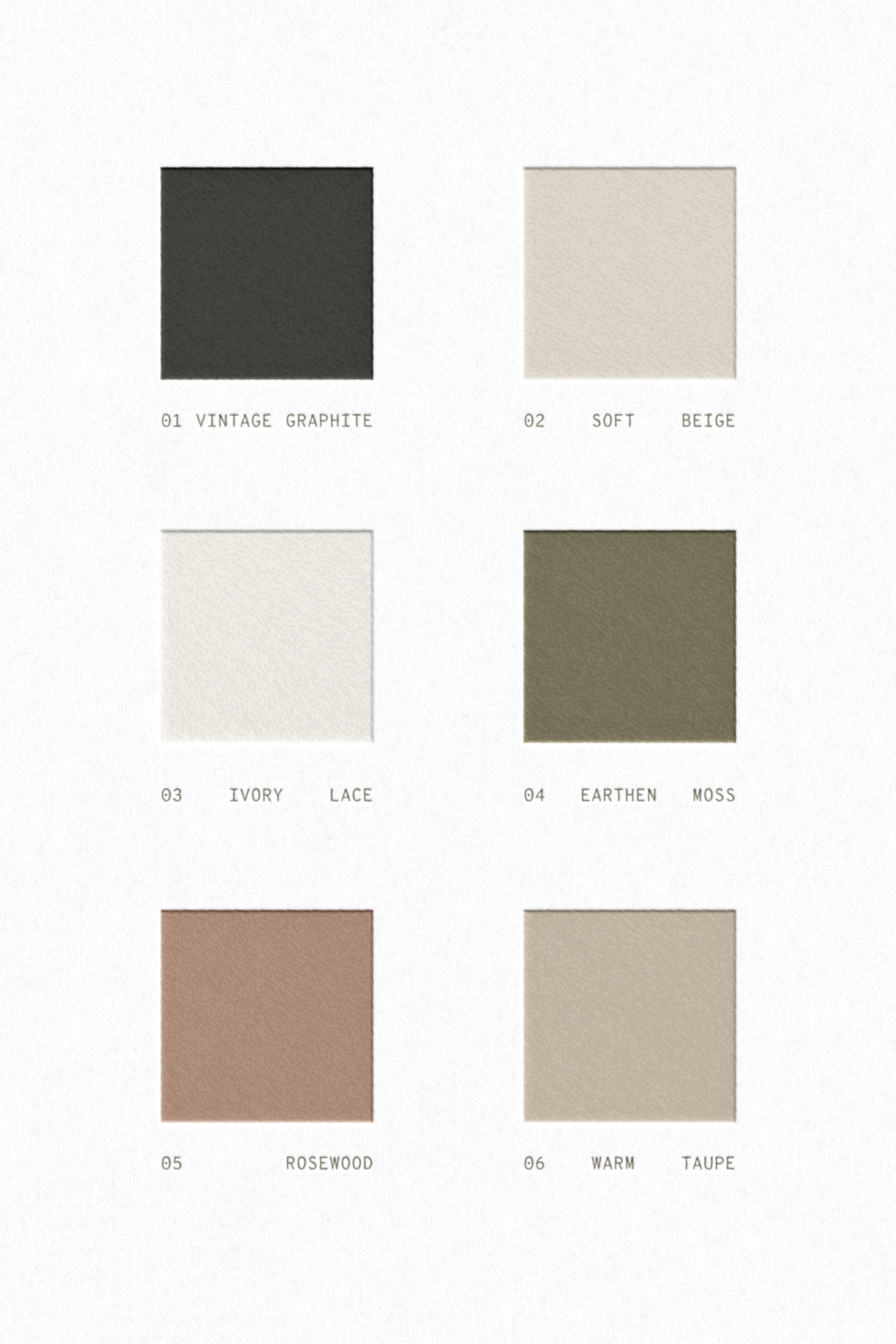
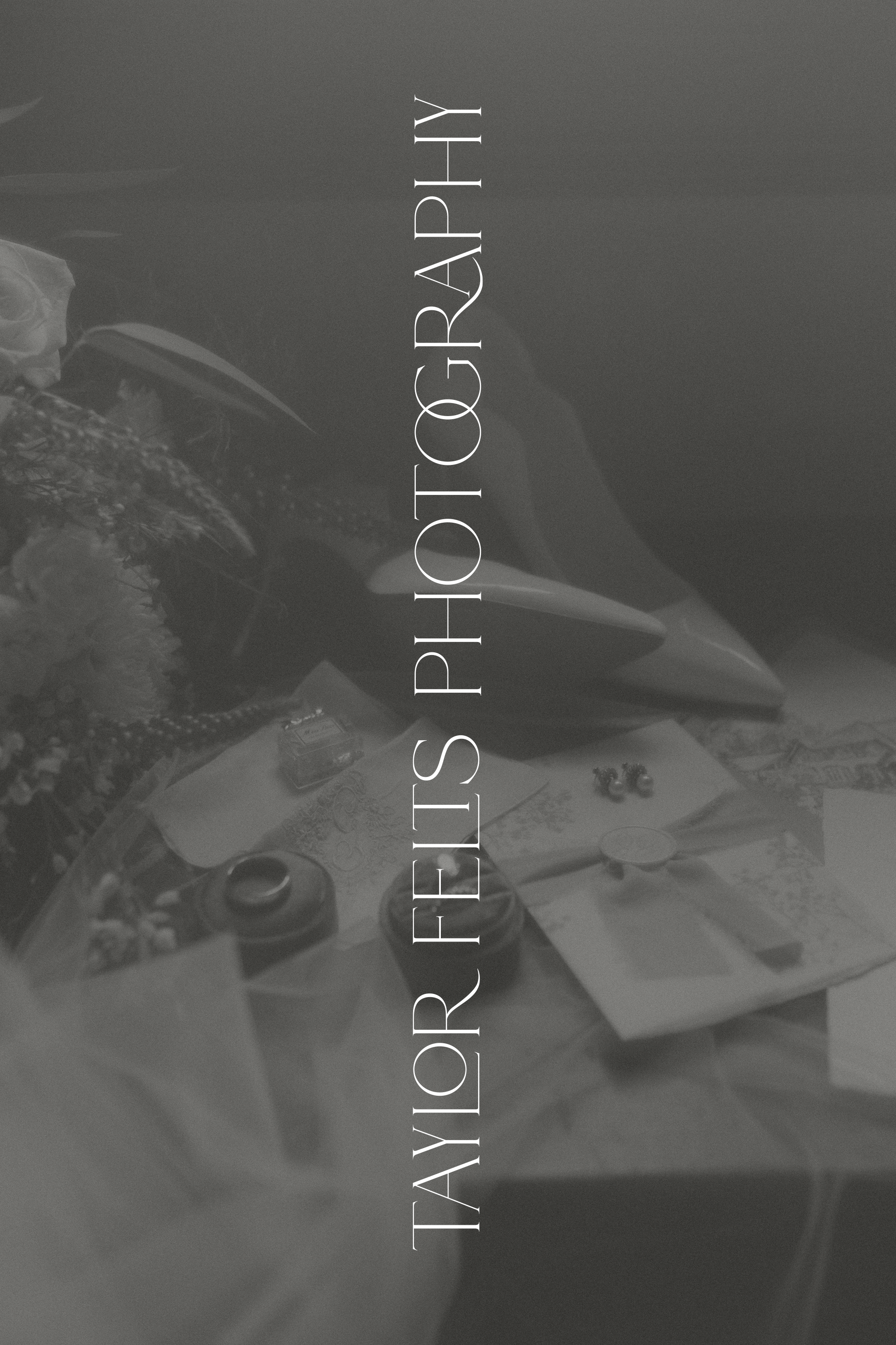
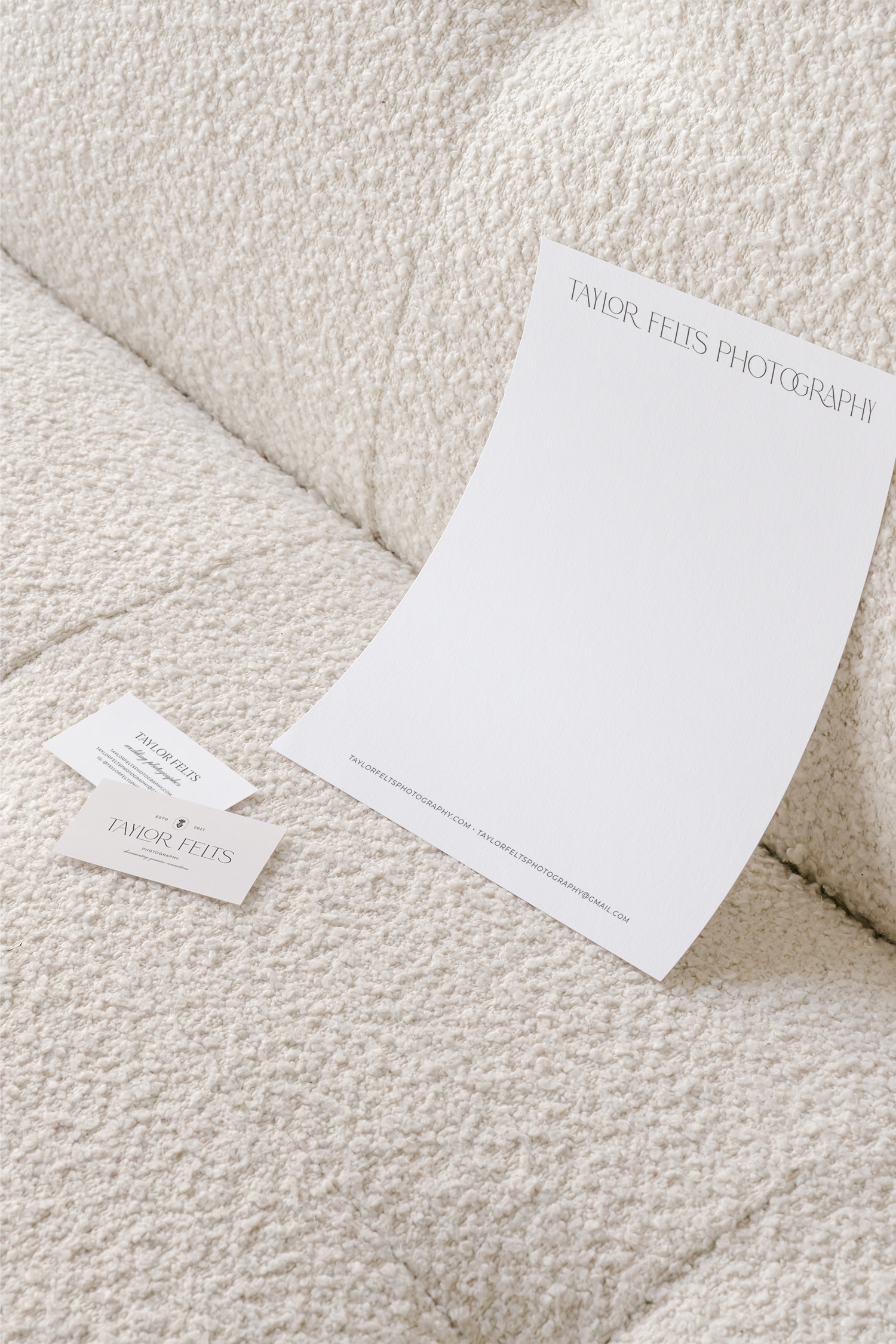
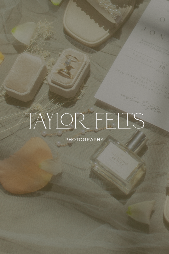
This color palette is inspired by warm neutral earthy tones found in nature. Her audience would interpret this as comforting, genuine, and balanced. The main logotype is a customized serif with letterforms nesting together to bring a fun, carefree feeling to the brand. Pairing this with a clean sans serif font for taglines adds a timeless, professional touch.
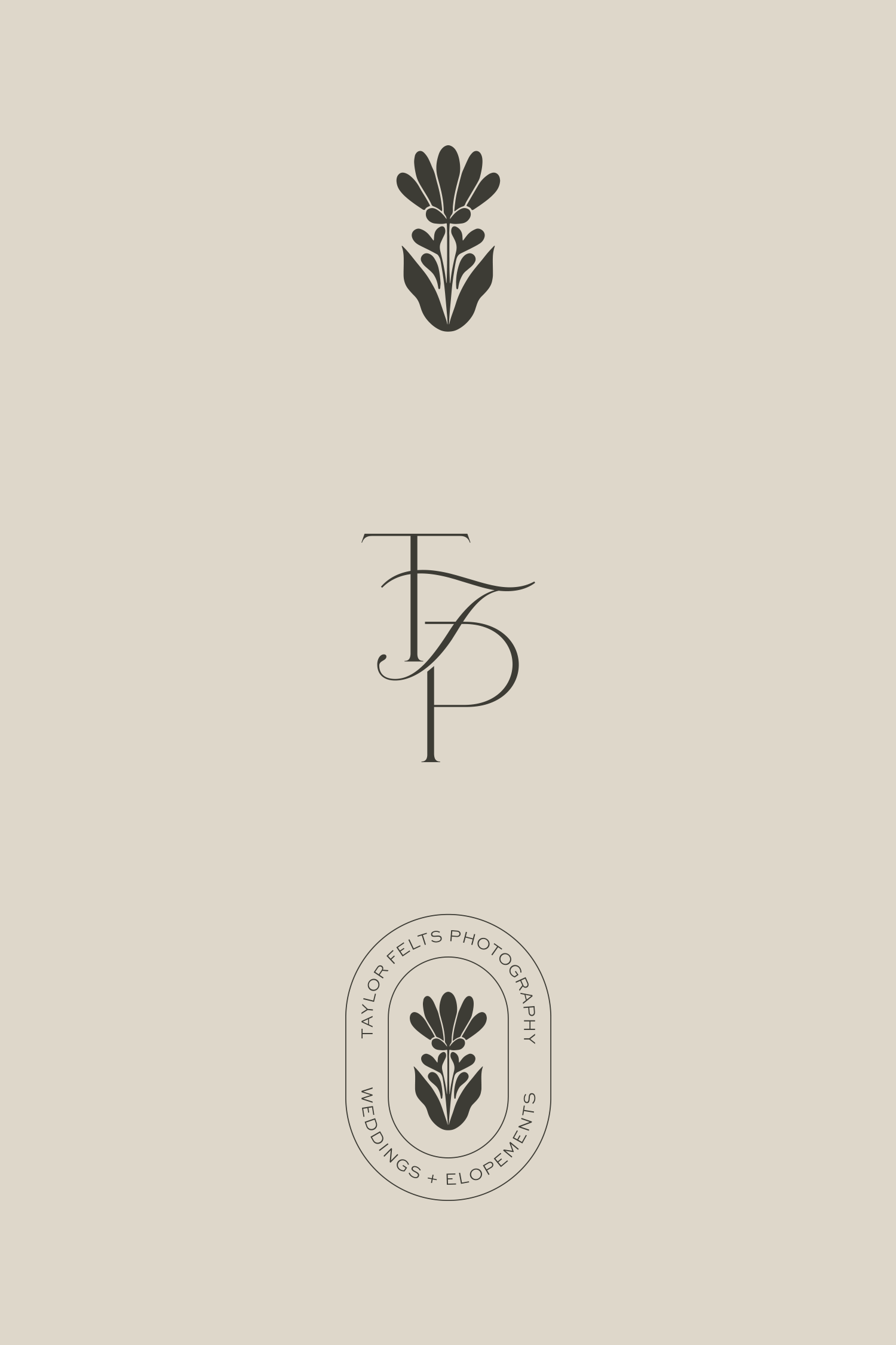
Taylor’s brand icons balance a vintage nostalgic style with simple romanticism. The botanical icon illustration is simple, modern, and elegant. Including a script touch to the monogram adds a unique flair that maintains a level of sophistication. The oval stamp mark is modern, evocative, vintage addition.
Showit Template Customization
For Taylor’s website, I customized the Sterling template by Revel West Studio. Because this was not a template originally created for photographers, I custom-built several sections and pages to accommodate Taylor’s needs. To begin, I implemented Taylor’s brand fonts, colors, logos, and brand marks into the template. Next, I added her photographs and written verbiage to the template.
Importantly, I assisted Taylor in purchasing a custom domain to connect her website. She had been using a Pixieset domain, which wasn’t helping to drive traffic to her site or establish a professional approach. Additionally, I did hours of SEO keyword research to establish her page titles, focus keywords, H1 tags, and meta descriptions. Setting proper and researched SEO content to your website is vital in Google indexing and ranking your website.
