About the Faith-Based brand She Who Magnifies
This beautiful brand came to life in one day during my design intensive service offering. She Who Magnifies is a Christ-centered retreat and resource business geared toward women entrepreneurs. I was both humbled and thrilled when Kaitie chose me to design the brand for this wonderful business. As a believer in Christ myself, this project hits especially close to home.
In Kaitie’s own words, “She Who Magnifies exists to encourage and equip women as they magnify God in the midst of their callings, their families, and their everyday lives. Through heartfelt retreats and ongoing resources, we create space for reflection, connection, and realignment so women can live boldly and intentionally, with both purpose and peace.”
During this post, I will walk you through the strategy, process, and finalized visuals for this project. So without further ado, let’s take a closer look at the foundation of this brand identity.
The Strategy Behind the Brand
She Who Magnifies was born out of a place of deep longing to be remembered not for perfection, but for putting God first. To magnify God’s glory through beauty, rhythm, and wonder. Kaitie aims to support and encourage women to magnify God in every aspect of their lives, especially through motherhood and business ownership.
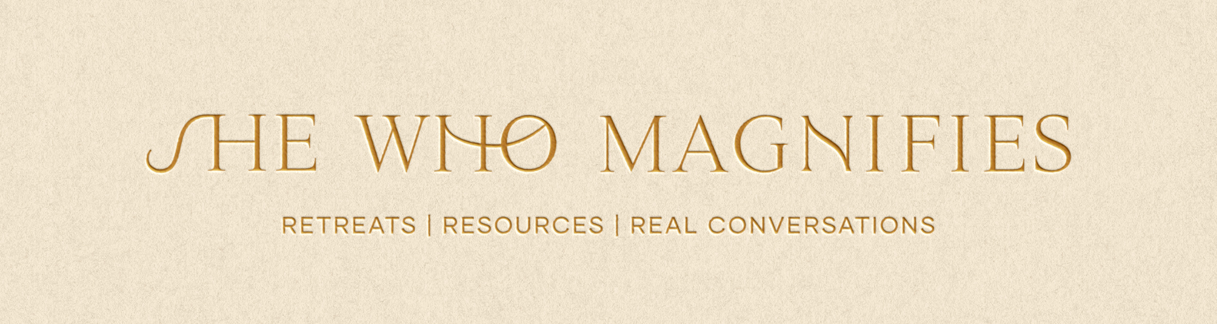
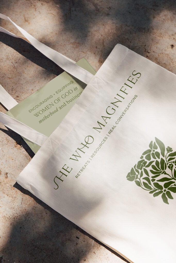
She Who Magnifies is described as retreats, resources, and real conversations for the woman who longs to magnify Christ in her business, motherhood and everyday rhythms
Ahead of Kaitie’s actual design day, we hopped on a strategy/prep call to talk through her questionnaire, visual inspiration, and creative direction. This is an important step in the design process in order to set a strong foundation to build brand visuals upon. Without strategy and a plan in place, we are just designing something pretty. And ‘pretty’ doesn’t always resonate with your ideal audience. Selecting colors based on the psychology behind it brings depth to your brand. The style of typography also evokes specific feelings and themes your brand stands for.
When discussing strategy, it is important to establish the brand’s core values and tone. She Who Magnifies core values include faith over hustle, honest community, rooted purpose, graceful responsibility, creative obedience, and sacred rest. The brand’s tone is described as approachable, honest, and genuine.
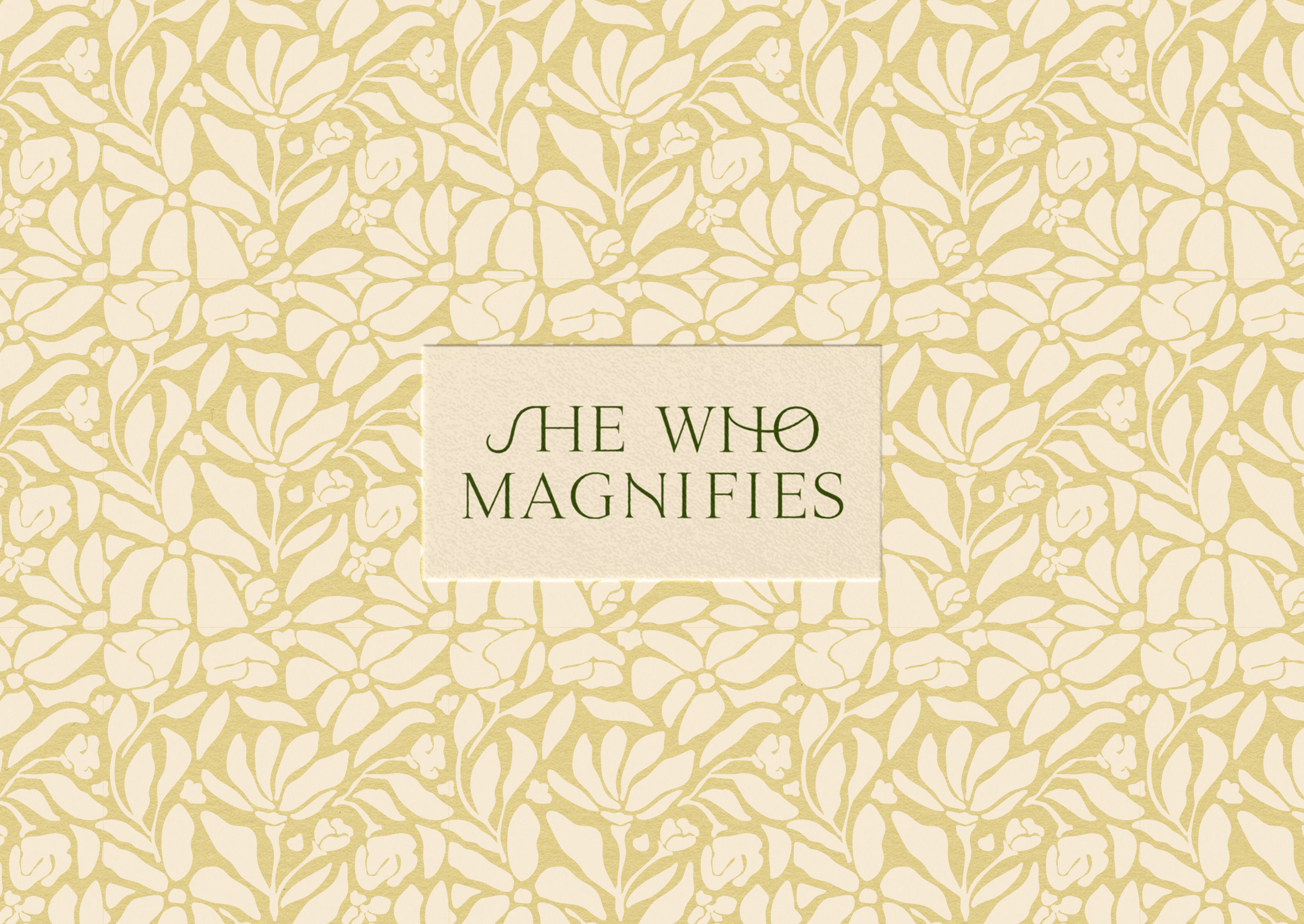
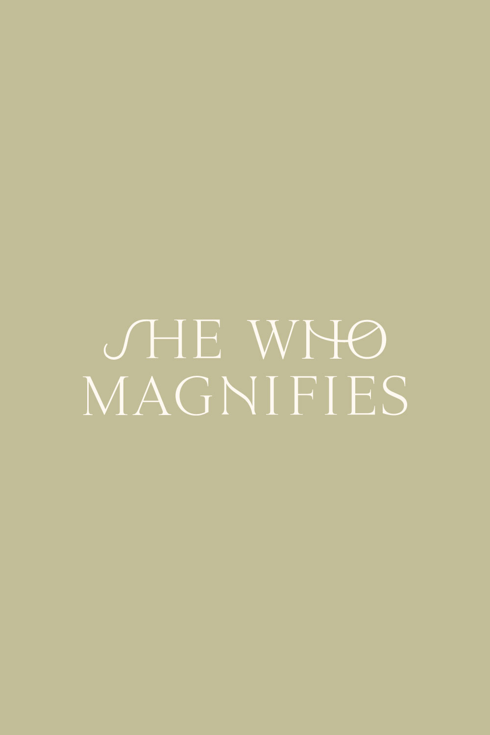
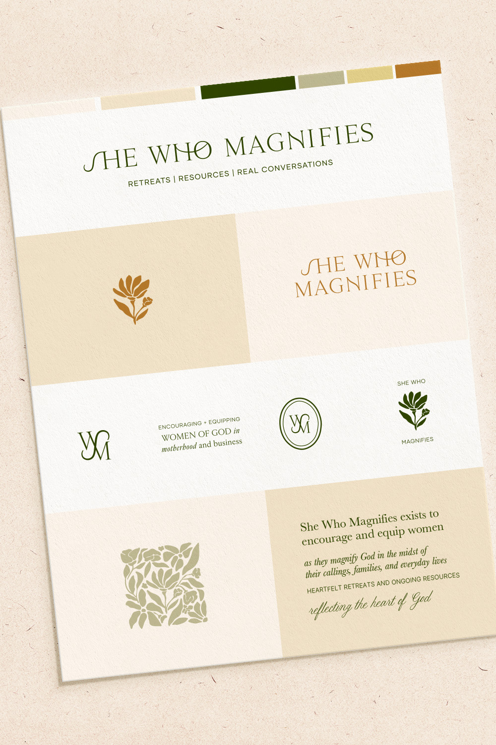
During the strategy call, I presented two different creative directions, both including color, typography and additional design elements. The direction we collectively decided to move forward with for She Who Magnifies included a warm, vibrant color palette, customized serif logotype, unique monogram, and floral motif style icon.
The Final Reveal of Christian Brand Design for She Who Magnifies
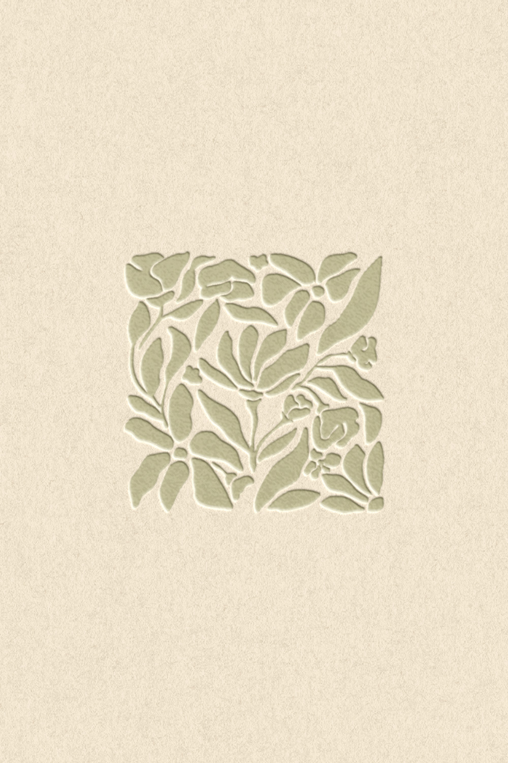
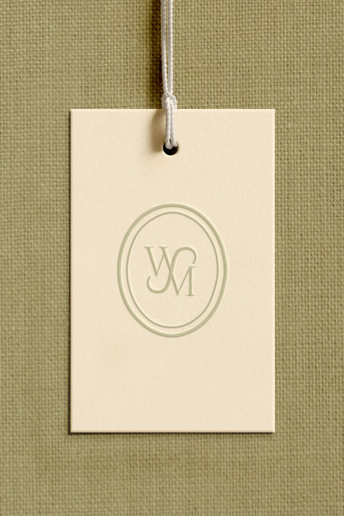
The main logo type is a custom-stylized serif. Including connecting details create a sense of movement and unity, reflecting themes of community, connection, and faith. The monogram has a mirrored aspect to it, offering a rhythmic aspect to the brand. The square floral motif reflects the idea of viewing God’s creation through a magnifying glass—an intimate, thoughtful perspective. Together, these elements form a brand that is both meaningful and beautifully intentional.

Closing Thoughts
Design and faith worked hand-in-hand to create this intentional brand. How as a believer myself, I connected with Kaitie on a deeper level of understanding to design visuals. Also as a young new mom to almost two babies, myself, I personally understand to the intention and meaning behind this business.
If you are a faith-led creative looking for a brand rooted in purpose and visually speaks volumns, I’d love to work with you! Fill out the inquiry form on my website to set up a time to chat.
