Salted Pages is an SEO copywriting studio for entrepreneurs looking to grow their businesses and book dream clients. This ocean-inspired brand identity design includes a classic serif, custom hand-drawn illustrations, and a calming color palette. Working with Lauren from Salted Pages was a great experience from start to finish.
First, it is important to note that this was a collaborative process with The Kate Collective. Katie tackled the brand strategy, while I completed the brand design. I really enjoy working with other designers. Uniting with other creatives to work on design projects offers a fresh perspective. Each time I collaborate, I learn something new, either about myself, business, or design.
Ocean Inspired Brand Identity Design for Copywriter Salted Pages
Because this was a little different than my usual process, Katie, Lauren, and I scheduled a call to get started. Planning a time to discuss the brand strategy was an important step in the process. This ensured that all three of us were on the same page moving forward. Katie provided a few documents with a detailed strategy that I referred to throughout the process.
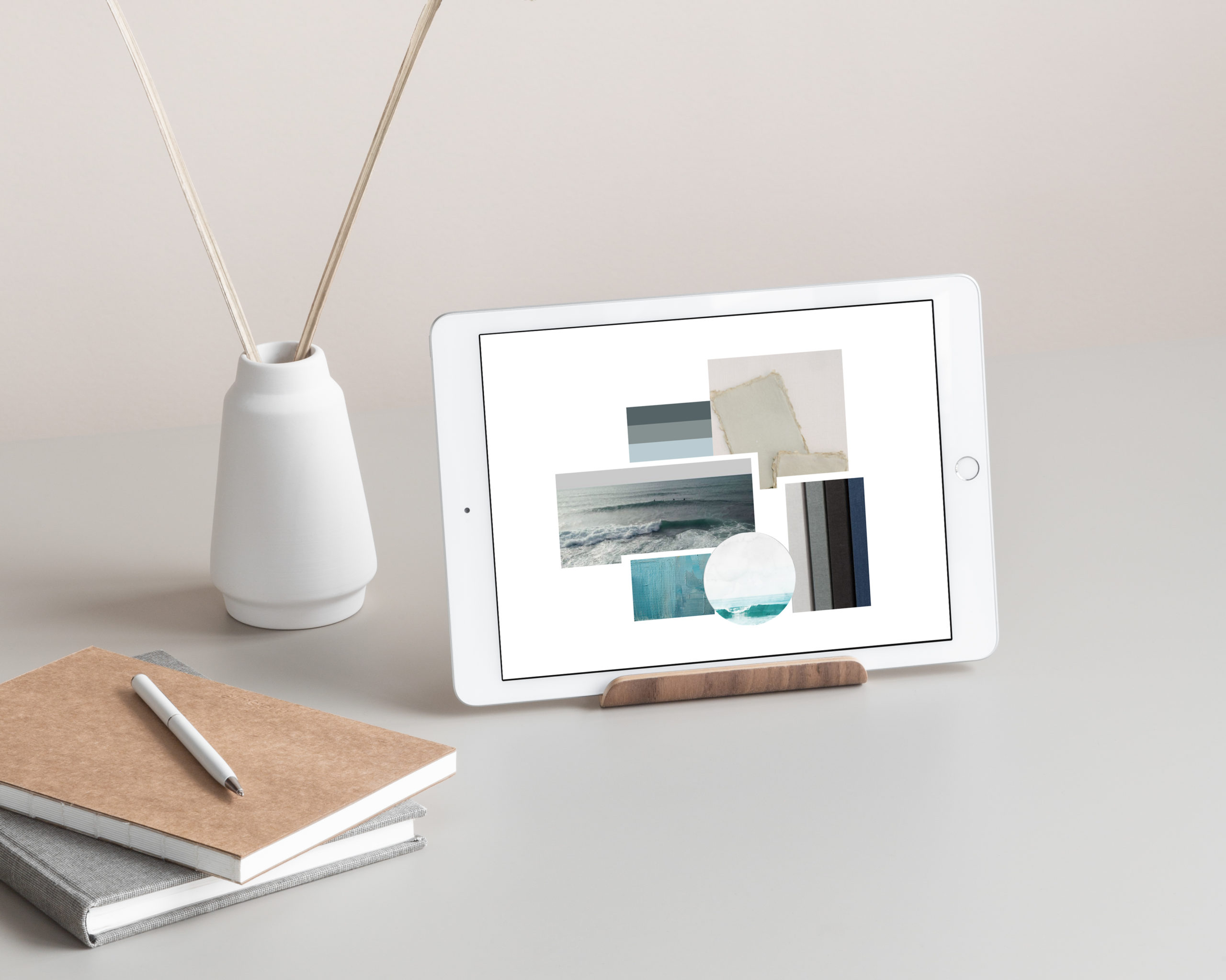
Lauren’s brand words are: modern, refined, sophisticated, authentic, luxurious, and minimal. The mood board includes inspiration from the ocean, paper-like textures, and painterly elements. The color palette was inspired by deep ocean tones. With these strategy documents in place, I am ready to start designing.
Before beginning the logo design, I had Lauren fill out my brand design questionnaire to ensure we had everything in writing. It was helpful to have the questionnaire alongside Katie’s strategy documents. Now the preparation is complete, it is time to begin designing the logo.
About the Logo Design Process
When beginning the logo design process, I start small. I work intentionally and in detail. Nailing down the most simplistic version of your logo is an important step in the design process. This serves as the base of your logo design. It is important to have a ‘bare bones’ logo design to begin working from. Oftentimes, the most simplistic logo is used for your website header, stationery, or as a watermark.
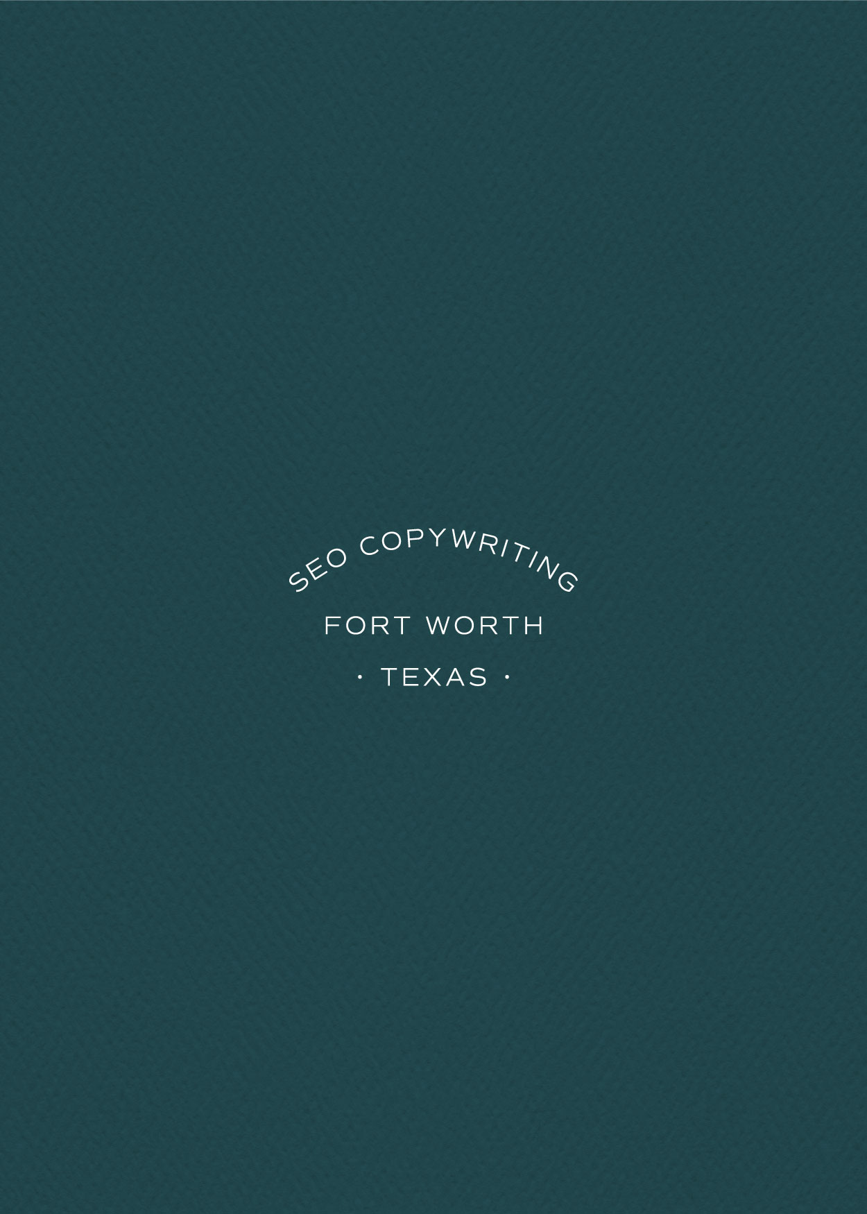
From here, we build on that foundation with supporting elements. Your tagline, monogram, and supporting typography are all great to include in your supporting logos.
I love working with clients that have unique business names. This gives space for more creative freedom and deeper meaning. Naming your business something special instantly makes you memorable. Which is why I was so excited to work with Lauren. ‘Salted Pages’ is inspired by her love for the ocean and all things salty. Furthermore, being in the writing industry, ‘Pages’ was the perfect addition.
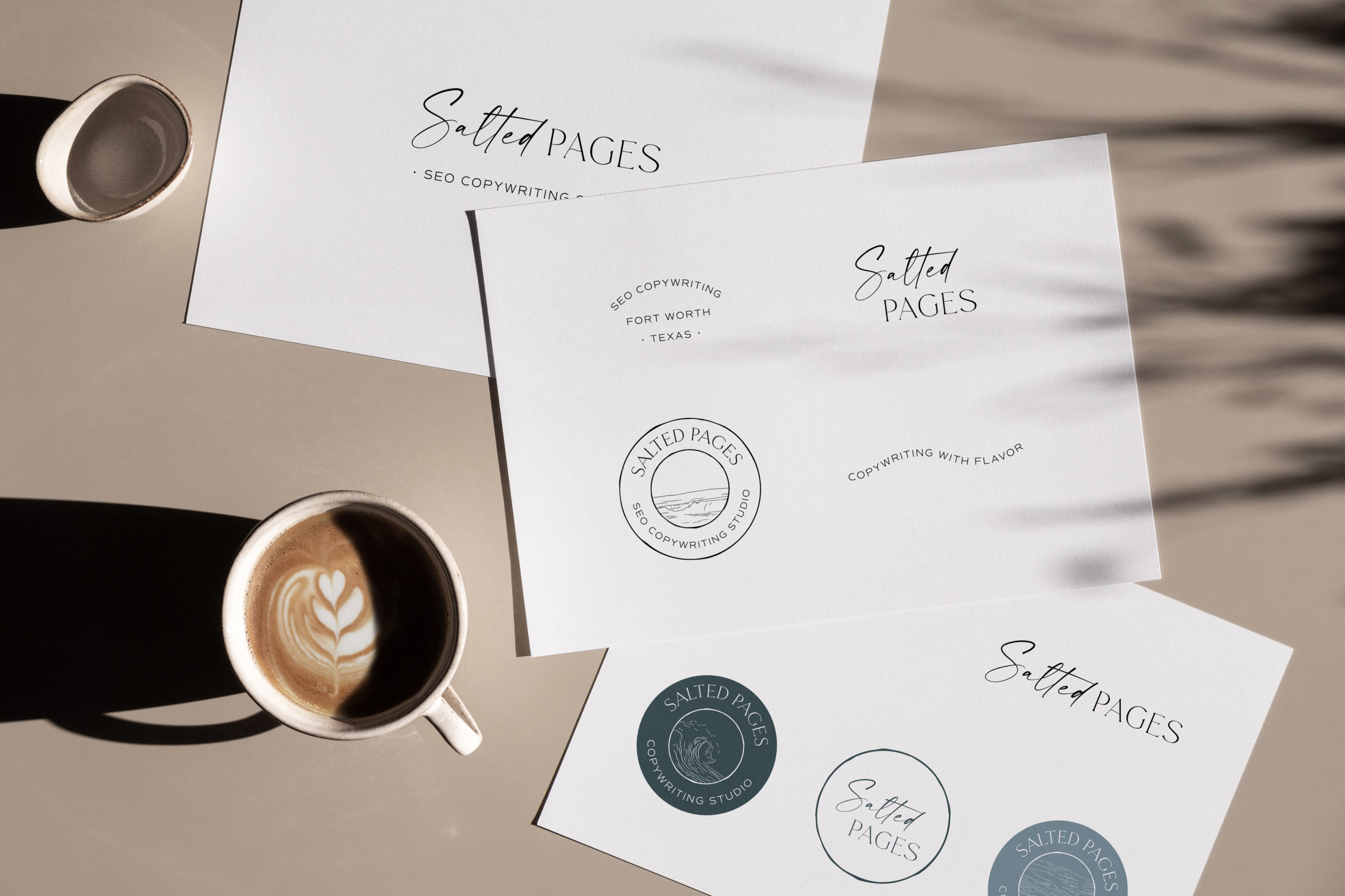
Logo Design and Variations
I selected a timeless serif to begin working on the logo. When selecting typefaces, it is important to reflect on the brand words set in place. In Lauren’s case, the font must say modern sophistication and approachability. Because of Lauren’s authenticity, I did not select anything too luxurious. There is something to say about a balanced design. You can have both – modern luxury AND authentic approachability.
There are endless ways to say modern sophisticated. So, I looked deeply into Lauren’s brand voice and strategy when making typeface selections. Once I stumbled across a few fonts that spoke to me, I started playing.
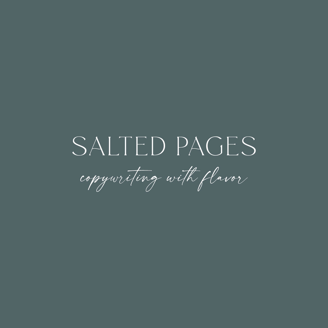
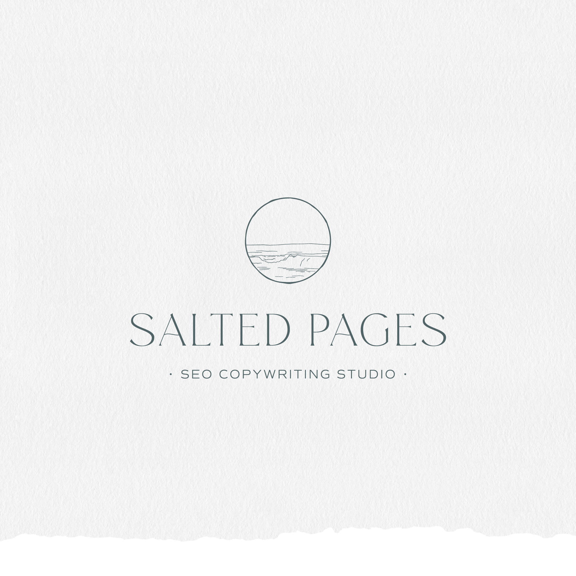
One of the most important qualities of this logo design is the subtle curve added to the ‘a’. Mimicking the ocean, this subtle curve not only gives movement but also meaning to this design.
As previously stated, Lauren is inspired by the ocean and all things salty. She brings a zest to each of her projects. Adding in a fun script offers a more authentic approachable personality. The brand marks in this brand design are also a great portrayal of Lauren’s personality. The combination of texture and clean lines, these marks convey a strong message. They are representative of the subtle-yet-impactful impact words have on your business.
Brand Marks
The brand marks for Salted Pages are nautical-inspired, textural, and simple. Incorporating details such as hand-drawn elements and a minimal san-serif reflects the brand’s voice. The circles are purposefully imperfect conveying the unique tailored experience Lauren provides.
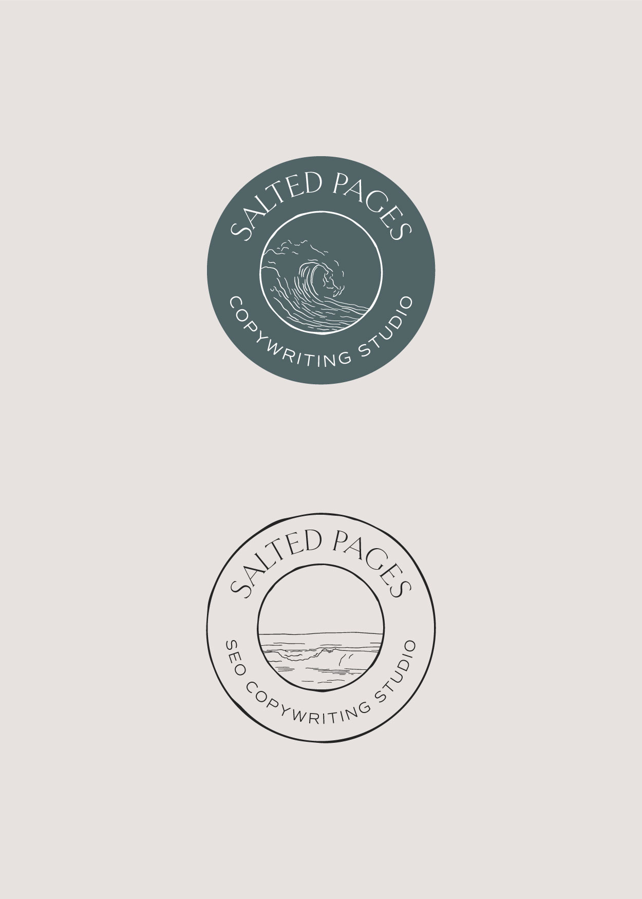
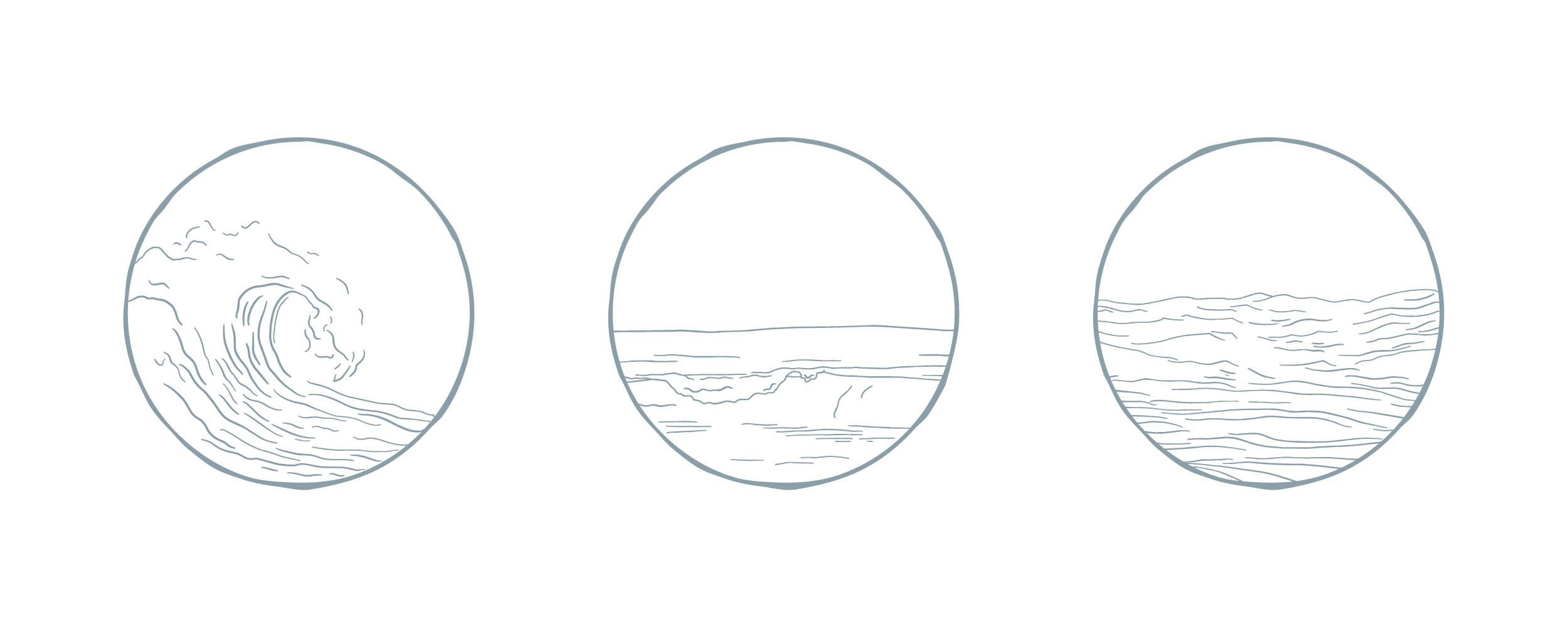
Custom Illustrations
Custom illustrations are a fantastic way to sprinkle personality into your brand. When clients request illustrations, my creative gears really start going. Because every illustration I work on is handcrafted, nobody else will have anything like it. Needless to say, I was thrilled when Lauren expressed interest in illustration.
Since this brand is majorly influenced by the ocean, some type of symbolism with water was a must. We brainstormed watercolor versus line drawing. In my opinion, watercolor is an overused element that can become juvenile if you are not careful. Because Lauren’s brand is sophisticated and refined, I knew a linear approach to the illustrations was the way to go.
The custom illustrations with this brand are simple and modern. Simplifying a wave into an illustration was a bit challenging, but nothing I couldn’t handle. Specific details give clarity to the water concept. I provided three different styles of water to add variety.
Overall, I am SO proud of this brand and the story it tells. A talented Copywriter on a mission to transform your business with the flavor of words! Including both minimal and detailed features, this design is well-rounded and timeless. If you are looking for a strategized and beautifully designed brand, book a discovery call today!
