I am SO overjoyed to share my latest design collaboration with December Oak! This magic logo design for The Art of Self-Care is classic and enchanting. From the custom typeface to the monogram and quirky illustrations – this was such a fun project! During design collaborations, Stefani of December Oak completes the brand strategy and I design the brand. I absolutely love working with other designers, so design collaborations are a blast!
This particular client of December Oak is a therapist who uses art and magic to promote healing and connection. Amber of The Art of Self-Care is a licensed therapist and is wonderfully passionate about her work.
From Stefani’s strategy, “The Art of Self-Care helps people who’ve faced difficulties in their life to connect and heal through practical tools that improve their self-expression.”
Now, let’s get into The Art of Self-Care Magic Logo Design

Overall, the design is clean and neutral. The typeface design is simple with a touch of magic. Manipulating specific letters allows us to create deeper meaning. Specifically, the ‘h’ is representative of taking steps forward to restoration. Subtly connecting the letters are representative of our connection to ourselves and our recovery. Incorporating stars into the design add a magical touch.

Initially, the monogram included all the letters from The Art of Self-Care. To clean up the design and represent the most important words, Art and Self-Care, we landed on this beautiful monogram.

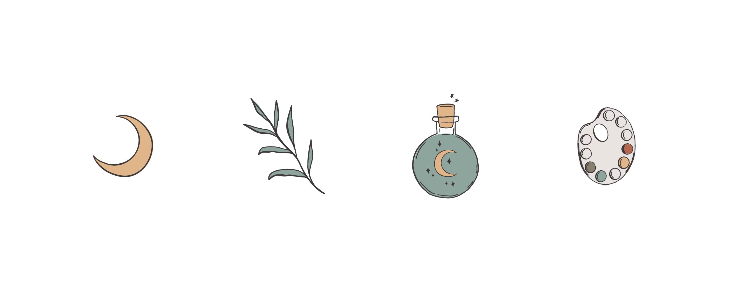
These super fun, magical custom illustrations are the icing on the cake. Because Amber works with art and magic to provide therapeutic techniques, it is important to incorporate these elements into her brand visuals.

Stefani completed Amber’s blog design and it’s truly a beauty, you have got to go check it out! Did you love finding this design collaboration? More of these projects will be coming your way, so stay tuned!
